Effective Graphic Design Strategies for Social Media
Author :
In a world where people scroll quickly, amazing graphic designs can only stop viewers in the middle for few seconds. And in those few seconds, you can impress and engage the audience however you want. In this blog, we’ll discuss the important details about graphic design things or how graphic design tips can be useful.
Whether it is color, contrast, fonts and alignment, types of images in graphic design are the deciding factor. They decide how viewers will think and feel about your brand.
According to Venngage study, 56.2% of marketers believe that visual content plays an important part in marketing strategy. In one of the studies by Dr. Ellen, 49% of marketers report that they cannot do without pictures in their strategy. It is also documented that color enhances brand recognition by up to 80%
These facts are enough to confirm that graphic design can increase visibility and trust. Regardless of whether you are a beginner or an expert, you can reshape your social media presence by using graphic designing techniques.
Before You Start Designing
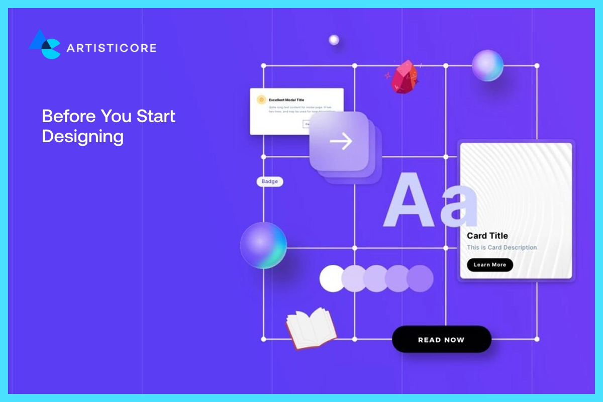
You need to pause and first think about what is good graphic design? And then you can jump towards how to design graphics. To help, there are graphic design process tips available that graphic designer can use to achieve effective yet simple graphic designs.
Moreover, you can take guidance from graphic designer stock photos. If you want to make something unique, research first by asking yourself who are you designing for? What kind of feeling you want to provoke? Who do you want to target?
Cool graphics design is not just attractive but also captivating. There are ways to give graphic design a customized feel such as by using brand tone to deliver the message. Even if you are working for an agency, there are tips for graphic designer on how to graphics, teaching you about the use of color, fonts, typography and layout.
The moment you get the direction, start making graphic design. This blog is all about how to make cool designs using graphic design diy. Read and use the ones that suit your graphic design cool vibes to make outstanding posts.
Do Proper Research
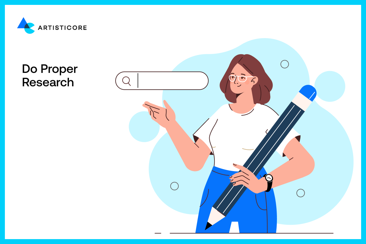
All great designers start by looking at other designs. It is not about stealing credits but to understand the reason behind their success. Observe elements like colors, spacing, and flow and after knowing these, make your own spin.
For example, ads of brands like Nike or Spotify are exemplary to many digital artists. They take the graphic design tips from their ads before creating in their own style. It is a simple way to practice your eye for good visuals. Imagine it as rehearsal of what you are about to do.
Design for a Global Audience

Your designs go live and the whole world can see them. If you are designing for a particular audience, it must have those cultural aspects. In different places, different colors, symbols, and pictures have different meanings.
For example, in China, red is auspicious but in west, it is a sign of warning. See how the meaning changed? Similarly, meaning of different symbols and icons vary according to the area.
Before you make a design, take it through people of the culture you would like to target. It is a smart move to keep your design universal. Brand like Airbnb and Coca-Cola do this by using informative, non-exclusive, and memorable graphic to have universal impact.
A good design always remains timeless and reach beyond borders.
Think Outside the Box

Every designer has a stock of graphics in their folder. But each time, they look past that design to make something unique.
During the graphic making, photos, nature, fashion or buildings can be used as inspiration. You can use tools to bring energy into boring layout. There are platforms where you can play with texture or add 3D effects.
Tools like Creative Cloud ads by Adobe are famous for these functions as they combine both real and digital pictures. They are used by designers to make images memorable.
As a beginner, you can test these tools to understand how each function works. This way you can get a better idea about whether you need them or not. Overall, your creativity is what can bring the amazing outputs. Designs are not made with rules but with curiosity in mind.
Keep Inspiration Boards
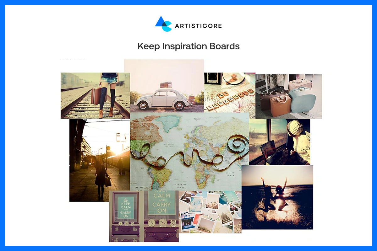
Every graphic designer must have a mood board or an inspiration folder. In that folder, they can store designs, color schemes, and layouts. This can be done easily with sites such as Pinterest and Behance.
Inspiration boards aren’t only a way to get cool graphic ideas. They also prove what makes a graphic visually appealing and how you we apply those tricks to our own design.
Design with Emotion
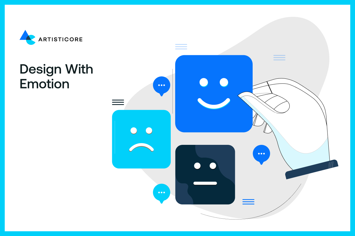
People can feel color, typography and images. Consider the energetic bright red of Coca-Cola or the relaxed design of Apple. That’s why before designing ask yourself, what emotion do I want my audience to feel?
When you design something for your audience particularly, you build an emotional connection. This connection can transform a dull design into something memorable. This tip is often disregarded by most of the designers which lead to unsatisfied responses.
Limit Your Fonts
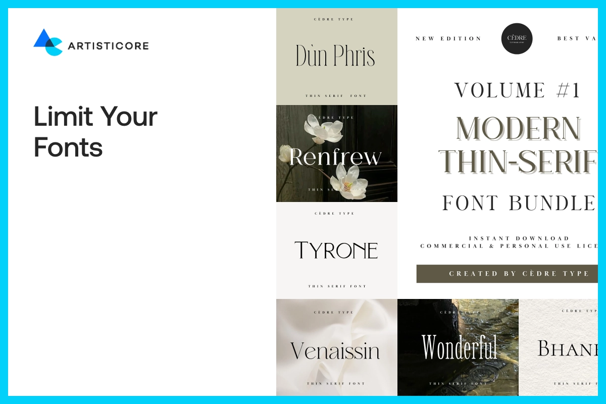
Typography will either break or make your design. An excess use of different fonts will create a confusing effect on your layout.
Use few, maybe one or two font styles. This is one of the most helpful graphic design tips to all beginners. Select one to use in headlines and another to use as body texts. Whichever font you would use, make sure they are both readable and consistent throughout the text.
This font tip will quickly bring a sense of harmony and makes your audience trust your brand. Classic, clean fonts are always a safe choice because the less complex it is, the better. Furthermore, you can look in to box graphic design techniques to create professional yet eye catching graphic designs.
Use a Limited Color Palette
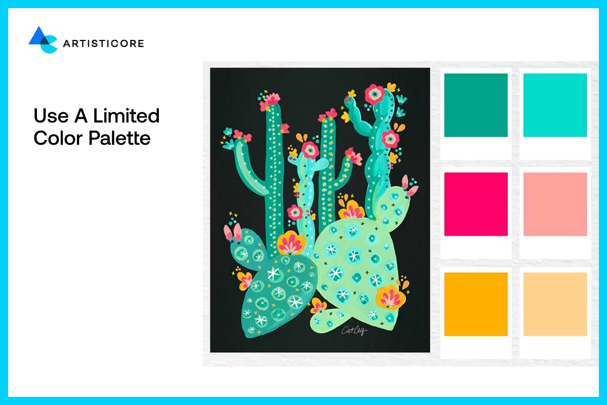
One of the strongest elements in design is color. It can entice emotion, promote brand recognition and gain attention. This is one of the most powerful graphic design techniques that can sort a lot of things for you.
The advice is to use a set number of colors, at most 3 or 4 color combination. This will give your images a unified look and in return gain loyalty. Loud and clear, use of color theory in graphic design create the mood and provide useful outcomes.
Use Contrast
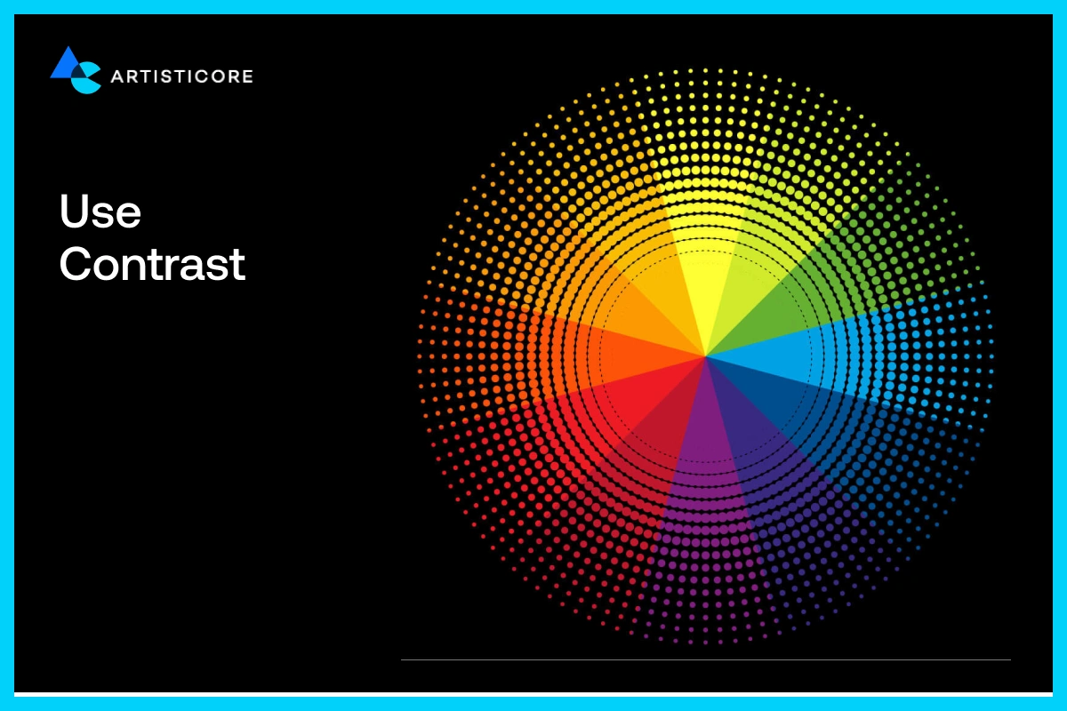
Choosing the right color won’t do the job alone. In graphics design graphic, contrast express emotion and enhance readability. To maintain an interesting design look, you can go for big vs. small, light vs. dark, loud vs. quiet.
Use contrast to highlight your headline, custom logo or call to action. Take a look at Spotify Wrapped where they used neon on black to present data. No doubt, it does look very exciting.
Cool graphic designs should not only look modern and interesting but should be easy to understand. Learning the magic of contrast and experiment with it can help you to get attention you need.
Play with Scale & Balance
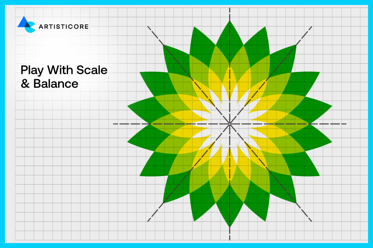
A design feels right because of balance. By scaling your text, icons, or images, you form a visual hierarchy which the eye follows. This is among the graphic design tips for social media that even experts apply on a daily basis.
With scaling, you can add focus to your headline or call-to-action with use scale. It is advisable to use a mix of big and small text. The balance in variety provides contrast and rhythm.
Even good alignment in graphic design is also a contributing factor. It makes each element look purposeful. If you are on the stage of designing graphics, then play between big and small to create harmony and clarity and see the results.
Use White Space Wisely
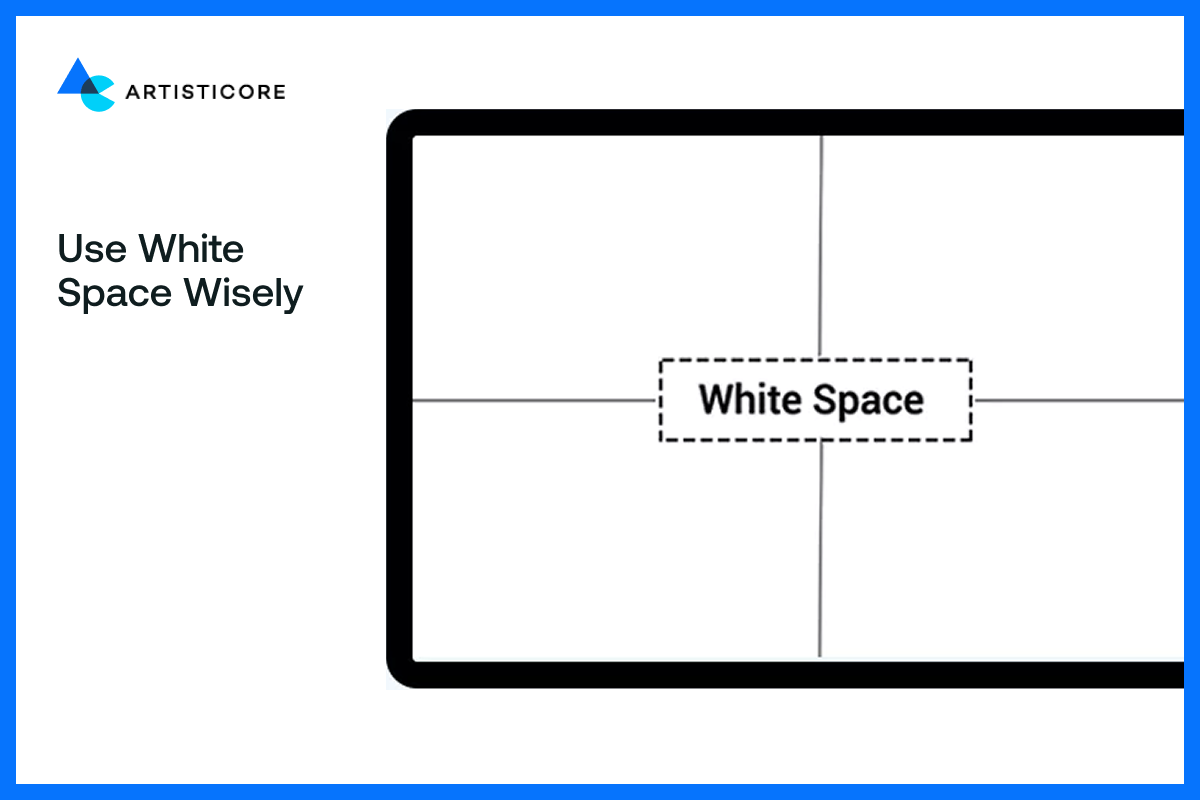
White space is a topic that is usually ignored as far as graphic design tips and tricks are concerned. Yet this blankness is what allows your design room to breathe.
The white (or negative) space enhances readability and makes it easier to focus on important information. A secrete to clean graphic designs are, the less the clutter, the more valuable.
Adding breathing space between different elements in designs leads eye catching result. It works just like punctuations in a piece of writing, allowing viewers to stop and digest what they are reading.
Grids for Perfect Alignment
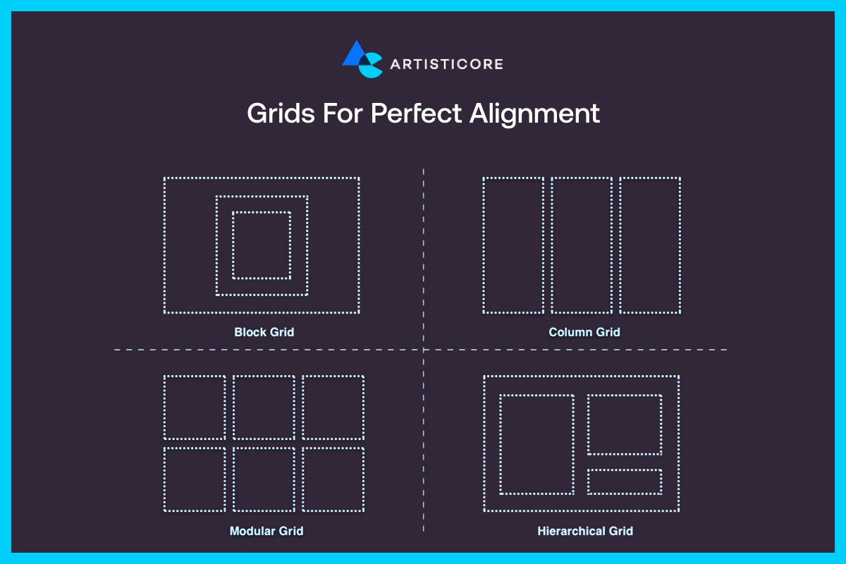
A grid provides structure to the design. It assists you in aligning things accordingly. This makes the page look equal and simply to read.
The first step to good alignment is to use a grid. Be it a social media post, a web page, a brochure, grid works like magic. Even basic designs have grid lines that are invisible and keep everything joined.
If you still don’t know how to apply graphic design tips
Mind the Margins
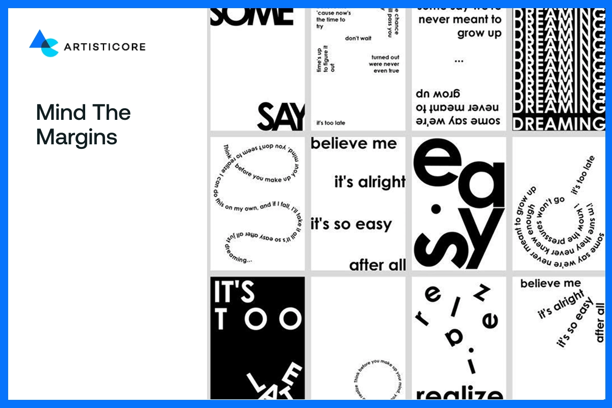
Margins are the blank areas surrounding your design. They help to create breathing space and simplify text reading. When margins are too narrow, it makes the design look crowded. Similarly, when they are too wide, it disbalance the whole design.
Never rush to finish your design, always go back and have a look at your spacing. Good margins add an aesthetic appeal to designs, working as an important graphic design tips for designers.
Use icons and infographics
![]()
Icons and infographics simplify difficult ideas. A long paragraph with pictures is easy to read because infographics does storytelling that simplifies complex information for you. This also means that the graphics needs to serve the purpose. To help easily location, you can add icons to direct images for viewers.
For example, HubSpot data visualizations use infographics which makes the data easy to process. Moreover, readers can easily understand and share them with their fellows.
According to THE HOTH, infographics can generate 650% more engagement than plain content alone. Responsive infographics help people learn more quickly and recall longer. This is a powerful graphic design tip that can help content writer, designers or even brands to bring clarity with creativity.
Use High-Quality Images
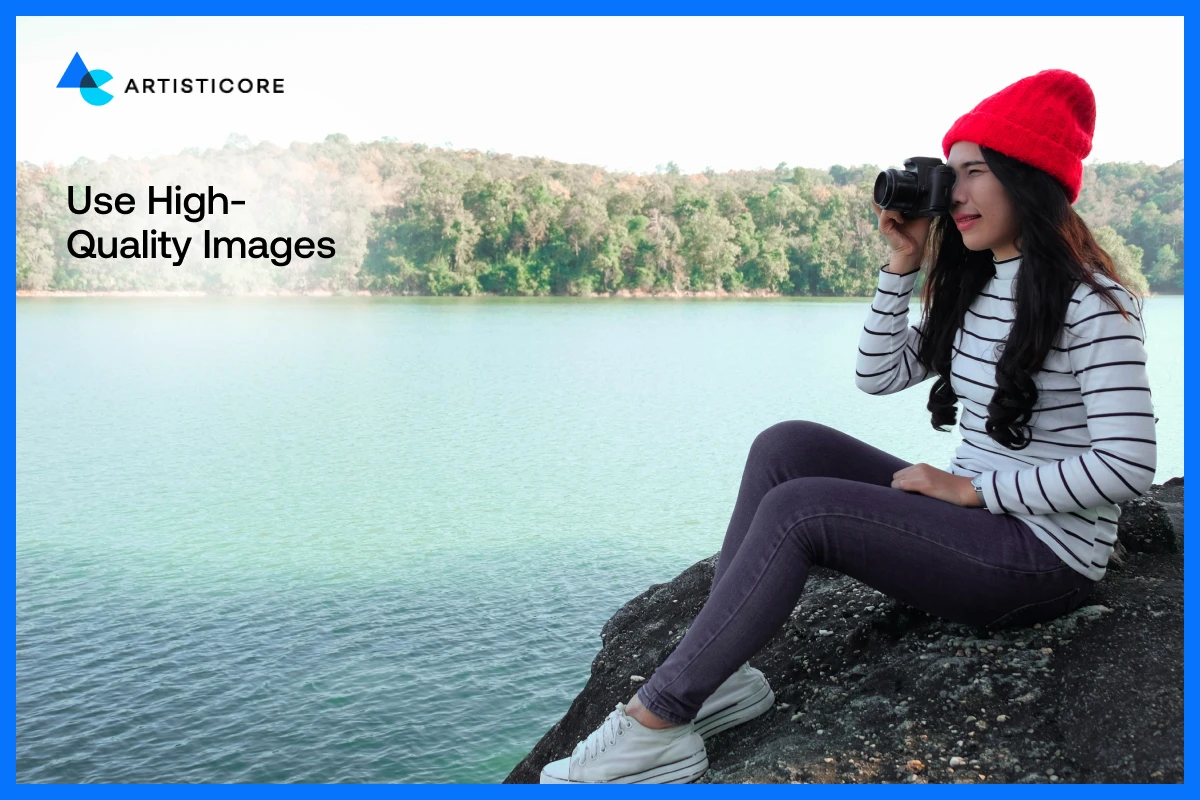
No one, literally no one wants to see blurred or pixelated images on your website. If the purpose is to educate then there is no point in using low quality graphics.
Do not opt for the low quality images from the graphic design stock photo even if you are beginner. That’s one graphic design tip for both graphic design pro or amateur.
The impression of your brand is created by your visuals. You should always use high-resolution images or custom illustrations that fit your message.
See how big brands like Nike use original, high-quality photos with emotion and movement. It is what makes a design memorable. As a beginner in graphic design, tools like Canva and Figma are there for you create sharp graphics This graphic design trick transforms a graphic design simple post into something that people do not simply pass by.
Choose the Right Format
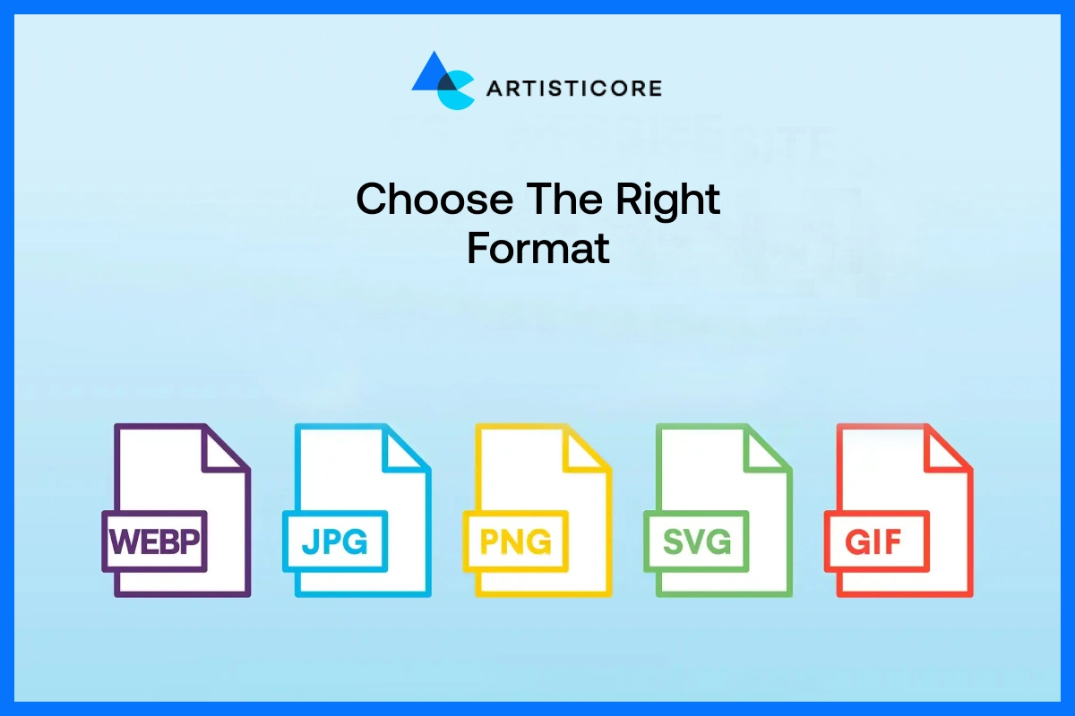
Select the appropriate file type to save your graphics. Learn the importance of each such as PNGs is to retain transparency, MP4s for animations, JPEGs for web posts, and SVGs for logos to stay crisp.
It is a minor yet important detail that can differentiate between beginners and professionals.
Simplify Motion & Animation
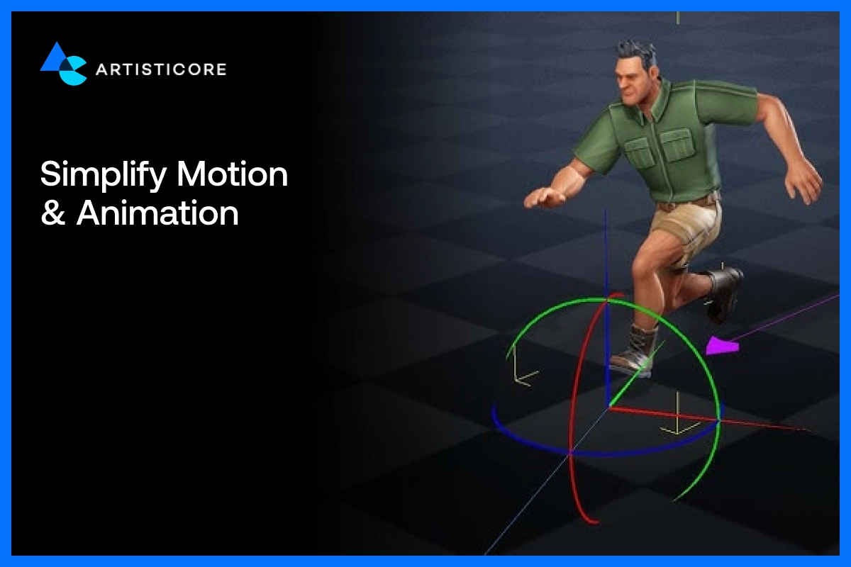
Cartoons are literally everywhere. You will find them in Instagram reels or on the site header. Movement must assist, not distract. Make animations smooth, light and relevant to your message.
For example, Airbnb use soft transitions that add experiences of their customers. You will see all the elements such as balance, energy and clarity in their ads.
Remember, even excess movement is distracting in the design. It is advisable to use minimal movement to add liveliness to material. This is one of the graphic design tips that you can use in this modern world to transform online images.
Keep It Simple and Clear
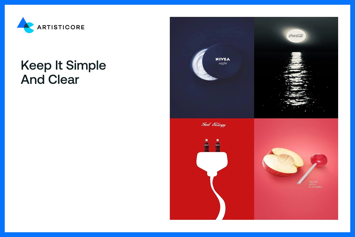
In design, less is more. Your message can shine through simple visuals. Excessive colors and fonts or effects can be confusing. Empty space around elements add balance in the layout and make design look more welcoming.
Have you seen marketing visuals of Apple? Observe, how they have a simple color scheme, clear fonts, and strong focal points. That is the strength of simplicity.
According to Canva, simple and clear design enhances readability and professionalism. These are some beginner graphics design tips that can help you express and maintain an elegant appearance of your visuals. It is always better to be clear than chaotic.
Follow the Rule of Thirds
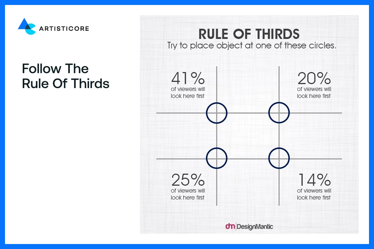
The rule of thirds applies when you want balanced designs. Divide your frame into 3 rows 3 columns. Put important details such as text, icons, or faces to form natural equilibrium and flow of visual elements.
Think about a travel image where the horizon is on the top third line, adding a cinematic and still vibe. This rule is used by National Geographic to attract the attention of viewers where they want. This trick will make your photos or social media design look purposeful and professional.
Optimize for Each Platform
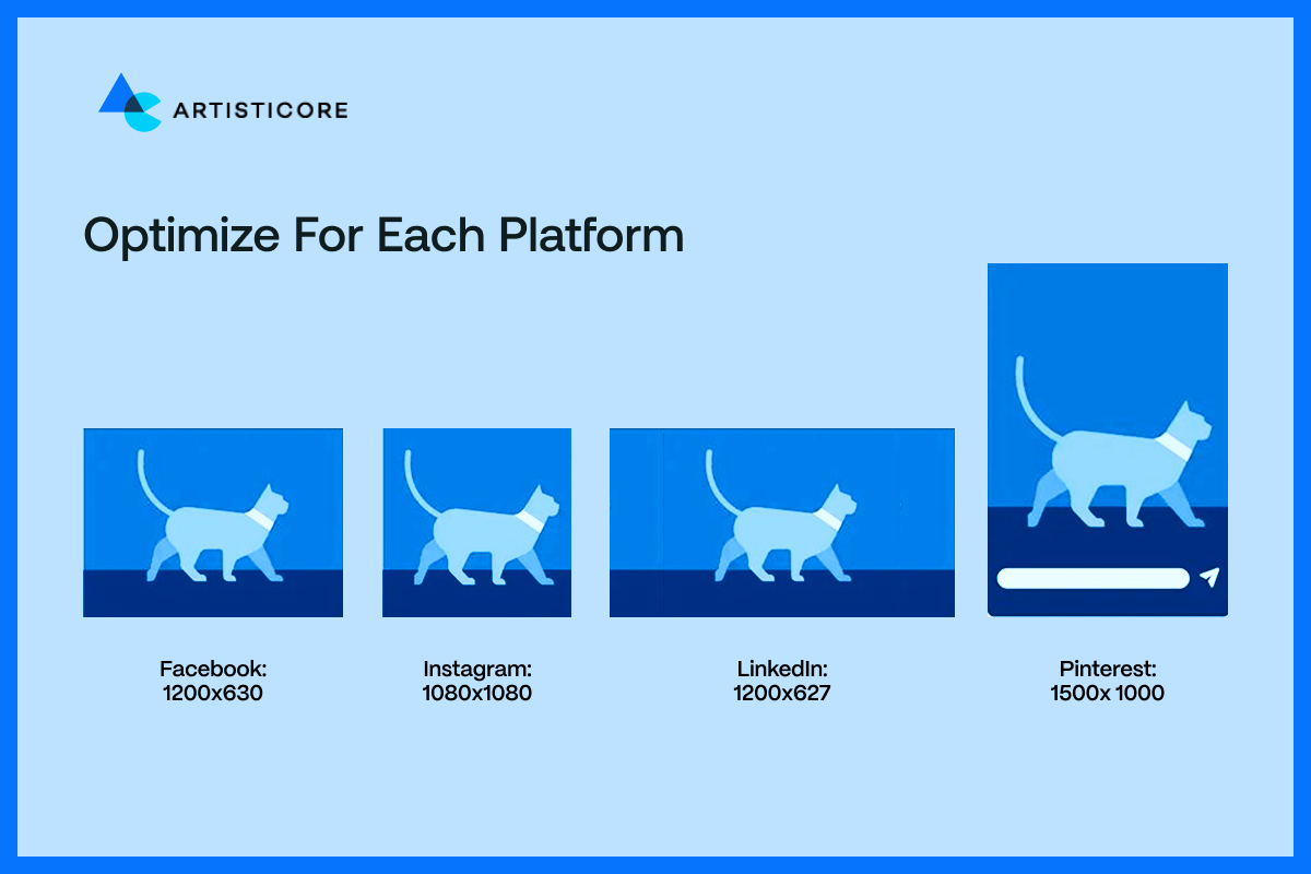
Each of the platforms has its rhythm. A square image will work well on Instagram but may appear out of place in LinkedIn. According to Hootsuite, social media images should be optimized according to the following sizes.
Instagram: 1080×1080 (square)
Facebook: 1200×630 (horizontal)
LinkedIn: 1200×627 (business format)
Pinterest: 1500x 1000 (vertical graphics)
When scaling, do not alter the basic structure. Do not change the position of the logo, or text or any visual effect if there is a chance for distortion. These graphic design elements must look sharp in all places.
Furthermore, maintain cross platform consistency as it adds credibility and a professional touch of your designs.
Make Your Designs Accessible
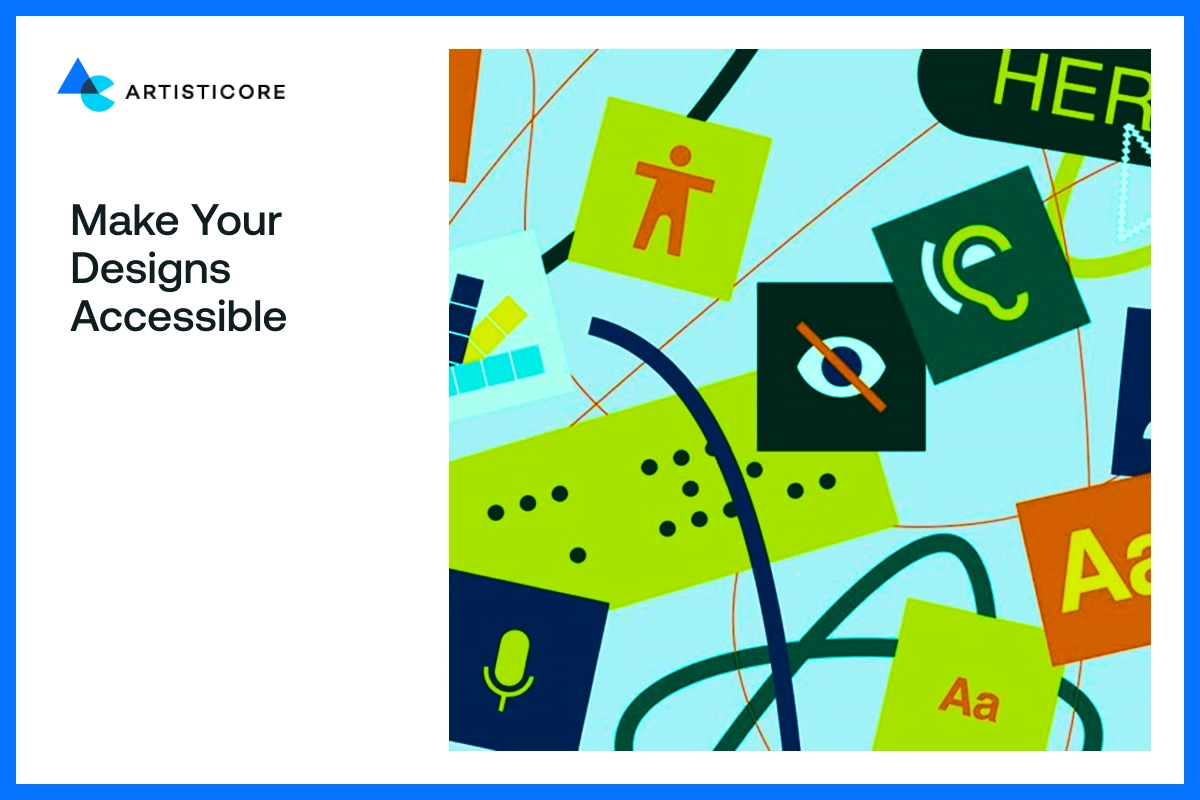
Good design must benefit all. Making your design assessable is the only to stand out. The design you make should be easy to understand by people with cognitive or visual disabilities.
Use images with alt text, high contrast and readable fonts. Do not use color combinations that are confusing to color blind such as red and green.
Companies such as Microsoft and Apple set the examples of how inclusive design can reach larger audiences.
Accessible designs are not only ethical, but credible and functional. This is one the simplest, yet most important social media graphic design tips for designers.
Keep up with the Design Trends
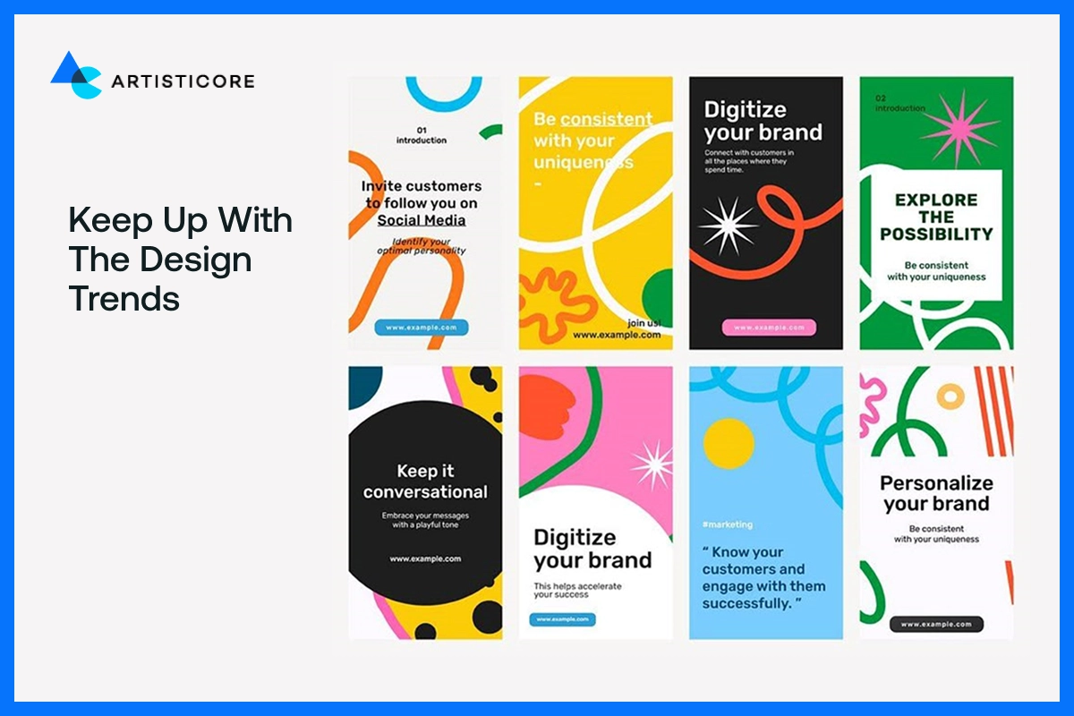
The job is not done when you go live with your design. The designing needs continuous improvement. As we move forwards, we see new design tools and concepts appear on the list.
New trends that can you can experiment with are AI layouts, 3D drawings, and motion typography. Also, trends are indicators but not laws. Study them, and make them your own.
Taking the recommendations graphic from the best studios keeps you on track. Wondering how to stay up to date? Contact Artisticore!
Tell a Story Through Design
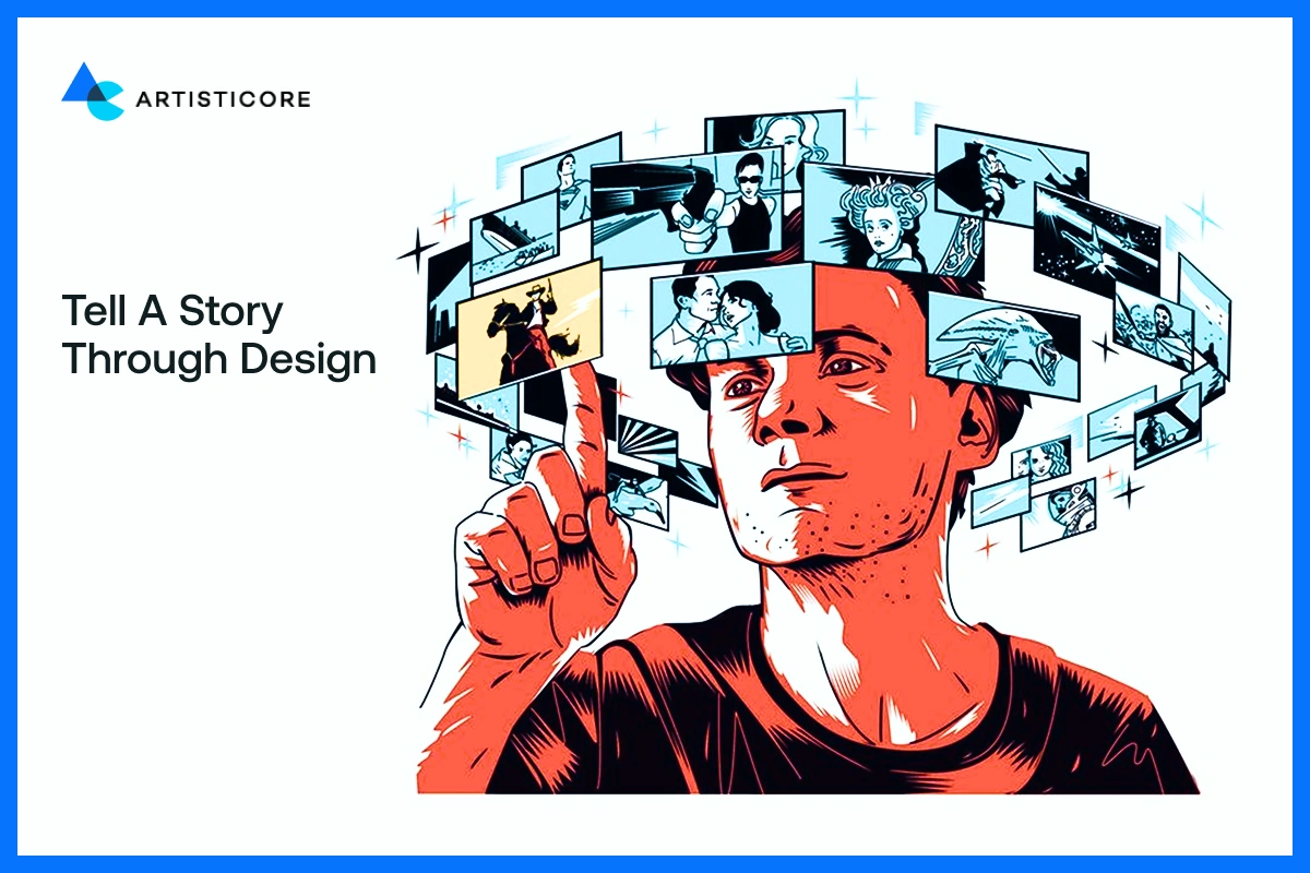
Behind every great graphic, there is a story. Storytelling provides meaning and connection to your visuals. It can be the social media post, an infographic, or a brand campaign, organize your message from the start, to middle and end.
Have you seen the Instagram posts of National Geographic? See how they use pictures with brief, emotional text. This is what makes their post unforgettable.
Visual storytelling is the best tool for communication. Use your visuals to entice emotions as humas are all about them. Create or share stories that are memorable.
Continue To Experiment and Develop
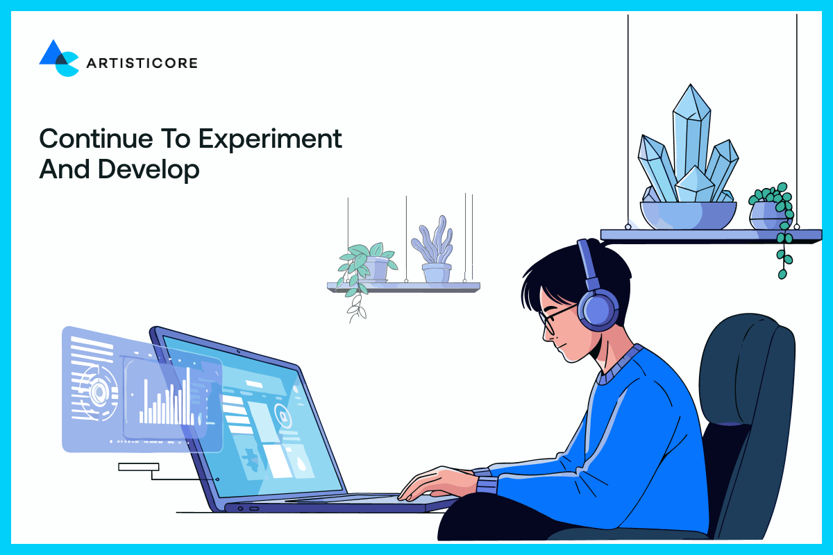
As tends shifts, you should shift with them. Basically adapt. The more you experiment the more you discover your own style.
Canva and Figma have templates that allow the beginner to experiment with. Everything you design, even it is a failed design will teach you something. The best thing about fun graphic design is that it is continuously developing, continuously surprising.
Keep learning and keep designing, and before you know it, there will be no limit in your creativity.
Ask for Feedback Early

Even the finest designers require a second pair of eyes. Feedbacks help you look at issues that you may overlook. Errors such as incorrect alignment, inappropriate colors, unreadable text can lead to failed outcomes.
To polish your work, publish on Dribble or Reddit, share it with classmates, or mentors. Criticism helps sharpen your design process and instinct. Do not take it personally, but use it as an opportunity to learn.
One more thing, team work always and always leads to stronger graphic designing images. Graphic design communicates and it can only improve with feedbacks.
Keep It Consistent
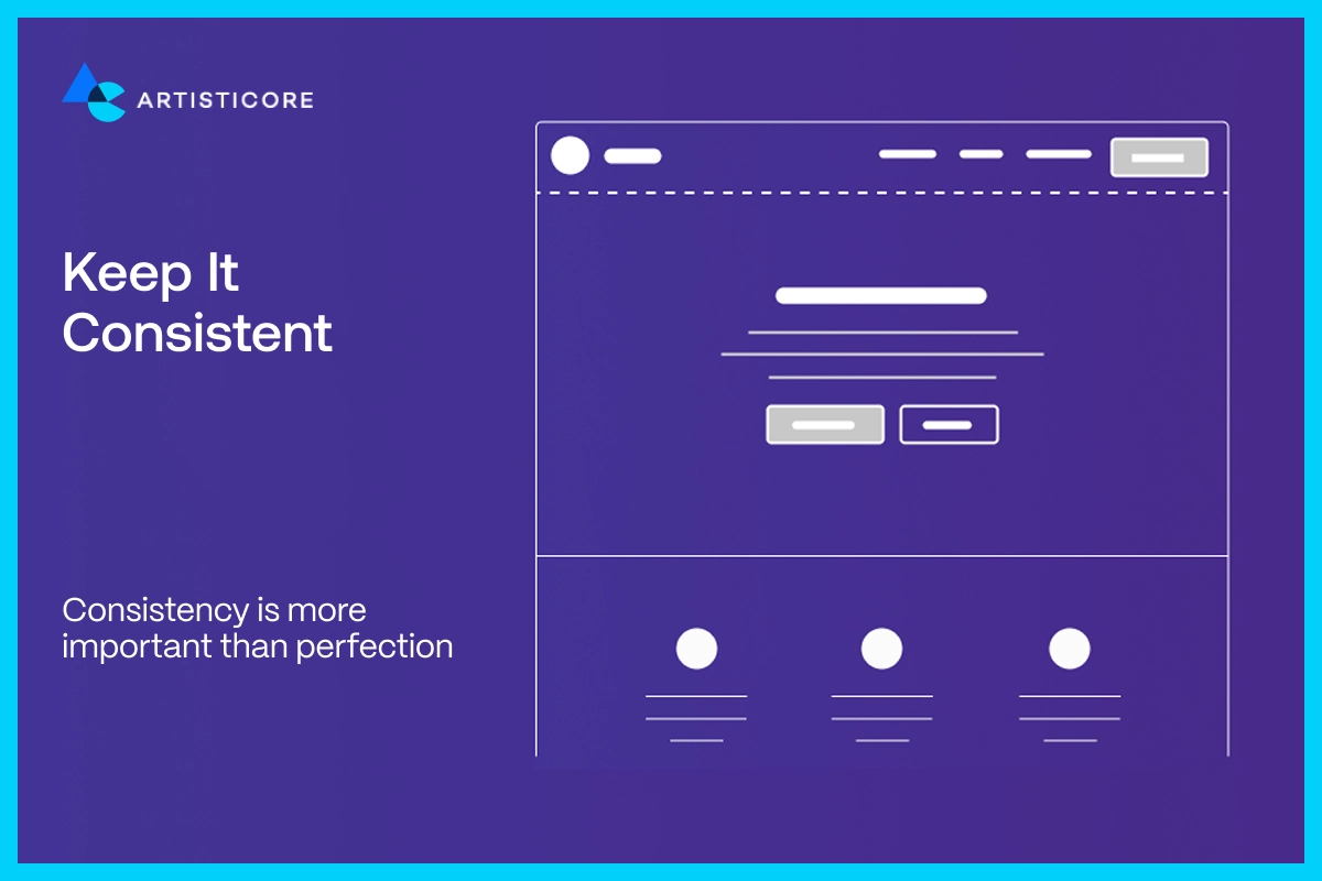
It is consistency that makes a design look professional and smooth. Your color palette to your icon styles, and font choices, everything needs to be consistent.
With flat icons, do not use 3D display. If the design bold and geometric, do not use whimsical font. This visual consistency builds credibility and makes your viewers identify with your brand at first sight.
It is like using the same visual language across your content, the same tone, rhythm and power in all the design elements.
Be True to the Brand Image
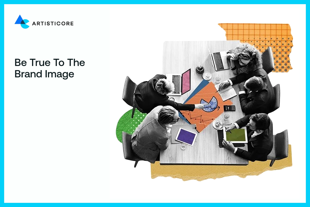
Your viewers must be aware of your brand without reading the caption. That is what a good graphic design does. It builds a strong brand identity.
Consistency creates familiarity and trust. Connect this to your brand guidelines to keep on track with your visual identity. This is one of the graphic designer tips that keep all designs truly yours.
Want More Clarity?
Here are some of the answers to most commonly asked questions. These will clear your doubts about graphic designing tips. You can also contact us, Artisticore is here to help 24/7.
Conclusion: Design To Impress
Graphic design tips are not about what does graphic design look like on the screen. These design tricks help you speak, engage and touch people’s hearts.
To understand what makes a good graphic design, go beyond decoration. Know that each color, line and texture has a purpose. Each element can create the feeling of familiarity.
Whether you’re looking for how to make a cool design or tips on graphic design, remember that graphics must not only look perfect but also communicate.
A great design never yells but talks. Talk with the right audience and deliver the right message. You can use the same tips everywhere, there is aways some moderation. For example, Instagram graphic design tips work for people looking for how to make a graphic for Instagram.
If you’re wondering about how to make a graphic design that motivate, all you can do is think, research and experiment. Be fearless and determined to create an excellent design.
Allow your thoughts to speak through images that relate and engage. Continue to play around with new graphic design tricks, but never forget about the message.
FAQs
Start with the basic tips for graphic design such as use of fewer but clean fonts, clear layouts, uniform colors. And even before introducing tips and tricks graphic must be properly readable and spaced.
Maintain them steady and uniform. Employ quality images, restricted color scheme, and correct alignment. A sleek, attractive design is smooth and reliable.
An effective graphic design attracts quick attention. Use striking images, logo design tips, brand colors and clear texts. It is all about telling the story in a matter of seconds.
Use free tools such as Canva or Adobe Express. Select a template, color adjustment, font modification. Such tools enable a graphic design pro to create professional graphics with a lot of ease.
Overcrowding such as the use of number of colors, fonts or elements can make digital design pictures turn into nothing but noise. If you want to know how to be a good graphic designer then learn to maintain balance, white space and alignment in design.
Ask yourself these few questions for example is it visually balanced? Does it evoke emotions? If the answer is yes then you have got a good design that looks good and works.

Hafsa Hanif is a talented content writer at WebnHubs, specializing in topics such as graphic design, web design and development, logo design, and animation. With her deep understanding of design principles and creative processes, Hafsa crafts engaging, informative, and SEO-optimized content that resonates with readers. Her expertise in SEO ensures that her articles not only captivate audiences but also rank well on search engines, helping businesses boost their online presence through compelling design-focused narratives.
