Elements Of Graphic Design: The Building Blocks of Effective Designs In 2026
Author :
- Key Benefits of a Good Design
- Lines in Graphic Design
- Shapes in Graphic Design
- Colors in Graphic Design
- Texture in Graphic Design
- Space in Graphic Design
- Forms in Graphic Design
- Typography in Graphic Design
- Value in Graphic Design
- The Interplay of Elements of Graphic Design in Communication
- Why Designers Must Learn the Graphic Design Basics?
- Conclusion
We live in an era where you can’t just refer graphic designs to beauty. It is a great and most important tool for visual communication. As brands owner, you can use graphic design to communicate ideas or any emotions you want. The trick is to use the build it properly using the key building blocks also known as elements of graphic design.
Anything you engage with online, be it a product, website or an advertisement, you see that the elements used in graphic designs have a purpose. A properly designed and a well thought design direct the flow of user’s attention and shape their experience.
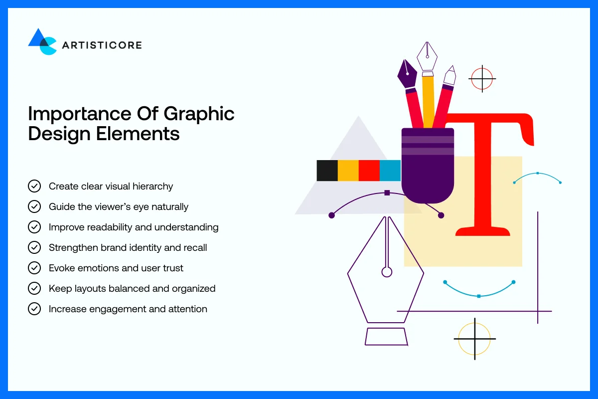
Known as building blocks of any graphic design, elements of graphic design are like the ingredients of a recipe. You go step by step, add all the ingredients, adjust them to deliver a wonderful dish, graphic design is created like that too. To add a visual direction in design, you need put all the elements of graphic design like lines, shapes, colors, textures, space, form, typography, and value together very carefully.
Take Google’s homepage as an example. It appears minimal but each line, button, and white space usage is done with care. You see the position of a search box, the company name, and even the distance between the links, all appear very clearly. It all directs the user without them having to think about it. That is why designers should know all about the elements of graphic design to build trust, and smooth user experience.
Want to make your designs shine? Start working with the fundamentals of graphic design today!
Key Benefits of a Good Design
Good design is not merely about the look. It has a direct effect on branding, marketing and usability. Companies such as Apple, Nike, and Airbnb have the advantage of having a unified design that allows them to be immediately identified by users. A study by Lucidpress indicates that consistent branding boosts revenue growth by 23%.
Learning the graphic design principles help designers produce appealing, practical, easy to remember, and effective visuals. This blog will take you through all the elements of graphic design, their uses, and effects on design and branding. We will also take your through the real life examples that you study them.
Lines in Graphic Design
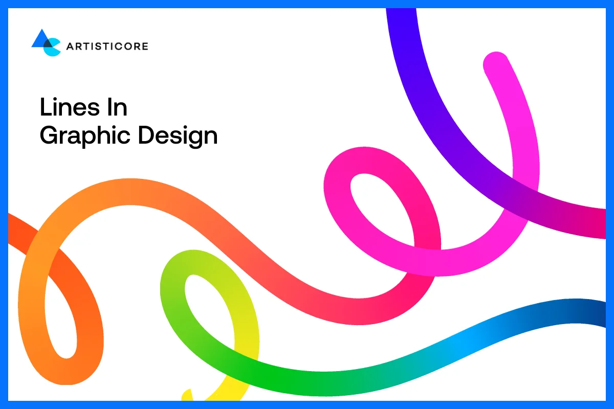
One of the simplest but effective elements of graphic design is lines. They are not merely dividers of sections or ornamentors of design, but they regulate the movement of the eye, produce emphasis, and draw up feelings. Lines are purposeful and every designer will use them to direct the users and convey structure.
Types of Lines in Graphic Design and Their Meaning
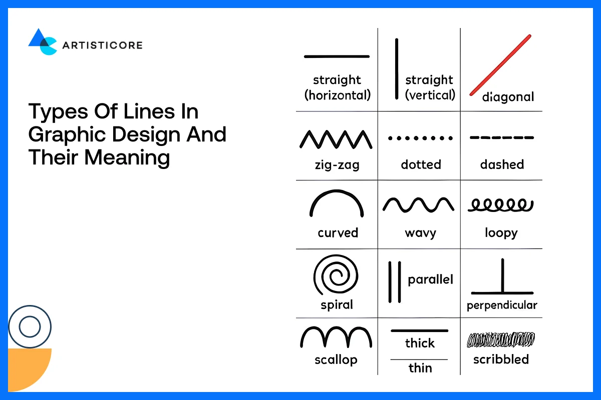
Direct lines indicate order, stability, professionalism. Straight clean lines are frequently used on business sites, banks and technology brands in order to appear professional as in the case of the IBM logo or the minimalistic designs of Microsoft.
Curved lines are hospitable, cozy and inviting. Due to this reason, brands like Dove and Airbnb resort to curves to make individuals feel welcomed and at ease.
The thick lines are outstanding and emphasize significant content or calls to action. Thin lines are delicate and elegant, typically used by high-end brands like Apple product pages.
Horizontal lines produce an impression of rest and calm. The vertical lines imply power and order. The diagonal line usage in layouts indicate movement and power (good with sports brands or new technology products).
How Users See Lines in Reality: F-Pattern And Z-Pattern
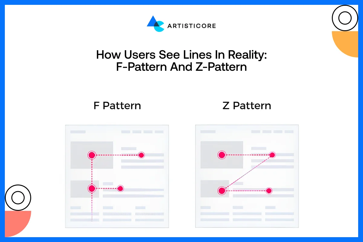
According to a study by Nielsen Norman Group, 79% of people skim web pages and 16% read line by line. This shows how users explore web pages and allow designers to play with lines in order to direct the users where they want.
On pages with a lot of text such as the blogs or the news sites, users use an F-pattern which means reading things horizontally between headings and vertically on the left. For example, when you go to the CNN home page, they feature top stories in this direction for readers to see the headlines in just one look.
On pages that have a lot of visual content such as landing pages or advertisements, users tend to move in a Z-pattern, or a top left – top right – bottom left – bottom right. This way, they important visuals or any buttons do easily get noticed. This strategy is used by Nike which directs visitors to hero images, product figures or call to action buttons.
Lines in Layout, Logos and Visual Structure Design
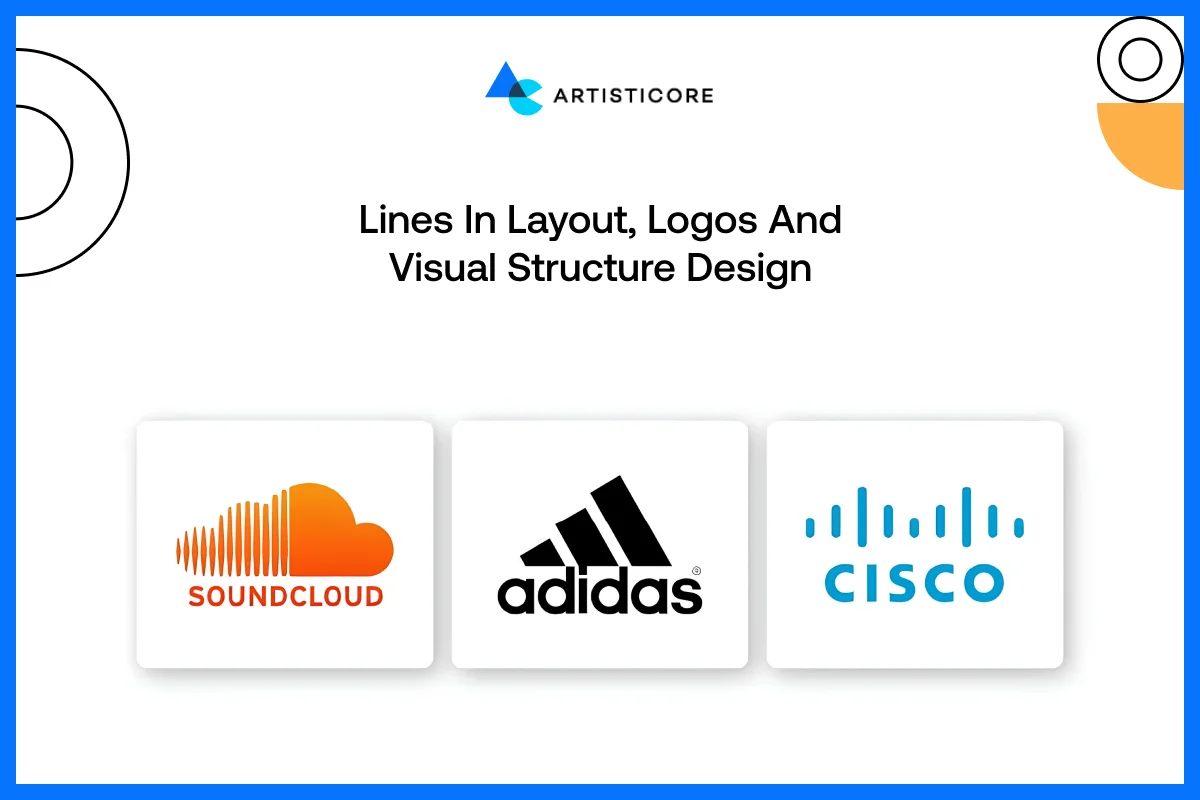
The lines do not only serve the purpose of guiding, they also provide structure, separation, and rhythm. Lines are used in layouts to arrange information in clear readable forms without messing up. Amazon uses e-commerce grids to help users differentiate product categories easily.
One of best minimalist line design examples is that of Adobe logo. The logo speaks of clear and accurate information just with the use of a single line. All in all, visual hierarchy is determined by lines that are easier to read and to digest content and enhance the user experience.
Shapes in Graphic Design
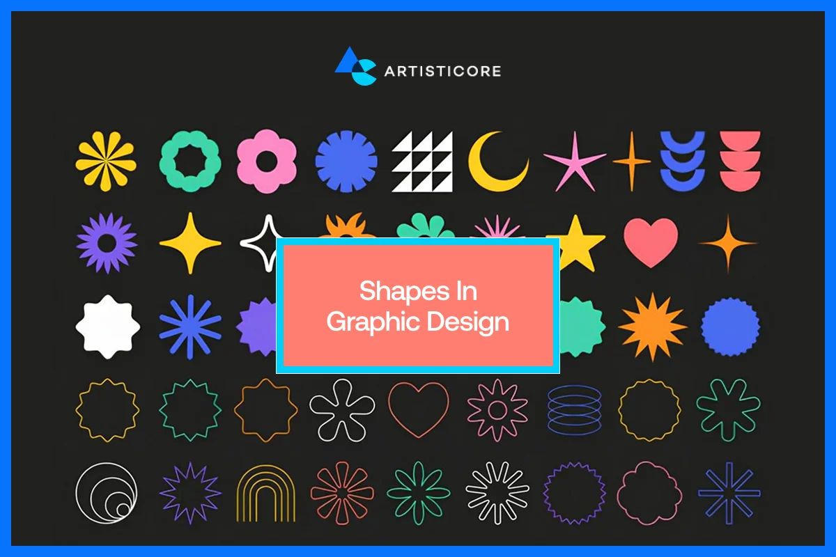
Shape meaning in design is not about lines but an important component of any visual design. Each button, icon, container, or image frame is also a shape that is part of the overall layout, meaning and user experience. It is always possible to learn how to use shapes strategically and this may uplift aesthetics as well as functionality.
What Shapes Are and Why They Matter in Graphic Design?
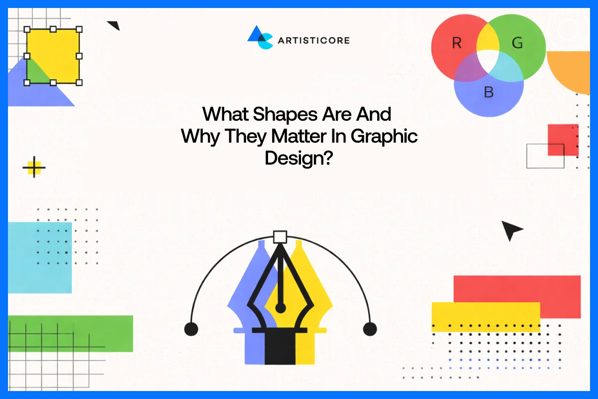
In design, shape is defined as any area that is enclosed by lines. Shapes bring visual structure, direction to the eye of the viewer and even convey meanings or brand values. In the absence of shapes, designs appear messy and unorganized. For example, the LinkedIn clean rectangular shapes create a sense of professionalism and trustworthiness, whereas the rounded shapes of Slack logo are friendly and inviting to touch and interact with.
According to UX Bit, logo shapes (angular and circular) have an impact on how consumers perceive brand qualities, influencing memorability and identity in design.
Geometric and Organic Shapes and Their Use in Real Brands
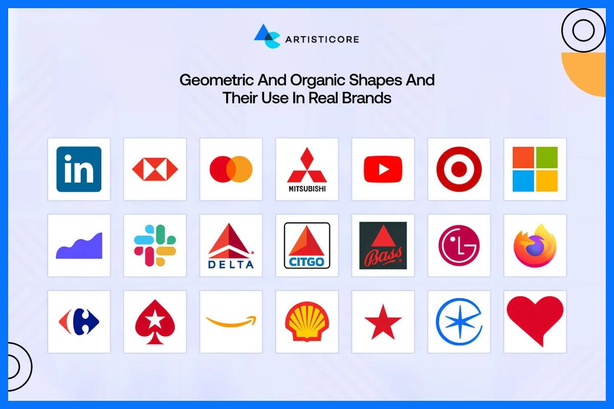
Squares, circles, and triangles are geometric in nature and are organized, consistent and predictable. They provide a feeling of stability, order and accuracy, hence common in technology, finance and corporate logos.
The Role of Shapes in Brand Perception
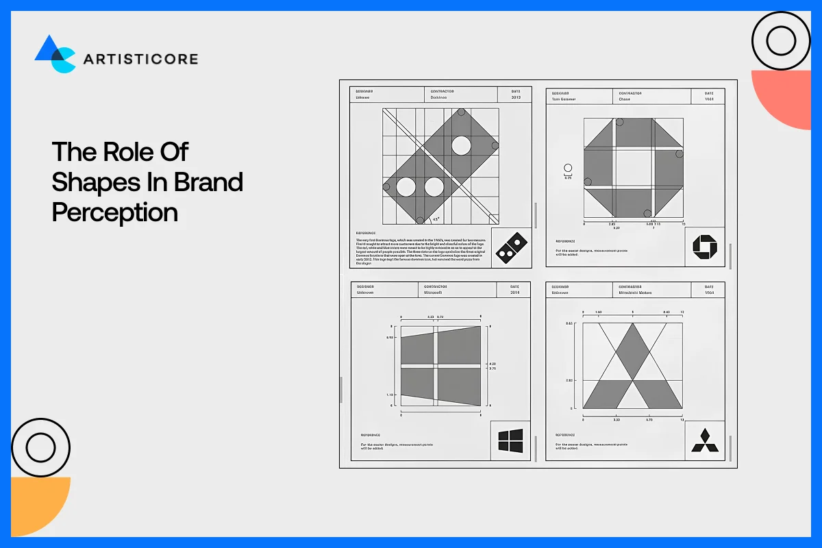
Shapes help organize content but also convey the hidden messages to the audience. There are different kind of shapes for example circles used by Target and Spotify shows collaboration and friendliness. Squares and rectangles used by LinkedIn show stability, reliability and balance. Then there is a triangle which you often see in Google Play and it shows energy, direction or innovation such as Google Play and Delta Airlines.
You need to be very careful while selecting a certain shape if your goal is to increase brand identity and establish an emotional connection with users.
Shapes in Visual Structure Design, Logos, and Layouts
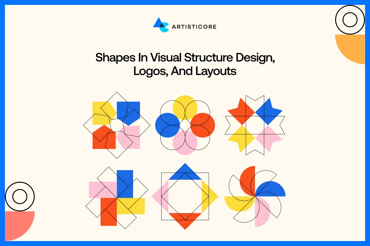
Shapes are used in layouts to subdivide pages into portions that can be digested and in an intuitive manner. Image frames, cards, and buttons depend on shapes to build hierarchy. Just like how the product cards in Shopify are in a rectangular form, making it easy for users to browse.
Colors in Graphic Design
Color is known to be the most important elements of graphic design because it affects how users perceive things. It creates a quick response, impression, build brand recognition.
Effects of Color in Design Perception
Color has a psychological significance. The warm colors such as red, orange and yellow provide energy, excitement, and urgency. The cool colors such as blue, green and purple have a calming, trusting and professional effect.
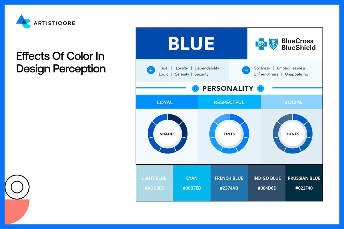
The red in Coca-Cola is its brand color identity that shows passion and energy whereas blue in Facebook shows trust and reliability.
Research indicates that color can enhance brand recognition by 80%, and it is a very important tool in design.
Warm and Cool Colors and How They Make Us Feel
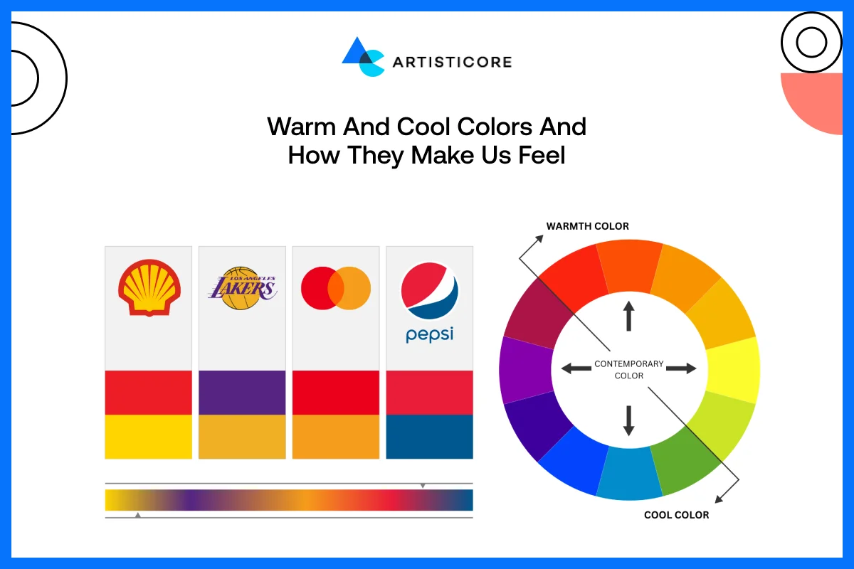
Warm colors are vivid and catchy. They perform effectively on call-to-action buttons, promotions, and moving pictures. The yellow-red combination of McDonald makes one feel hungry and excited. The cool colors are calming and comforting. They are widespread in technology, financial and healthcare brands. The blue colors of PayPal instill a sense of safety and reliability in people, which makes them feel comfortable using the service.
The Color Theory in Graphic Design
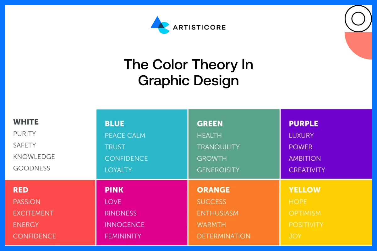
The psychology behind color is of paramount importance in brand identity development. The different colors convey different messages. Green is sustainable and growth. Purple is the color of creativity and luxury. The color orange is a symbol of innovation and hospitality.
Brands should be very careful when going for different color combinations. Why? Because it is one of an important branding design basics that create an emotional reaction they want users to feel when they interact with the brand.
For example, Spotify uses black and green to bring a mix of energy and contrast and form a modern and vibrant identity.
Color Unity for a Reliable Brand Identity
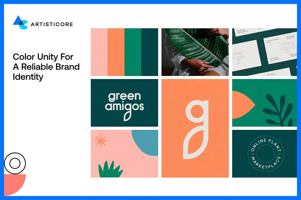
Consistency is key. The same colors in websites, logos, package, and marketing are important in giving high brand recognition. The consistent color scheme supports the message and makes users readily identify the colors with the brand.
Color Combinations That Work and How to Avoid Mistakes
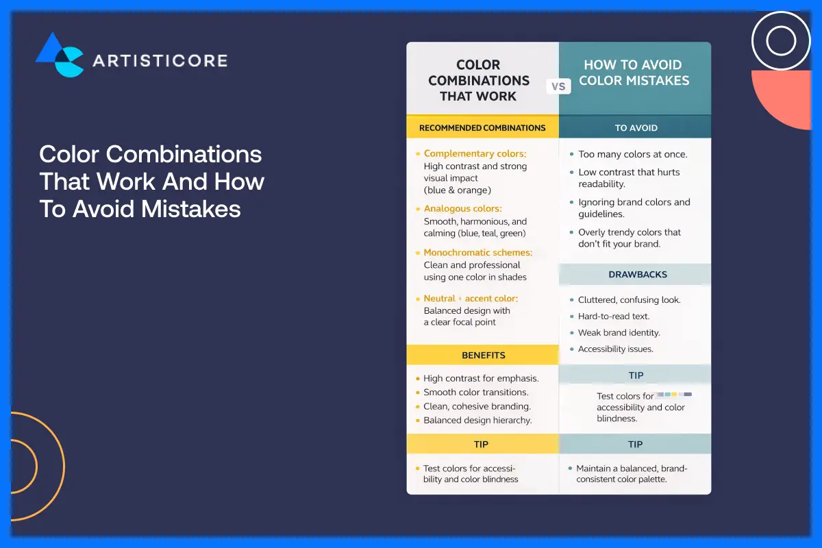
Using a color psychology in design can help you deliver beauty and better clarity of your brands. For designers, there are color wheel and complementary schemes available that help them take the right decisions. One important tip is that, do not mix too many colors with contrast, which creates confusion or make it difficult to users to access information.
According to research by HubSpot, colors 90% of the first impressions comes from color which is why, red or orange color CTA buttons are used in sales to convert.
Looking for a professional advice on color and texture? Let our designers help you bring life to your design ideas
Texture in Graphic Design
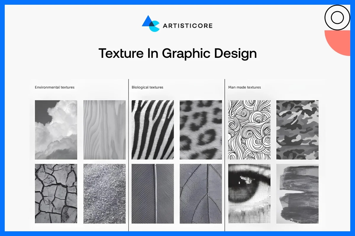
One of such unsung heroes of graphic design is texture. Although the screens on the computer are flat, the application of texture gives designs an animated aspect, providing dimension, tactile quality and depth in design. This is the small visual element that can help attract attention, make the mood better, and provide brands with realistic design effects.
What is Meant by Texture and Why Does It Matter?
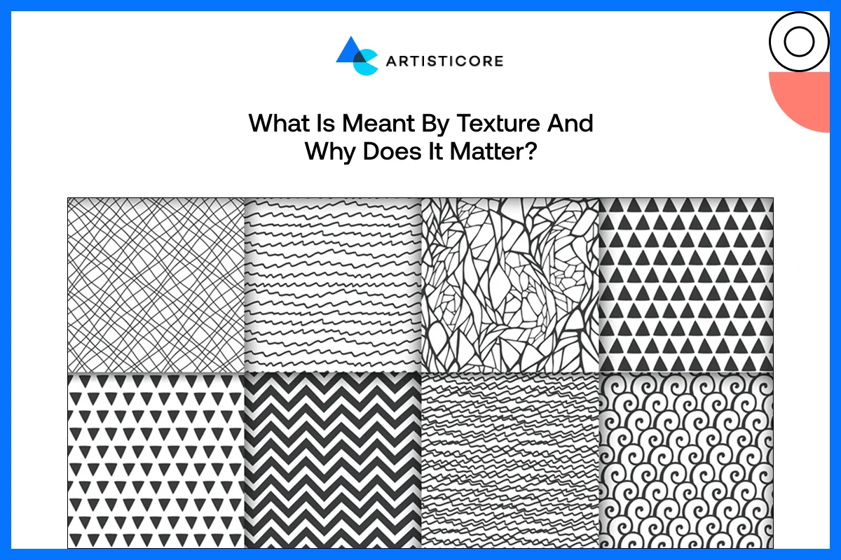
In design, texture is the apparent quality of the surface of an element. It may be a smooth, rough and soft, glossy or grainy and affects how the viewers perceive the design. The element of texture is not an ornament; it can arouse feelings and character. An example would be a hand-made brand of pottery with a textured background on the site that looks like clay. Although this design option will not enable the user to actually feel it, it sends a message of authenticity and craftsmanship, which immediately strengthens the brand story.
Visual vs. Real Texture: Ways to Create Depth
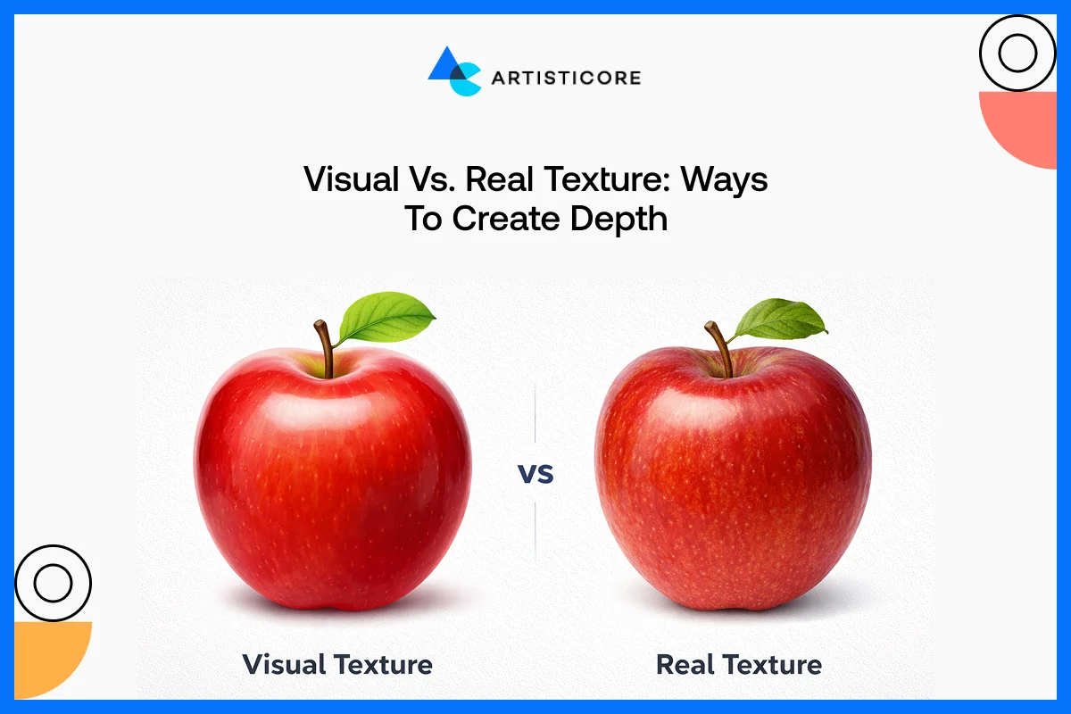
Patterns, gradients, illustrations or photo overlays are used to develop visual texture. It is completely visual but deceives the eye into thinking it is three-dimensional depth. Take the promotional graphics of Adobe as an example where they used layered gradients and delicate textures to bring life into flat designs.
Real texture, however, is that which is in physical products such as embossed business cards, textured packaging, or book covers. These touch points will leave an unforgettable experience to the senses and make a brand memorable.
Use of Texture to Improve Design
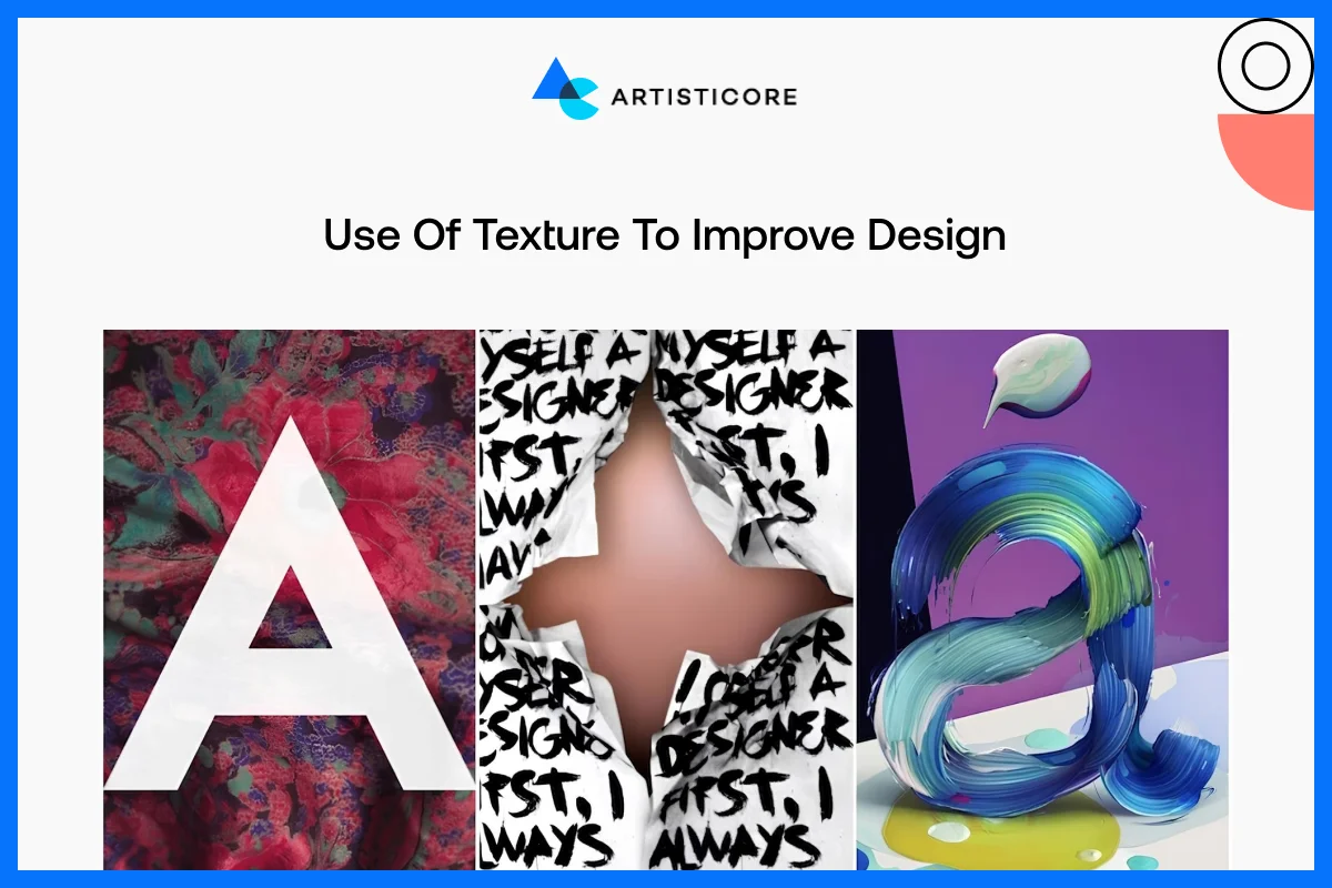
Texture can serve to emphasize areas of interest, and to bring reality to images, as well as to convey brand image, whether natural, home-crafted, or posh, when used appropriately.
One of the best visual texture examples would be Starbucks menus and packaging. They make use of warm, paper-like textures in them to deliver a relaxing and welcoming feel. On the other hand, Apple maintains a minimum of textures on product pages, allowing smooth lines and shapes to be the center of attention. Too much texture will saturate a design; therefore, delicacy is paramount.
Key Notes on Visual Texture
- Rough or spotted backgrounds have a vintage or nostalgic appearance.
- Fabric-based textures promote aesthetics of lifestyle or fashion brands.
- Light gradients or minor shadows make UI and app design three-dimensional, which makes screens more attractive.
According to a study by Enov Tech, UI texture creates a sense of realism, focus, and emotion. It allows users to more naturally interact with an interface.
Space in Graphic Design
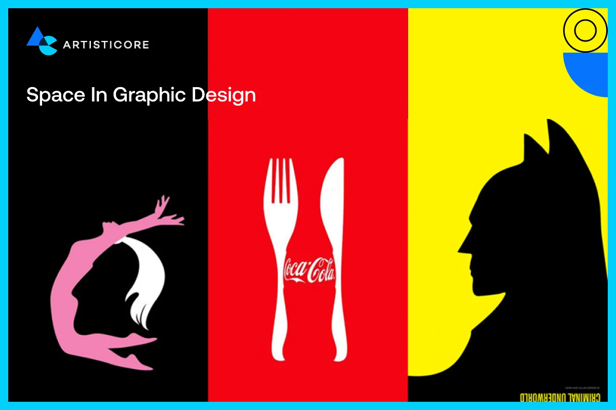
Space, also referred to as negative or white space, is one of the least appreciated aspects of graphic design. It is not merely blank space, but a mighty weapon that makes the text more readable, emphasizes the critical elements and provides the designs with space to breathe. Space can convert a busy layout into a neat, professional and pleasant visual experience when utilized well enough.
Importance of Negative Space in Graphic Design
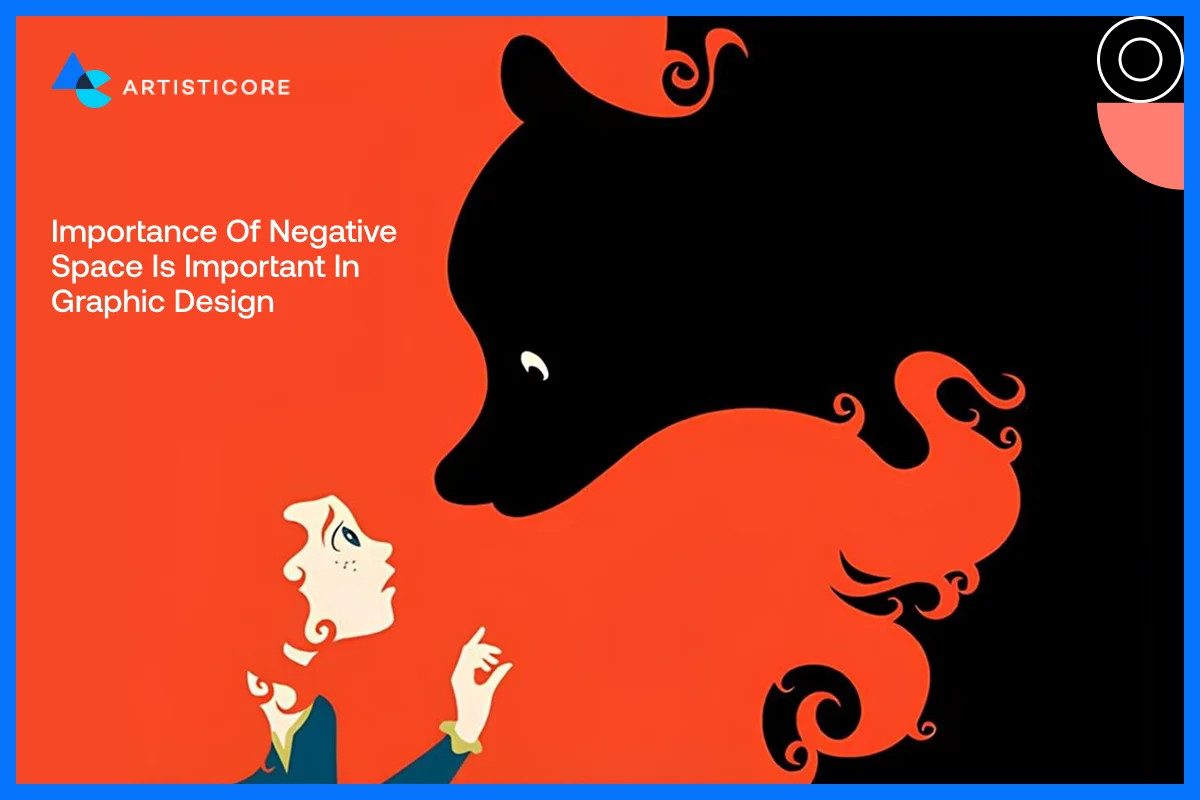
The negative space in design is the space between text, images, and other elements. It establishes connections between objects and forms balance in a composition. In the absence of space, designs may appear overcrowded, overwhelming, or hectic. Appropriate spacing directs the search of the user and simplifies content browsing. An example is the product pages at Apple which are spaced widely to give attention to each product so that the user can absorb information without being distracted.
Use of White Space for Clean Layout Design and Better UX
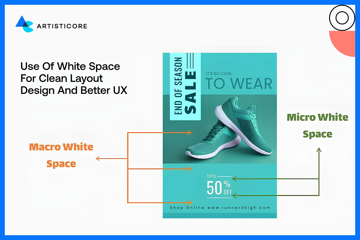
White space is not a mere aesthetic, but it is functional. It assists users in scan reading rapidly, enhances comprehension and decreases mental load. For example, the blog layouts in Medium have a lot of white space around headings, paragraphs, and images, so that the articles become easier to read and easier to stay longer.
Space Provides with Visual Hierarchy
The empty space in design creates a visual and text hierarchy. A broader gap between sections indicates separation and narrower gap indicates arrangement between items. For example, Shopify has rectangular product cards with the same spacing to create a smooth and intuitive browsing process. Spacing is also needed to make buttons, cards and icons feel clickable and different.
Common Spacing Mistakes to Avoid
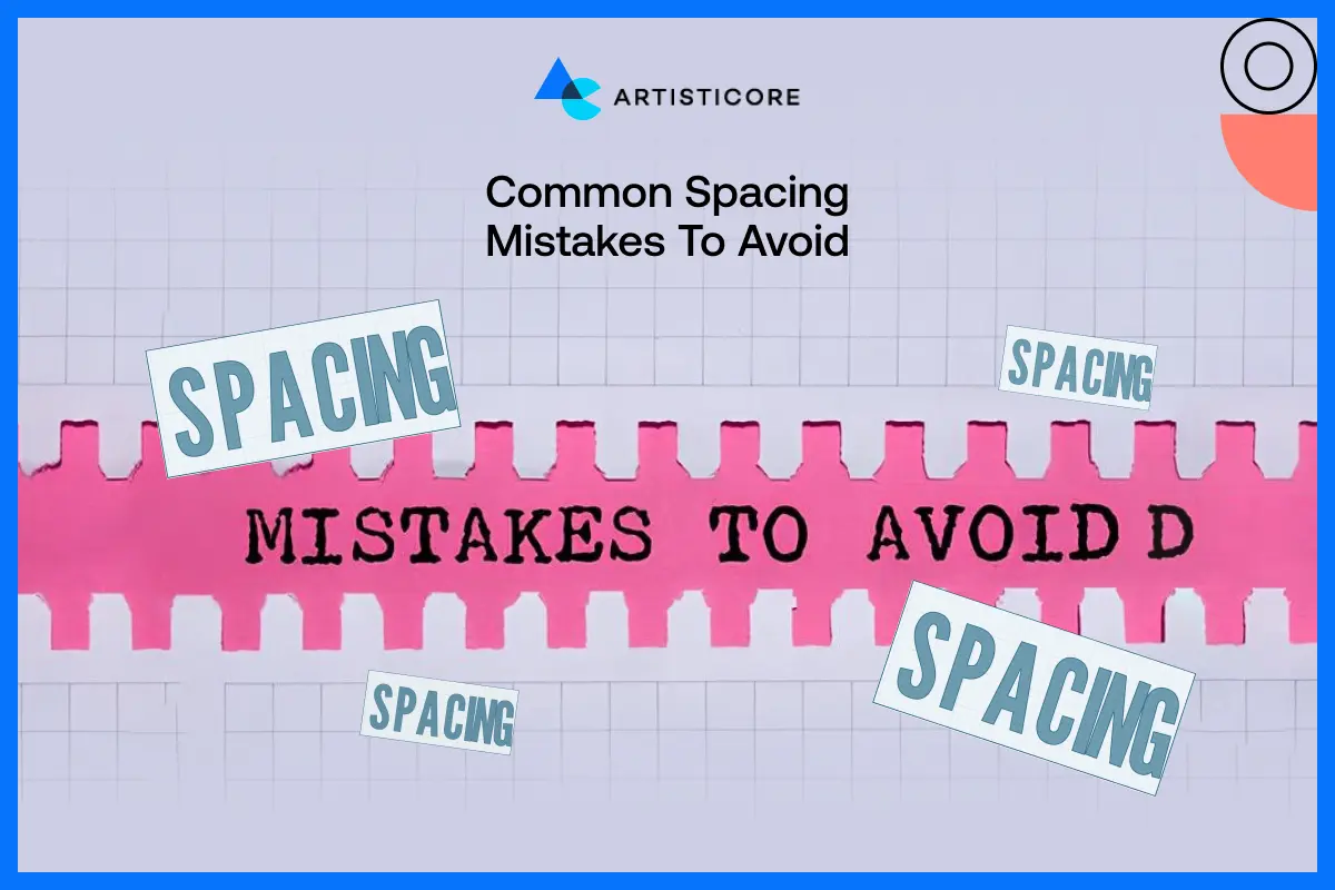
- Try not to stuff things but provide some breathing space.
- One common mistake is not focusing on alignment, leaving the designs out of order.
- Most of the times, too much spacing or gaps and irregular margins also affect the design layout.
According to UX Experiments, having enough white space between paragraphs and margins increase reading comprehension by up to 20%. This is because less visual clutter information is easier to process.
Forms in Graphic Design
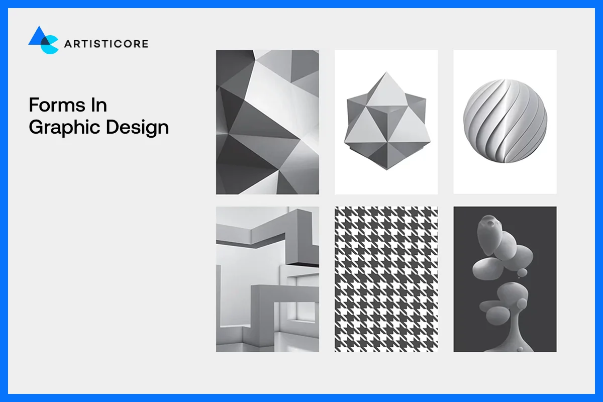
It is the form that makes flat shapes to feel real, tangible and three-dimensional. Shapes are two-dimensional, whereas form provides them with depth by use of shadows, highlights, and perspective. Using form appropriately makes designs stand out of the page or screen and direct the attention of users and make the visuals more compelling.
Form vs Shape, The Major Difference
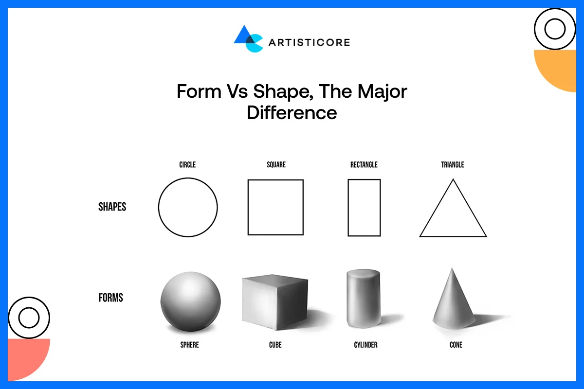
A shape is a flat, closed space whereas form gives sense of volume and depth. For example, a circle is a simple shape, whereas a sphere is a form since it appears round and three-dimensional. Form assists users to experience physicality with digital or print design, although the design itself may be purely visual.
For example, Google Material design has used shadows and layering to provide structure to buttons and cards so that they feel more clickable and real.
2D And 3D Design Forms and Their Effects
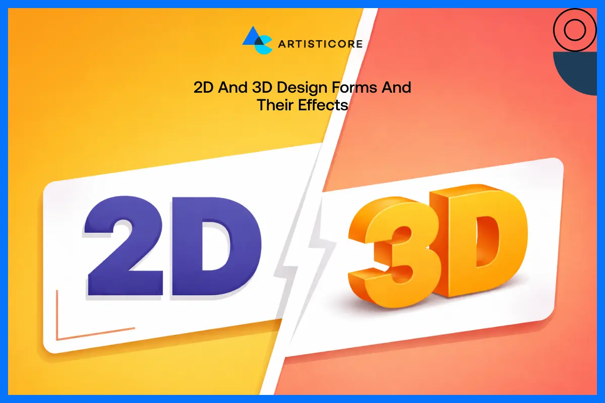
In 2D designs, the designs are flat, and it can create the illusion of depth with the smart use of color, gradient and overlaying. In 3D form, the designs have depth, they feel real with much use of color, gradients and overlay and is mainly applied in product mockups, packaging or in an illustration.
The best example of this would be Nike product pages. They have used a slight amount of 3D effects in their images that add texture, curves and angles. This way, users get the real feel of the product before purchasing it.
Use Of Shadow and Light to Provide the Effect of Reality
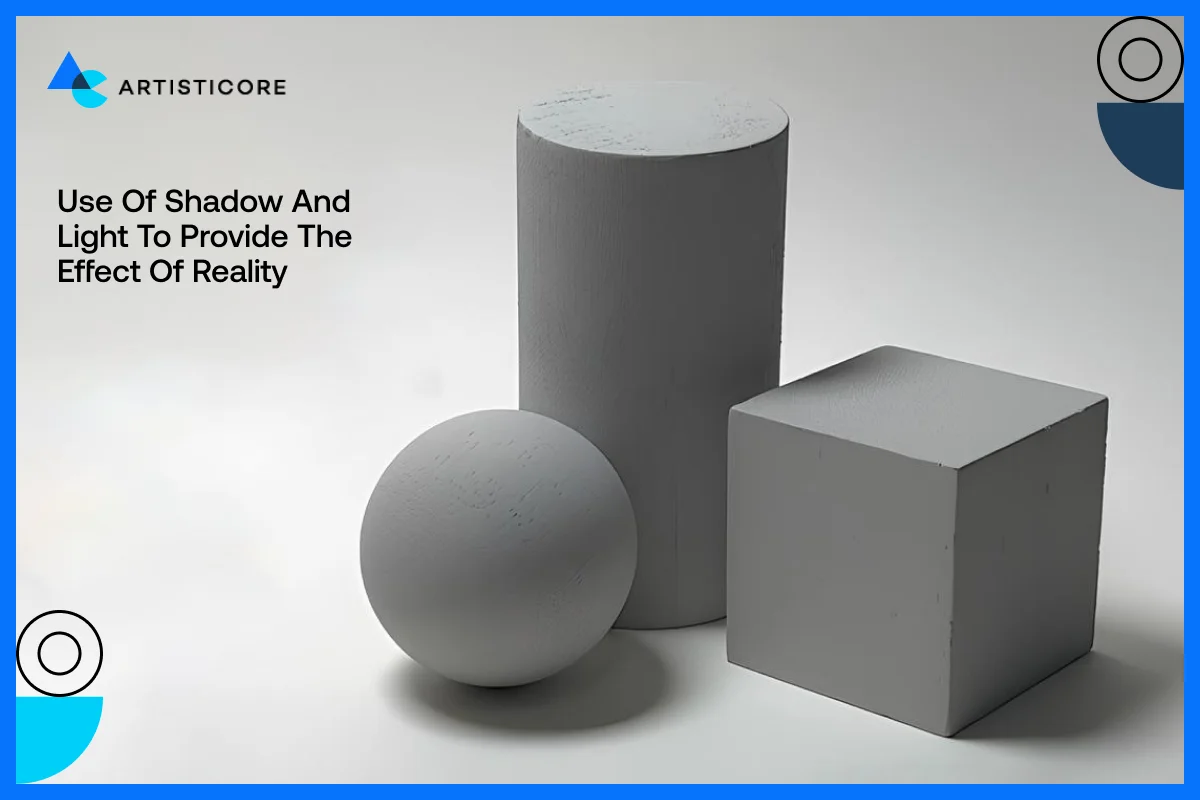
Shadow and light in design is necessary to form and visualize depth. They show direction of light, form hierarchy and make things prominent against the background.
For example, Apple uses soft shadows on its MacBooks and iPhones to makes the products look more immersive to users.
Tips To Use Form in Design
- Apply light shadows to distinguish between layers and clickable objects in the UI.
- Also be very sure to use a combination of light and dark design to add volume and curvature.
- There are gradients that should not overwhelm the design so use them carefully in order.
- You can also add layers because they are a great source for depth and focus.
Research indicates that users engage more with objects that has a 3D effect because it adds the feeling of real and reliable.
Typography in Graphic Design
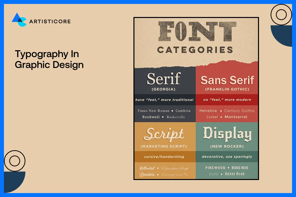
Typography in graphic design is not just about picking a pretty font because it defines the voice of your design. It dictates what the reader sees your message, directs their eye movement, and forms the brand personality. Good typography is necessary because it makes your content readable, interesting, and put everything in sync.
What does Typography Mean in Graphic Design?
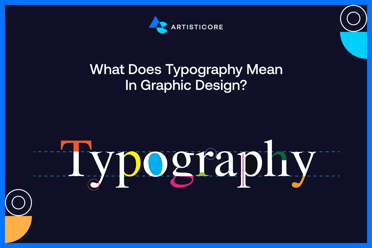
Typography is defined as the style, structure, and the appearance of text. It affects the way the users comprehend information and engage with content. The right font selection can produce a professional, playful, luxurious or approachable design.
Have you seen how Vogue has used elegant serif fonts to convey elegance and high fashion sense in their magazine? But Google has clean sans-serif fonts that are easy to read on digital platforms? This shows the importance of fonts in graphic design.
Choice of Fonts, Size, Types, and Fonts Pairing
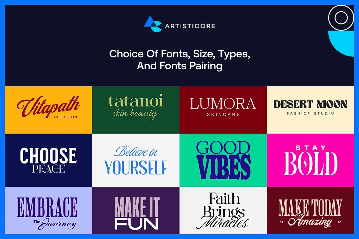
Whatever font type or its type you’re going for, do remember that your decision is going to affect the clarity and mood. Do not complicate and use clear, simple and readable fonts specially when a lot of text content is there.
Font pairing is done to add contrast and hierarchy in designs. Do this particularly in blogs between headings, body texts or even subheadings.
Have you seen Slack website? It is one of the perfect examples of the use of combination of fonts. They have used a modern sans-serif headings with a rounded body text to provide both warm and friendly but professional look.
Effects of Fonts on Hierarchy, Visual Emphasis, and Contrast
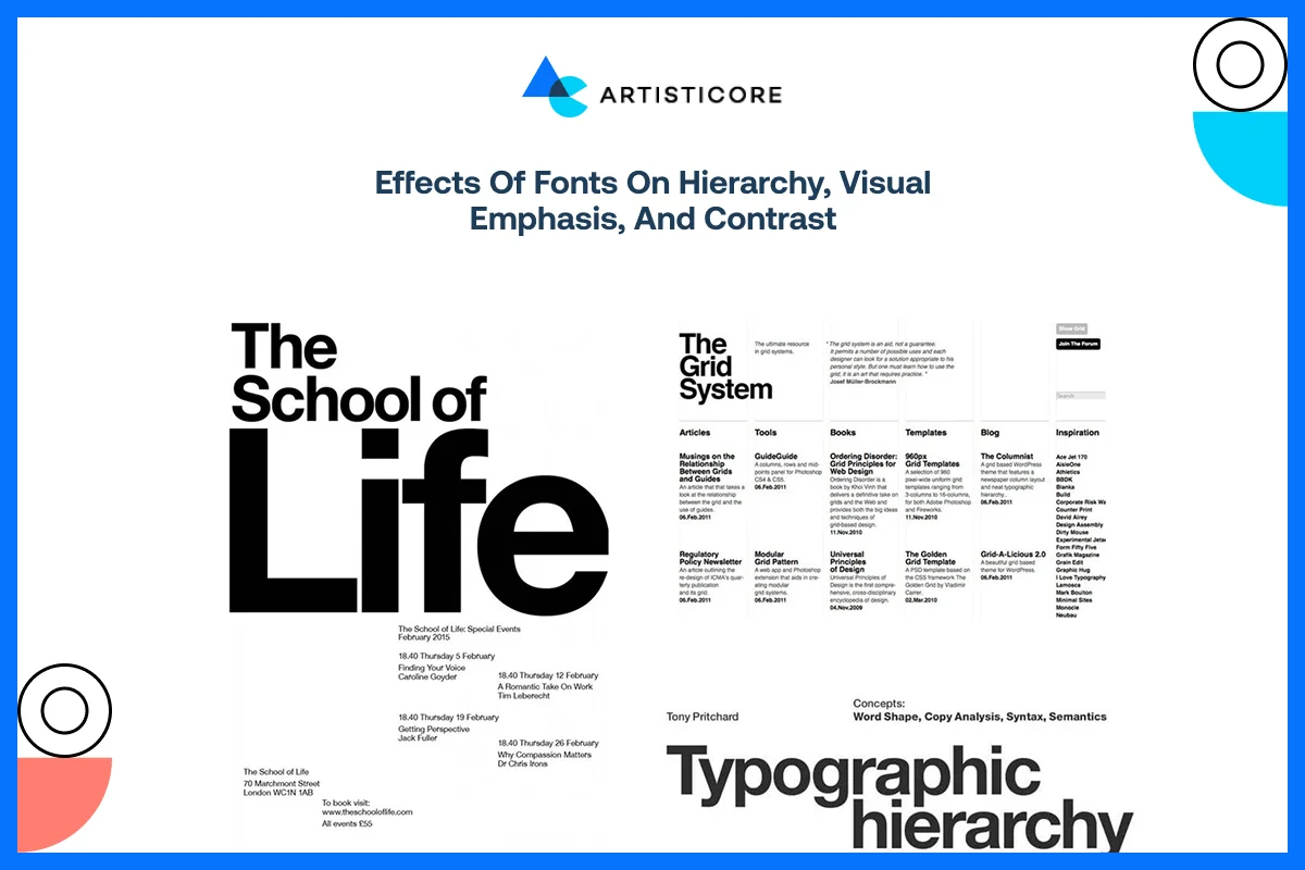
Typography does not refer to the style of letters. It is about what font style and size you’re choosing to add structure into your content. Creating hierarchy by size, weight and color helps the reader to move through the main information to the supporting details. Font contrast and background contrast improves the focus and readability.
One good example is that of New York Times website and how it features bold serif fonts in the headlines, but keep the text of the articles easy to read. This keeps the focus and emphasis on important stories.
According to Abobe, using optimized fonts increase reading speed without losing knowledge. This also means that smart typography choice can enhance brand communication and comprehension.
Graphic design Typography Tips
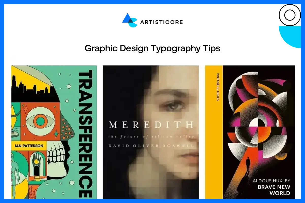
- One should not use more than two or three font families in any layout to clutter it.
- Make sure that the line spacing is enough to increase the readability.
- The correct font style will compliment your brand personality, be it playful, professional, modern or luxurious.
These are the basic graphic design tips related to typography that can help you get great graphic design outcomes.
Value in Graphic Design
Value is the graphic design element that concerns lightness and darkness that provide visuals with depth, importance, and structure. It assists designers to direct the attention of the viewer, improve readability, and achieve a fair, professional appearance. Even a well-shaped design or a colorful design might seem flat and confusing without value.
What Does Value Mean and Why Contrast Matters?
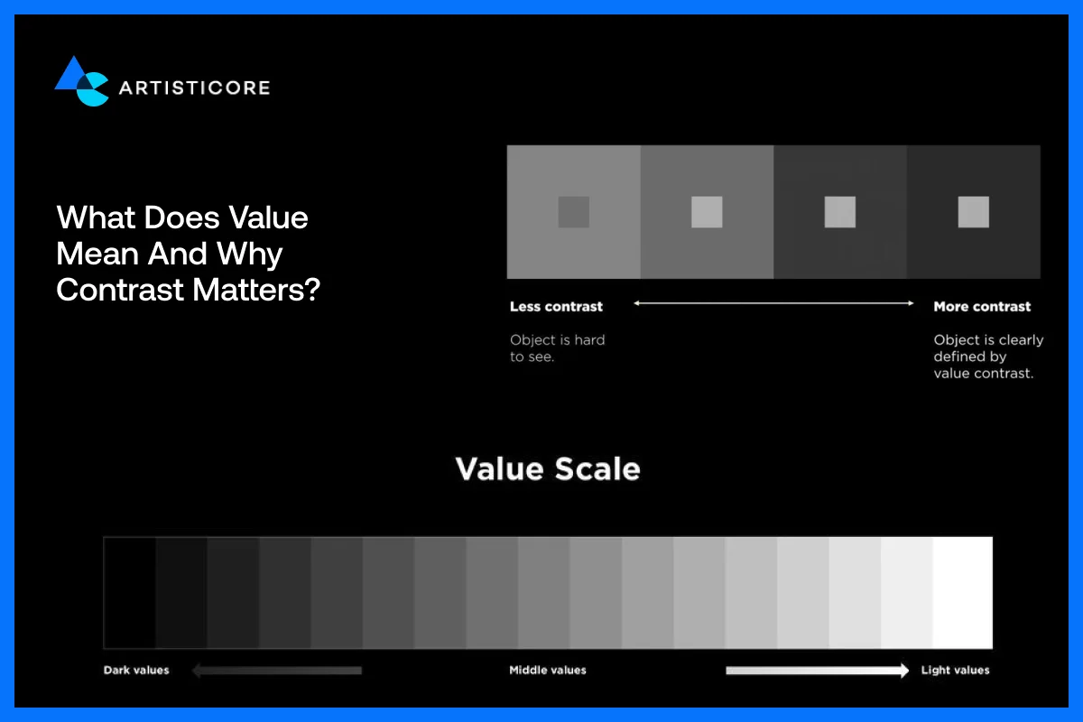
Value can be defined as the light and dark effect of a design. These tones have a strong contrast that enhances readability, emphasizes important content, and a sense of order. Value can be used by designers to attract attention to areas of focus or crucial messages.
For example, Spotify app has a mix of dark backdrop and light color text and colorful album covers. This contrast helps users to quickly find the music they want and makes visuals look modern and unique.
Use of Light and Dark to Highlight Important Things
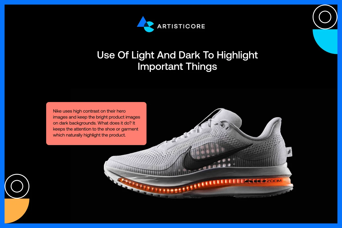
Designers can make things stand out by playing with light and dark spaces. Shadows, gradients and contrast of the background help in visual depth and focus.
Nike uses high contrast on their hero images and keep the bright product images on dark backgrounds. What does it do? It keeps the attention to the shoe or garment which naturally highlight the product.
Effects of Value in Visual Order and User Interface
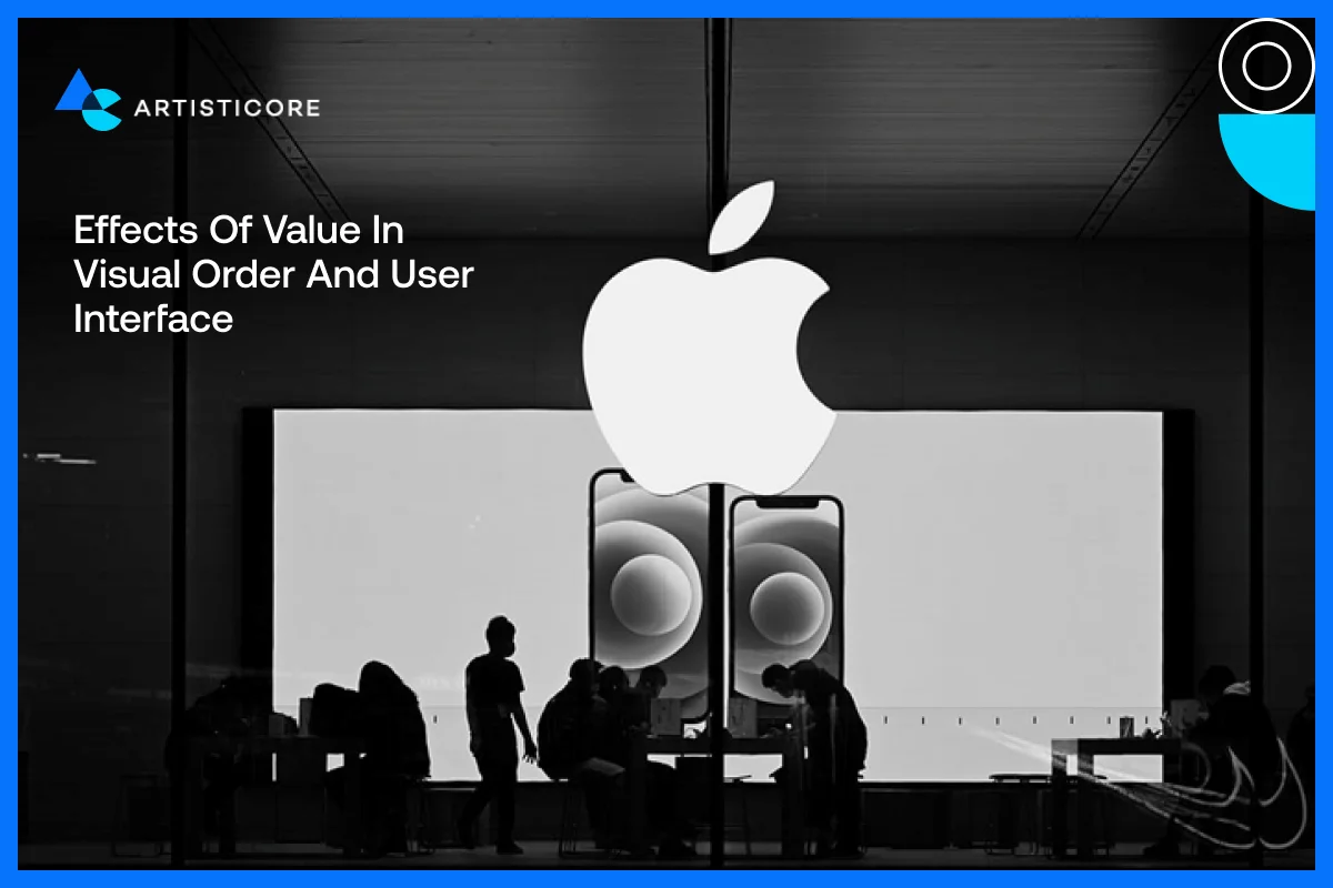
Value is not only about opposition but about visual harmony. Having a balanced structure comforts eye whereas, if you use a lot of dark colors or light colors, it can make your design look clumsy or dull.
For example, the Apple company website has a mix of white and black color with soft shadows on product images which creates a clean and airy effect on users.
According to a study by MoldStud, high-contrast elements are 70% more likely to attract users attention than low-contrast ones.
Tips to Add Value in Design
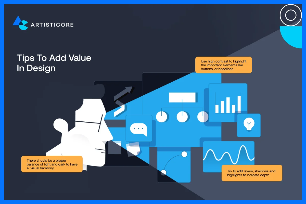
- Use high contrast to highlight the important elements like buttons, or headlines.
- Try to add layers, shadows and highlights to indicate depth.
- There should be a proper balance of light and dark to have a visual harmony.
It is much better if you do not clog your design with deep colors and make sure to use white or negative space.
The Interplay of Elements of Graphic Design in Communication
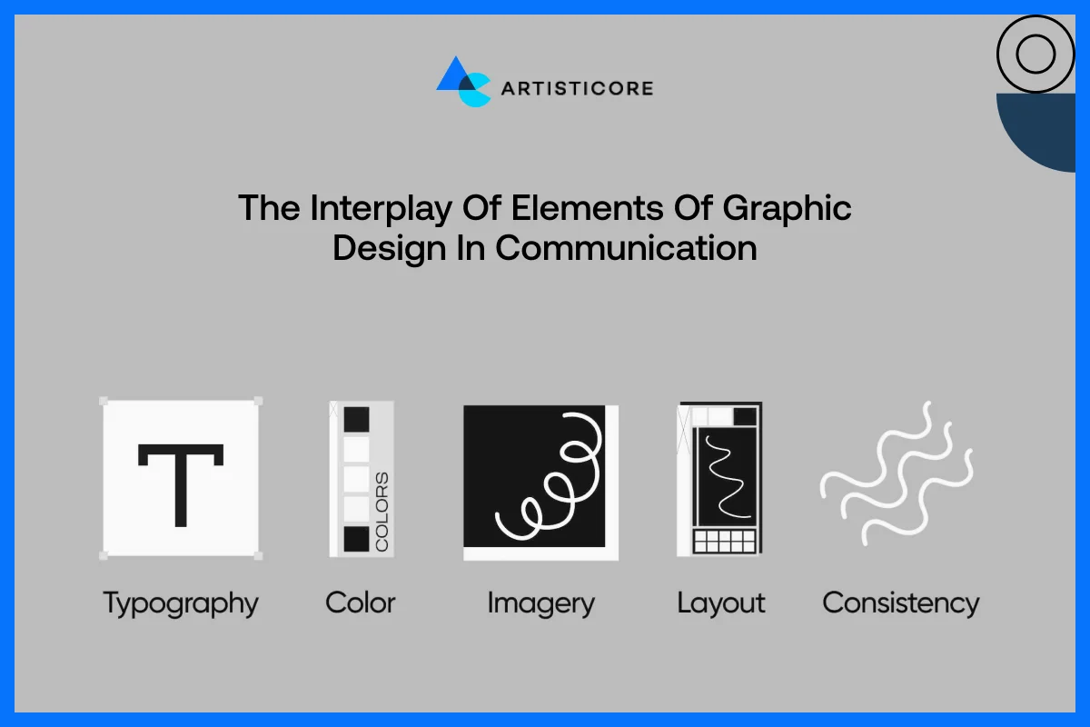
Using only one of two elements of graphic design may create a discontinuous design. It is very important to strategize all the elements of graphic design to have a beautiful outcome. Proper use of lines, shapes, colors, and typography create visual hierarchy and clarity.
This is not a bluff but a tested experiment by many famous brands. There is no doubt that heavy lines lead the eye, forms outline areas, and contrasting colors indicate calls-to-action. And all of them combined leads to better understanding and develop a more user-friendly experience.
For an example, Airbnb has used curvy lines, colorful tone, and friendly fonts on its webpage. The combination of these elements of graphic design creates a sense of trust, friendliness and convenience. All of which supports the brand image and improves the user experience.
Why Designers Must Learn the Graphic Design Basics?
When the designers have the proper knowledge of all the elements of graphic design, it is easy to them to create beautiful and effective design. All these elements provide designers with the ability to work out communication issues through visual means.
Conclusion
Studying about the different elements of graphic design is just like learning the alphabets. Once you know it all and apply it, you come up with a story to tell. The different elements of graphic design like shapes, color, texture, fonts, and more, each has a purpose.
One thing for sure, they do help elevate your basic graphic designs that you have been designing up till now. Proper and wise use of these elements of graphic design help you build a unified brand identity and speak to your audience from all over the world.
Graphic design for beginners and experts works the same way, you need to use elements of graphic designs to create a design that serve as your communication tool. Always remember, having more knowledge never restrict your creativity, it helps you bring innovation that too without fear.
FAQs
Well, there are 3 or 4 elements that you must know of. These include color, then comes shapes, fonts and lines. Once you master these, you can go for the rest of the elements but these 4 can help you create a beautiful yet purposeful graphic design.
Lines guide eyes of the viewer, structure content as well as provide visual hierarchy. As we discussed above, lines can control the way users go through a page. Some explore horizontally and some vertically. So, each line whether curved or straight has a purpose and when you use them with the right intent, you get beautiful and user-friendly designs.
Forms represent feeling and meaning. Circles mean friendliness, squares mean stability and triangles mean power or innovation. There are other shapes discussed in this article and you can go for any shape but you must know the meaning of it.
Colors can attract but they can also repel your customers because they are the sole reason behind creating users’ mood and emotions. It educates viewers about your brand so for example, if there is blue, users will get a sense of trust. If there is red, it means passion or urgency and when there is green, it means nature. Whenever you are choosing color, try to stick to the same color palette to create a strong brand identity.
As humans, we do get irritated with crowd right. Designs also look suffocated without proper use of negative space. This negative space is unlike its name because it adds a breathing space in designs. Also known as white space, spacing removes confusions, increase fonts and design clarity as well as focus. As a designer, you must add white space to deliver professional and functional designs.

Hafsa Hanif is a talented content writer at WebnHubs, specializing in topics such as graphic design, web design and development, logo design, and animation. With her deep understanding of design principles and creative processes, Hafsa crafts engaging, informative, and SEO-optimized content that resonates with readers. Her expertise in SEO ensures that her articles not only captivate audiences but also rank well on search engines, helping businesses boost their online presence through compelling design-focused narratives.
