Responsive Web Design Examples That Deliver a Seamless User Experience
Author :
- What Is Responsive Web Design?
- What This Blog Offers?
- The Importance of Responsive Web Design in 2026
- Basic Principles of Responsive Web Design
- Examples Of the Best Responsive Web Designs
- Why These Responsive Designs Stand Out?
- Common Responsive Web Design Mistakes to Avoid
- Best Practices of Responsive Web design
- Responsive Web Design Techniques and Tools
- Conclusions
- Get a Quote Today!
You cannot really predict what kind of device users are using to browse your website. They can open your website through a desktop, laptop, tablet, or maybe mobile phones. There are high chances that they will look for you through mobile phones but there is constant switching between devices. Now, your goal is to make websites that provide the same kind of experience on every device, right? And, to do this, you need to look at the brands that are doing so. This is where responsive web design examples come in. The famous brands that are not confusing or irritating their users.
A responsive website adapts to every screen on its own. But, if it is not responsive, it can confuse visitors, slow engagements, and weaken brand trust. It is must to study responsive web design examples to turn your online space into an easy and fun experience for everyone.
What Is Responsive Web Design?
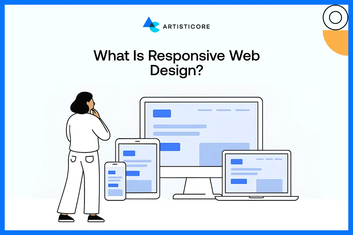
Designing a responsive website is about making layout, content, and structure that automatically adapts to different screen sizes and devices. The goal is to make websites that appear well and work well on each screen.
Do not go extra by designing differently for different mediums. All you can do is use responsive web design features that offer flexible grids, fluid images, and media queries. With this, your content will adjust on its own on any screen. Mobile responsive design also makes sure that users do not need to zoom, scroll sideways, or struggle.
As you know that adaptive design has fixed layouts for specific screen sizes. Well, this is not the case with responsive designs as they are flexible and lasting. All these benefits make responsive design a preferred choice for modern businesses, ecommerce development, and corporate website design.
What This Blog Offers?
This blog talks about the best responsive web design examples that deliver best user experiences on all devices. It also highlights mobile responsive website design techniques, and key elements that make responsive sites successful.
We will also discuss the responsive web design errors and how to avoid them. By the end of this blog, you will know the tools, and best practices to use in the making of responsive web design.
If you study these responsive web design examples, you can easily create appealing websites. The kind of website that are responsive, easily engage and convert users into customers.
The Importance of Responsive Web Design in 2026
In 2026, mobile app design trends are must and not just a choice. According to Clarity Microsoft, 60% of total web traffic comes from mobile phones. This is why there is a huge demand for effective mobile responsive web design.
Other than this, responsive sites also increase interactivity and credibility. When users visit a web page that is mobile responsive, and loads fast and feels instinctive, they remain longer and engage more. This has a direct effect on the conversion rates, depending on whether it is lead generation, subscriptions, or sales.
Responsive websites are also easy to maintain. You don’t have to spend a lot to maintain them. In competitive markets, the responsive web design practices are no longer a fashion; they are a must.
Basic Principles of Responsive Web Design
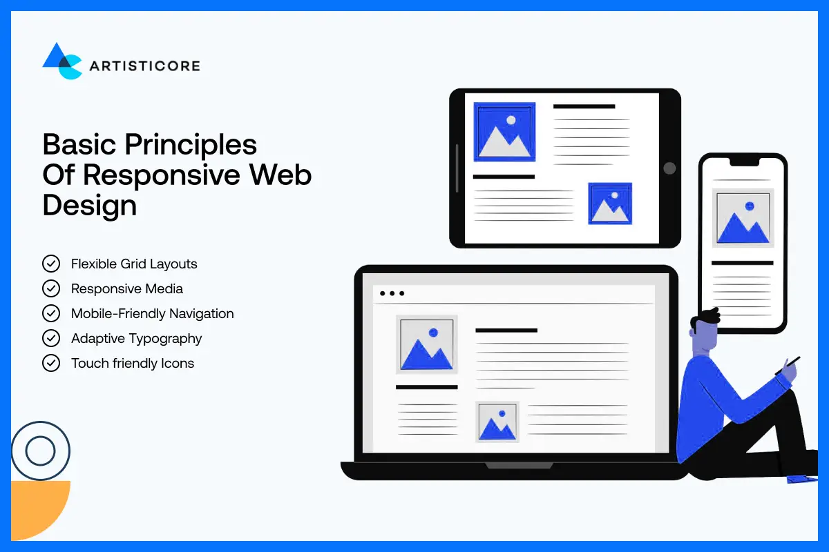
A good responsive website is only possible of you value all the important factors that make it deliver a smooth user experience. As a brand or designers, you can follow these basic principles to create mobile responsive, accessible and attractive sites.
Flexible Grid Layouts
Responsive web development is based on flexible grids. The content blocks are not fixed-width. They change in size according to the size of the screen. If you use responsive designs, you can make your layouts more sensible and readable on all devices.
Responsive Media
When you resize media, make sure it does not affect the quality. This usually happens with many brands and they struggle to deliver quality visuals. Websites such as Dropbox and WIRED are exceptional because their visuals do appeal on every screen and size. They use responsive web design to maintain the functionality and SEO. Responsive media will make sure that your website remain professional on all devices.
Mobile-Friendly Navigation
When the websites are responsive, the navigation becomes easy which increase its usability as well. Such sites are less complication because the menus are simples. There are also clear icons and all the interactions are touch friendly which makes users find what they want quite easily.
Do you know that Shopify and Slack use foldup hamburger menus which makes their websites responsive? Yes, and this is why they are among the best responsive web design examples in the list.
Adaptive Typography
Text should be dynamic between devices in order to be readable. Scalable fonts and proper spacing reduce the over-scrolling and eye strain on the mobile users. Slack and Shopify are one of the best responsive web design examples that shows how the right fonts can you’re your site more accessible.
Touch friendly Icons
Add proper space between buttons or any interactive icons so that the users do not tap on anything by mistake. To avoid this, optimize everything. This will not only avoid random tapping but will make icons more fun and easier to use. To get an idea, go to Dribbble and see how their responsive icons help them increase engagement and conversion rates.
Examples Of the Best Responsive Web Designs
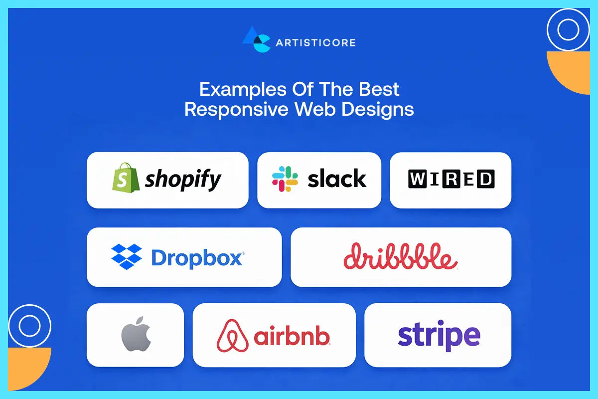
The finest responsive web design examples will not tell you how to resize content according to the device. They will tell you how to provide better experience without compromising on your needs.
You can keep the large content or quality images; you just need to use responsive design features. Below are the responsive web design examples of different brands and businesses that made it possible.
Whether you want to create a website for ecommerce, SaaS, or creative portfolios, responsive web design examples will help you develop functional, clear and usable site.
Shopify
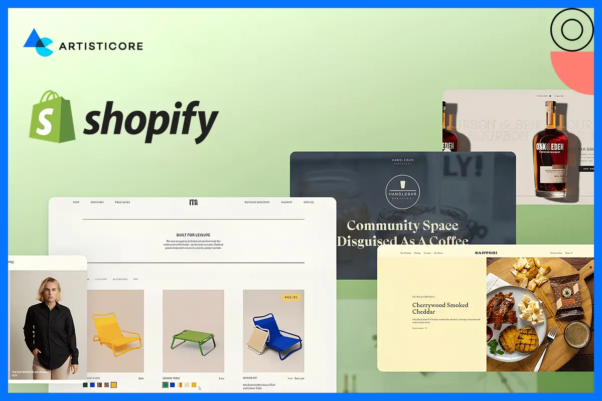
It is one of the best mobile responsive websites that is conversion based. You can see how they add product description, images and prompts. Everything is clear and readable to all. Whether you are on a laptop or mobile, the site adapts on its own.
If you go to Shopify using a phone, you will see how the content displays in a row. You can easily tap the button and the checkout process is also very easy. This kind of reactive web design is less frustrating, allow users to take actions and also set itself as a standard to ecommerce development.
Slack
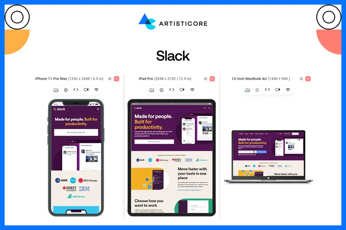
Slack shows how responsive web design can make complicated interfaces look appealing without confusing the user. Go to Slack and see the resizable grid. The layout easily adapts on its own. And yes, you can easily move from multi column desktop to single column mobile layouts.
This is the beauty of responsive web designs. They make navigation easy even when the layout is complex. Slack comes under the best responsive web design examples list because of its cross platform compatibility.
WIRED
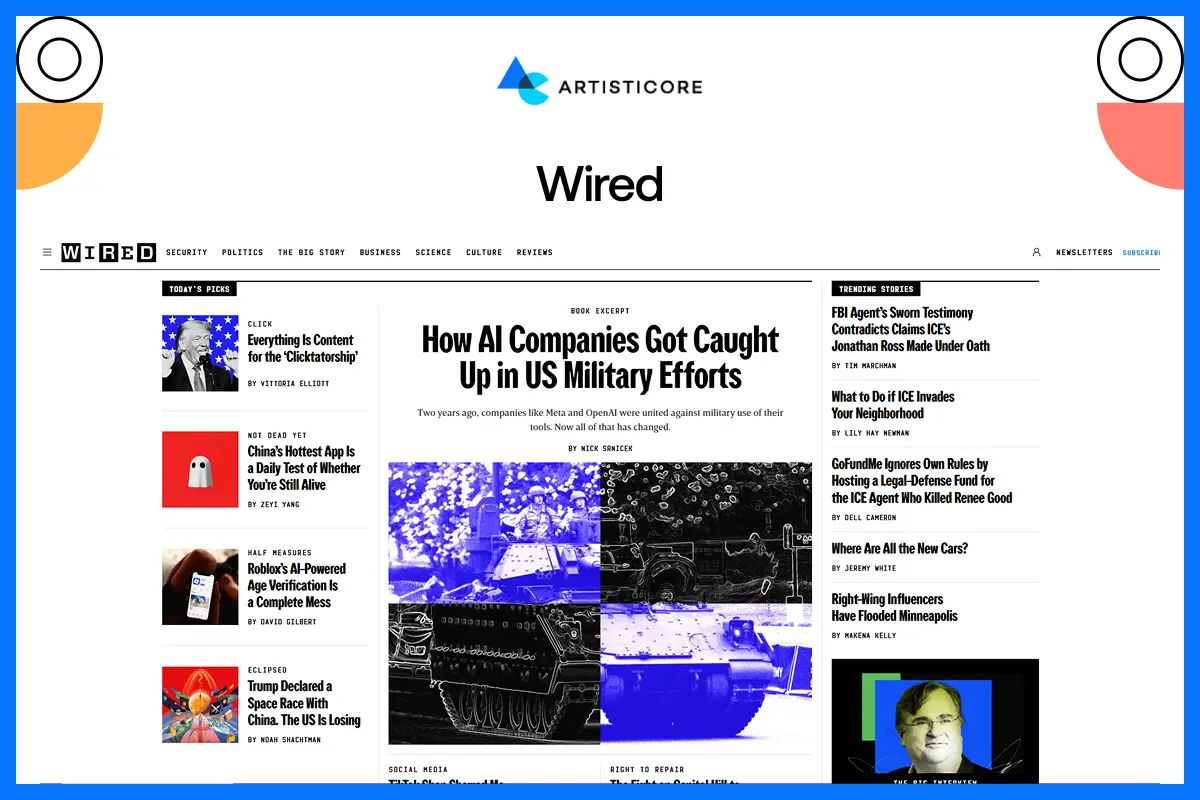
Sometimes, there is a need for large amount of content. This is a common need and you can’t run from it. WIRED comes under one of these brands who need to display large content on its website.
They used responsive designs for this. You can see that their desktop layouts have multi-columns that easily reduce to single-column layouts on mobile. There are also images and videos that shrink on their own. This is what responsive web designs are and it comes with better SEO, powerful UX and other user friendly features.
Dropbox
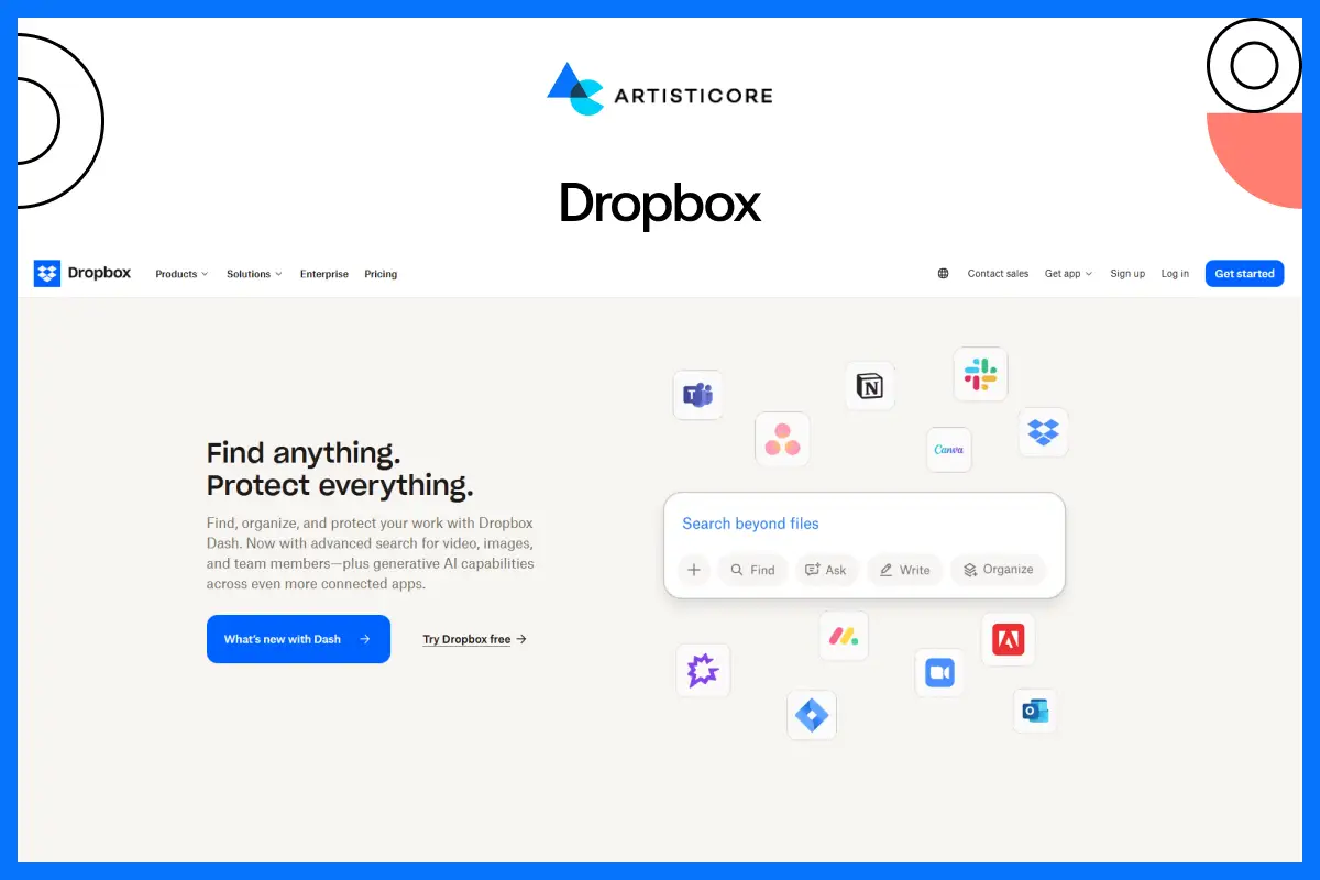
Dropbox strikes the balance between visuals and functionality and web responsive design. Images and hero sections, as well as product features and CTAs, are clear on all devices with the help of fluid grids and responsive images.
Its website works well on each platform and you can study them to create one of your own.
Dribbble
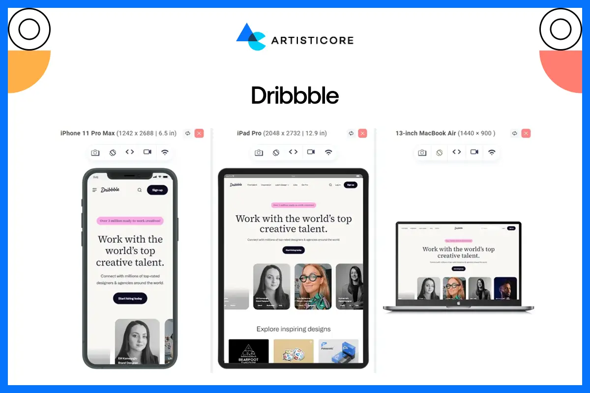
It is a visually rich platform with lots of colors and features. It is one of the responsive web design examples because of its dynamic grids. The layout is flexible, and the content flows properly which direct users to take an action. And yes, are flexible and move the content around, the animation is smooth, the pictures are sharp, and the interactions are natural.
Apple
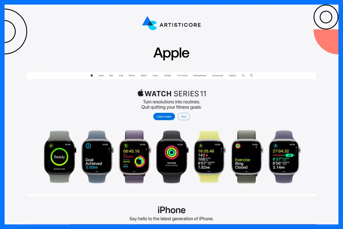
The Apple online site is one of the excellent responsive web design examples. They have product displays, videos and other interactive elements on the websites that work well on both desktop and mobile. All the visuals are sharp. They have used clear CTAs which naturally direct the users to take action. The content flows which make navigation easy. All these things improve brand identity and interaction.
Airbnb
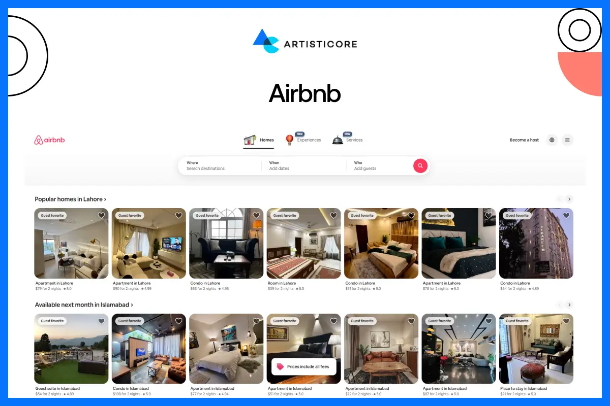
The Airbnb responsive site is a mix of structured designs and functionality. It means that the website guides the user naturally as the navigation is excellent. There is everything, from listings and maps to booking forms and all of these resize on their own to any size.
These things make the site fast, usable and readable. The user interacts more and eventually converts which results in revenue growth.
Stripe
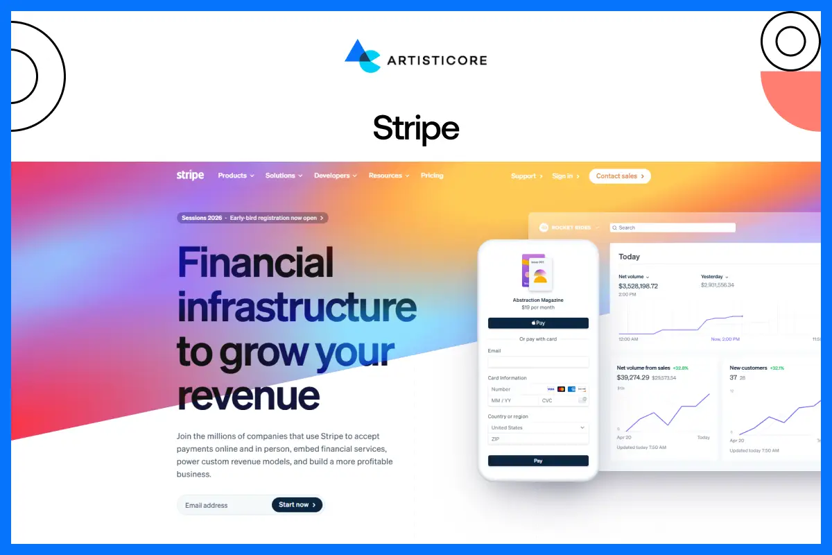
The responsive site of Stripe focuses on information that is easy to read and understand by developers. Everything from grids and codes to navigation work perfectly on every screen size. This helps users easily understand even the complex content. It is one the best responsive web design examples that can help you create informative and user friendly web designs.
Do not cut your content as this is not what it inspires you to do. But, make your site responsive so it feels natural, pleasant and accessible to all.
Why These Responsive Designs Stand Out?
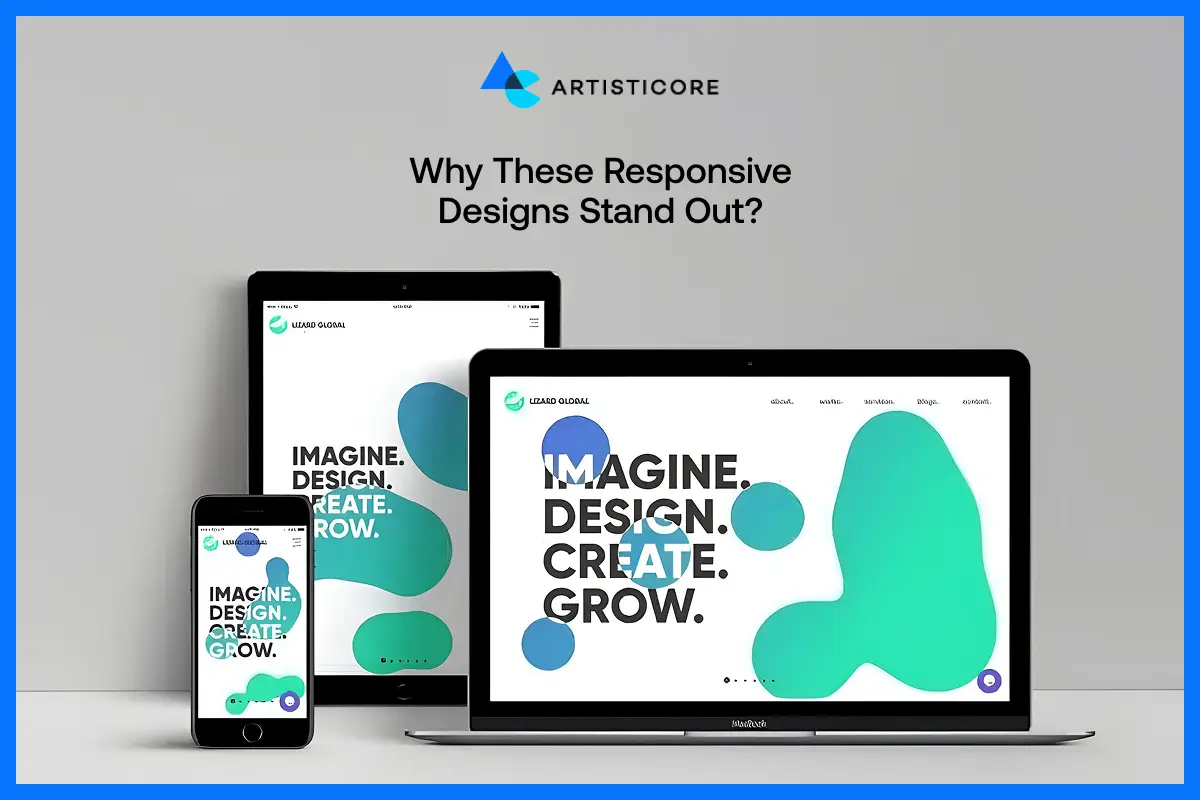
These best responsive web design examples stand out because they share similar characteristics. All these websites are user friendly, look appealing, load fast, interactive and engage. There is nothing more you need than these to add a natural and professional feel to your site.
Uniformity Across the Screen Sizes
One of the fundamental principles of responsive web pages is consistency. It helps in providing the same look and feel on all platforms. Shopify and Slack explain how responsive websites keep layouts, colors, content consistent which increase brand recognition. Why? Because users browse mobile responsive websites in an intuitive manner. They easily find the content they’re looking for and enjoy all kind of interactions.
Fast Loading Times
Mobile responsive web design depends on speed. Image optimization, code compression, and fluid grids also make web pages responsive and load fast when using slow networks. Here, Dropbox and WIRED are doing very well, improving usability and responsive design SEO.
Intuitive Navigation
Responsive mobile websites require clear and touch friendly navigation. See how Slack use collapsible menus and interactive grids. There is another example, Dribbble which allow users to easily get information on any device.
These are all the right choice that they took to make their sites responsive which make people want to visit them again.
Accessibility
The best responsive design websites have a major characteristic known as inclusive design. All users can read the content and have smooth interactions due to proper font scaling, color high contrast, and touch space. The best responsive web design examples are WIRED and Dribbble due to their accessible page, which are in line with the latest web design trends, emphasizing user experience, corporate web design principles, and mobile web design principles.
Content Prioritization
Responsive web design focuses on highlighting the key content. Go to Shopify and see how they place CTAs and products details on mobile devices and keeps the desktops clean. You will see how their responsive web design looks clean, focused, direct and interesting.
Performance Across Devices
Responsive websites are not just about good visuals but functionality. With such designs, your site work well on every medium. To make your site responsive, you must use media queries, flexible grids and responsive website templates. All these features make your site flexible.
The famous responsive web design examples like Slack, and Dropbox stand out mainly because they perform well on every screen.
They use responsive design features to make their sites quick, convenient, and attractive. You must look at the responsive web design examples to get the real idea on how big brands use responsive designs to stand out. And yes, also why they are the best competitors in the market.
Common Responsive Web Design Mistakes to Avoid
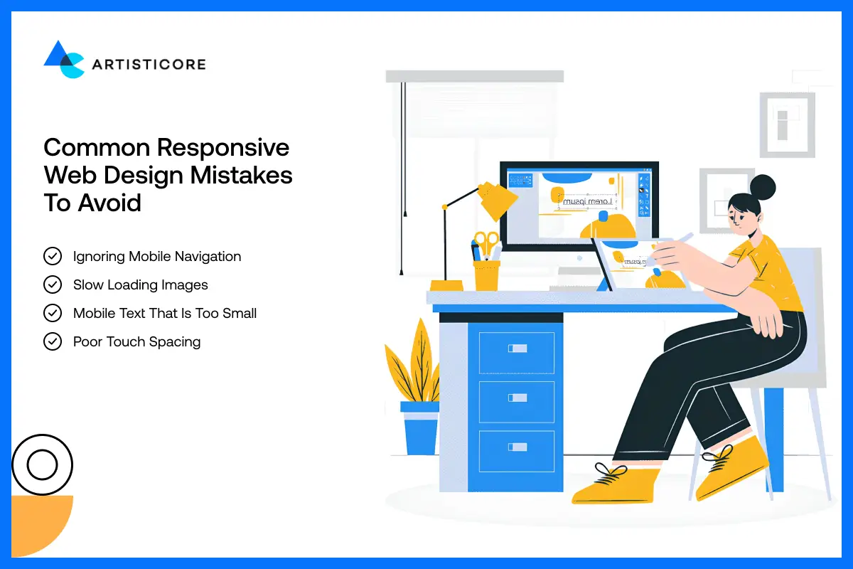
Even the most experienced designers make mistake when they develop mobile responsive websites. To avoid them, study the responsive web design examples by visiting their websites. Interact with them regularly and notice why they stand out. When you do this, you will know that the site speed, easy navigation, clear fonts, engagement, and SEO design help websites stand out.
Ignoring Mobile Navigation
One of the errors is not giving much important to mobile navigation. A lot of the websites maintain desktop style menus which do not work on small screens. And then, you see increase in bounce rate which nobody wants.
To ignore this errors, use collapsible hamburger menu as it makes your site friendly and touch-friendly.
Slow Loading Images
If the images you are using are heavy and you don’t optimize them, your website loading speed will frustrate users. Why? Because it will take ages to load. This is why, it is important to use have quick loading websites and you can make yours by using responsive design features.
Go to websites like Dropbox and WIRED and see how quick they load. They are responsive and work well across devices because of their SEO. When you optimize media, you make it easy for users to access your site in no time. They will engage with your site for hours and hours without noticing, hence, increase users’ engagement.
Mobile Text That Is Too Small
The kind of fonts you use on desktop can look small and difficult to read on small devices like phones. When they are difficult to read, you know what’s going to happen. It will irritate users and stop them from interacting how they should.
This is why; it is important to scale typography. It is one of the attributes you will find in the best responsive web design examples like Slack and Shopify. With proper focus on fonts, they make their content both readable and accessible.
Poor Touch Spacing
Do not keep interactive icons too close to each other. Keep a good space so that users don’t accidently touch the wrong icons. These random tapping frustrate the users which is why having a proper distance is importance.
To better understand, go to Dribbble and see the spacing between buttons and other interactive elements. It is one of the best responsive web design examples that shows how a responsive design is user friendly, touch friendly and well- spaced.
Having web responsive issues? Let Artisticore fix all your design problems and build a mobile friendly website.
Best Practices of Responsive Web design
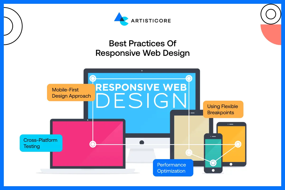
With the best responsive web design examples and practices, you will have refined, quick loading, and smooth web pages. They will work on all devices and provide best user experiences, visual consistency and excellent performance.
Mobile-First Design Approach
You can go from small screens to large screen easily. Always make sure that your key content, layout and other features fit well on small screen like mobile. This way, your site will be functional and users will read and access your brand message as well.
If you are successful with it, optimize your site and expand to large screens like PC or laptops. By doing this, your site will be easy, user-friendly and effective.
Cross-Platform Testing
Careful testing on smartphones, Tablets and desktops is important. By checking how your website work on real platforms, you get to see the actual issues. These are the errors that you can ignore if you are testing with automated tools.
Always test your sites frequently. This way, your site experience is going to be consistent. The users will easily read, navigate and use the site and it is all possible with the use of current responsive web design methods.
Using Flexible Breakpoints
They help define the width of the screen at which layout adjust. By using these, both the content and the design flow naturally on the website. There is no awkward space or layout which makes the websites look and work just fine. This way, the website looks and feel professional and stay usable on any kind of device.
Performance Optimization
To have a clean user experience, it is important to optimize images, compress code and make content loading a priority.
When you have websites that load fast, the bounce rates decrease and more users will engage with your brand. If you optimize it as well, Google will promote it and it all happens with responsive features. As you optimize your websites, you ensure that they look good and at the same time, they perform well on all the devices and all the internet speeds.
Want to create a responsive site? Get Artisticore because we turn the best practices into actual outcomes.
Responsive Web Design Techniques and Tools
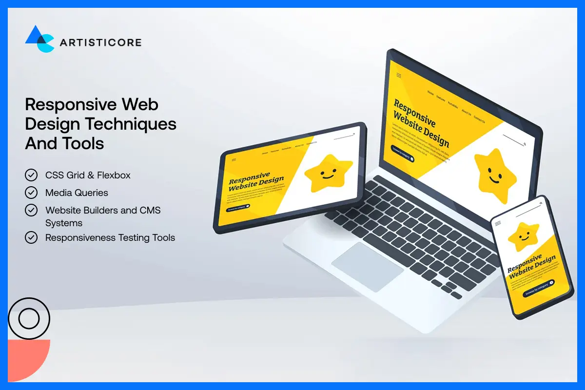
The right responsive tools and techniques can make a website both efficient and effective.
CSS Grid & Flexbox
CSS Grid and Flexbox allow designers to develop flexible layout which automatically adapt to different screen sizes. These frameworks help create websites in which the content is aligned and its flow is suitable across devices.
Media Queries
The media queries know what kind of device the user has. And that’s how it suggests the proper style for them. With this technology, your site works on desktops, tablets, and smartphones by meeting all design standards.
Website Builders and CMS Systems
WordPress and Shopify provide responsive web templates and free mobile responsive web design features. Designer prefer using them as it helps them work on UX without compromising on responsive design related practices.
Responsiveness Testing Tools
BrowserStack, the Mobile-Friendly Test offered by Google, or device emulators are only some of the tools that can make responsive site works with all devices. It is important to test because without it, you will not know how it works. Test and optimize your sites to make sites SEO-friendly, trustworthy and professional.
Conclusions
Responsive web designs help business and designers develop websites that actually serve the users. Some of the best real life responsive web design examples are Shopify, Slack, WIRED, Dropbox, and Dribbble which we discussed in this blog.
They are best because of adaptable layouts, media that load fast, and easy navigation. You can easily use their features and that’s why most brands are in awe with how they feel.
If you are making a website in 2026, use these responsive web design examples as they focus on mobile friendly web design which increase user interaction.
Remember that when we say responsive sites, it is not only about fitting content into the screen. It is also about making websites that adjust on its own, feel and look good to every user and meet your business objectives.
Get a Quote Today!
Contact our web design company for better user experiences and SEO. Stand out now!
FAQs
Responsive web design does not have the one screen size. This is why the trends are screaming for mobile friendly sites that fall between 320px and 480px. This way, your sites will not only look and feel good on large screens but also the small ones. The site you have must be clear, and smooth. The content should be easy to read, with proper spacing and user friendly interaction to provide an excellent user experience.
Yes, responsive web design is highly favorable to SEO. As we know by now that Google prefer mobile responsive websites and ranking them on top. It is happening because such sites make your brand and its content accessible to all.
You can employ Website Responsive Testing Tool to test the responsiveness of your site. There are other online testing tools available as well, you just have to put your URL there. Other than this, work on your content, layout design and images. Optimize everything as it all makes your site work well on engines. It is very important to test to make your website sustainable in today’s world.
Responsive web design contains adaptive media query and grids. You can easily scale images without them losing its quality. Such websites easily adjust to any screen size and medium. One the other hand, adaptive designs rely on different fixed layout and they are made for different types of screens. They both provide a stable user experience, but due to real time changes, responsive designs are superior in 2026.
We must go with the trends and use new tools to be current and stand out. When you go for responsive web design, you make your site look and feel good on every platform. This way, you cover a wide range of audience because you don’t really know which medium they are using. In 2026, responsive websites will rule because so yes, they are important.

Hafsa Hanif is a talented content writer at WebnHubs, specializing in topics such as graphic design, web design and development, logo design, and animation. With her deep understanding of design principles and creative processes, Hafsa crafts engaging, informative, and SEO-optimized content that resonates with readers. Her expertise in SEO ensures that her articles not only captivate audiences but also rank well on search engines, helping businesses boost their online presence through compelling design-focused narratives.
