What is Responsive Web Design? A Beginner’s Guide to Responsive Websites
Author :
- What is Responsive Web Design?
- Why Responsive Web Design Matters?
- Responsive vs. Adaptive Design: What’s the Difference Between the Two
- Benefits of Responsive Web Design
- Key Principles of Responsive Web Design
- Key Elements of Responsive Web Design
- Popular Responsive Web Design Frameworks
- How to Make Your Website Responsive
- 11 Best Practices for Responsive Web Design
- 3 Best Responsive Design Examples
- Get Started With Artisticore to Build a Responsive Website
There are many different devices that people use for surfing the web these days. With that comes a set of problems, such as websites made for PCs not adjusting to smaller screens.
However, mobile responsive web design (RWD) is the answer to that problem. RWD is an excellent method of creating sites that can adjust according to the viewer’s size.
This means that your site will be nice, smooth, and easy to use, without requiring any zooming, panning, or going with unorthodox layouts.
That is why we will talk all about responsive web design in this blog. More so, we will look at what is responsive web design, why it matters, and how you can make your site responsive.
So, without any further ado, let’s get right into it.
What is Responsive Web Design?
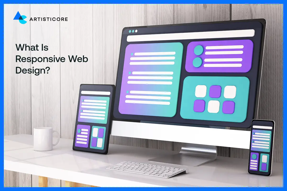
Responsive web design refers to the creation of sites that can make themselves fit any device. Its short form is RWD.
RWD makes a single site work on all devices. Thanks to RWD, developers are not required to make separate versions of a site for various devices.
RWD modifies the website’s arrangement, graphics, and text depending on the dimensions of the display.
The tech involved is that of fluid grids, CSS media queries, and responsive images. This gives the whole site a visually appealing interface.
This way, the user will have a nice experience no matter what device he or she is using.
Struggling With Mobile and Desktop Design Issues?Partner With Artisticore to Turn Your Site into a Responsive Experience.
Why Responsive Web Design Matters?
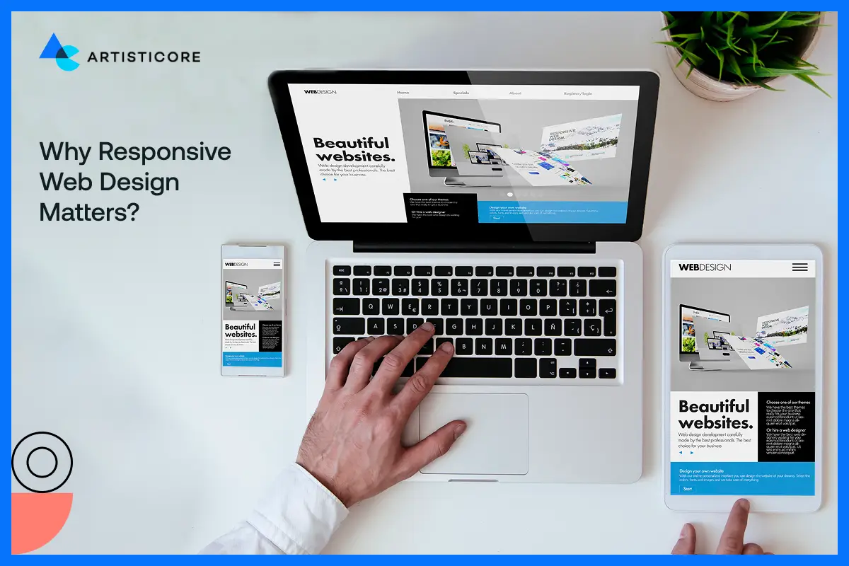
The importance of responsive design cannot be overstated. RWD is a must these days as users visit the web through different devices.
A site that is adaptable to all screen sizes is friendly for users. More so, it is also easy to read and navigate.
Besides, it is good for SEO as well. After all, Google favors responsive web design and SEO.
Furthermore, it is a cost-effective approach as you only need to create one site and not multiple versions of it. All in all, RWD enhances the experience of the user.
It also increases the accessibility of the site and assures a longer stay of the visitors. This, in turn, can increase traffic, engagement, sales, and even conversions.
Responsive vs. Adaptive Design: What’s the Difference Between the Two
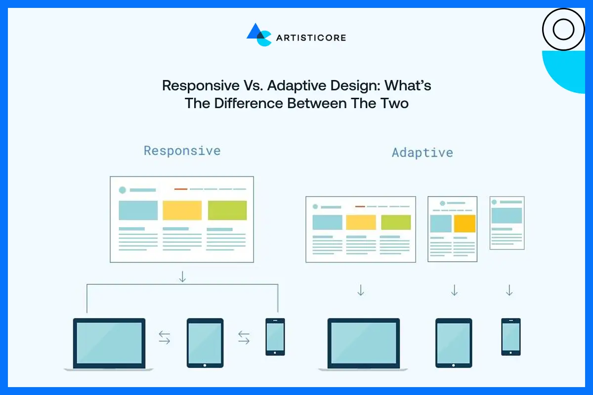
There are alternatives to responsive web design as well. The first is adaptive design. Let’s see what differentiates the adaptive design from responsive web design:
|
Feature |
Responsive Design |
Adaptive Design |
|
Layout |
Automatically adjusts to any screen size using flexible grids. |
Uses fixed layouts designed for specific screen sizes. |
|
Flexibility |
Highly flexible; works on all devices smoothly. |
Less flexible; works best on predefined devices. |
|
Maintenance |
One single codebase for all devices. |
Multiple versions may be needed for different devices. |
|
User Experience |
Consistent experience across all devices. |
Experience can vary depending on device. |
|
Development |
Easier and faster to update since there’s one site. |
Updates can be slower due to multiple versions. |
Benefits of Responsive Web Design
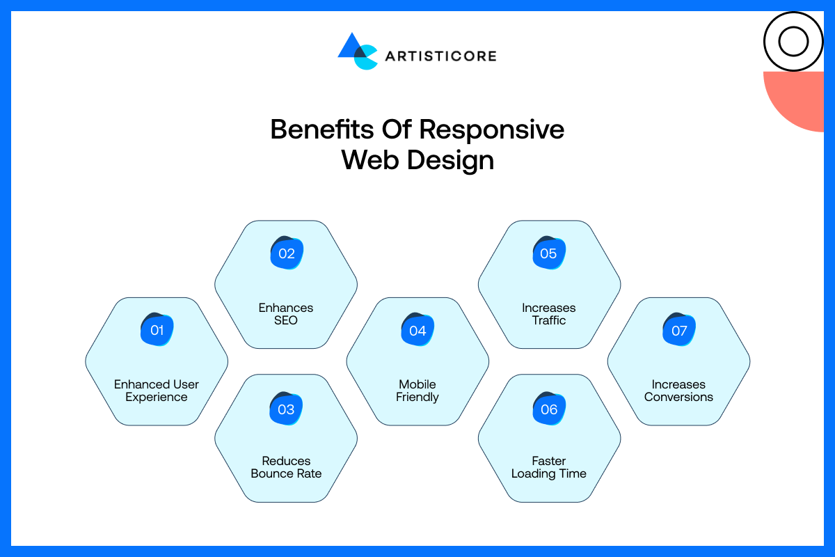
Now that we know what is responsive web design, let’s look at some of its benefits. They are as follows:
Enhanced User Experience
RWD allows the site to provide an enjoyable experience for browsing. This is regardless of the device used.
Moreover, they allow users to read the content, click on stuff, and navigate the site with ease. The users are not required to zoom in or scroll up and down to use the site.
Enhances SEO
Google loves websites that work on all devices. A responsive site improves the site’s rankings on SERPs.
Responsive web design used for SEO makes it easier for people to find your site. Better responsive web design SEO means higher rankings and higher traffic.
Reduces Bounce Rate
Messy and difficult user experience on a site leads to quick leaving of visitors. RWD makes your site look good and easy to use. This, in turn, gains users’ attention. It also allows them to visit more pages.
Mobile Friendly
A lot of people these days surf the web on phones. RWD makes the site adapt to smaller screens. This makes it convenient for phone users and keeps your content readable and clickable.
Increases Traffic
RWD is a major source of onsite traffic. That is because it provides great experiences to users on all kinds of devices. And search engines give these sites higher ranks.
Satisfied users are more prone to recommend your site. This helps increase the total number of visits.
Faster Loading Time
RWD uses layouts and optimized images. This leads to faster page loading. Sites that load fast do not let users get frustrated. And thus, it contributes positively to the whole browsing experience.
Increases Conversions
If your site is friendly for users and they can easily read and navigate it, it will convert more. There is a high probability that they will take some actions like subscribing, purchasing, or getting in touch with you. RWD can be a factor that converts your visitors into clients.
Key Principles of Responsive Web Design
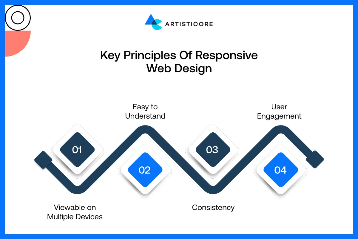
Every site must have these website design basics. The following are the key principles of what is responsive web design made of:
Viewable on Multiple Devices
A responsive site must look good and work flawlessly on all devices. Users must always see the content with ease.
More so, they must explore the site with ease. The user must have a good experience using the site regardless of their screen size.
Easy to Understand
The design of sites must be simple and easy to use. RWD will make the content readable. In this manner, individuals will be able to locate what they desire promptly.
Moreover, they will be spared from the hassle and irritation of going through a confusing situation.
Consistency
The main principle of what is responsive web design is consistency. RWD allows a site to have a uniform appearance and experience across all devices.
This also applies to texts, color schemes, buttons, and, therefore, the layout. That way, your users will keep recognizing your brand through all of it, and believing that your site will add to their trust.
User Engagement
RWD ensures user engagement and enhances their interaction. Visitors find it easier to navigate the site. More so, they read and enjoy the site. This leads to longer stays, higher traffic, and revisits.
Key Elements of Responsive Web Design
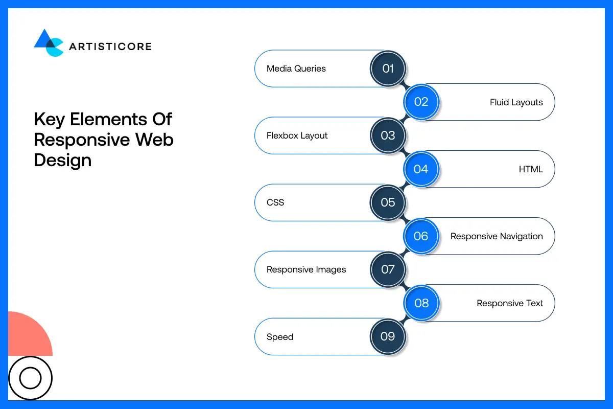
The following are the key elements of what is responsive web design. These components of responsive web design include:
Media Queries
Media queries are CSS rules that determine the appearance of your website on various screen sizes.
They allow you to modify layouts, fonts, or styles according to the user’s device – whether it is a phone, tablet, or desktop.
Fluid Layouts
Fluid layouts utilize percentages rather than static widths. This results in the automatic stretching or shrinking of the content to fit the corresponding screen of any size.
Thus, your site looks balanced regardless of the device that the visitors are using.
Flexbox Layout
Flexbox is a CSS property that enables layout design with elements to be expressed in terms of rows or columns, and also allows their size to be changed automatically.
It simplifies the creation of responsive layouts and, at the same time, offers proper alignment and device flexibility through the new layout.
HTML
HTML forms the structure of your website. Writing clean, organized HTML ensures all content is readable, accessible, and ready to adapt when combined with responsive CSS techniques.
CSS
CSS shapes the appearance and design of your website. The use of responsive design means that CSS will reconfigure the layout, colors, fonts, and even the space to present your website in a majestic way across all screen sizes.
Responsive Navigation
The navigation menu must work well across all types of devices. A responsive navigation alters the layout for the smaller displays.
It does that by converting a horizontal menu to a hamburger menu. Thus, it allows the users to move through your site.
Responsive Images
Images must resize on their own to fit their containers. Responsive images eliminate overlap.
More so, they lower the loading time. They prevent cropping to make sure the pics look good and properly scaled on each and every device.
Responsive Text
The text must change according to the screen size. This is so that it can be easily read. RWD text guarantees that the font size and space changes as per the screen size.
Speed
A RWD loads fast on all devices. This is thanks to the optimization of images, layouts, and code. It ensures that the pages load fast.
This keeps the users happy. It also reduces the frustration caused by slow-loading content.
Want Your Website to Look Perfect on Every Device? Artitsicore Creates Responsive Designs that Users Love.
Popular Responsive Web Design Frameworks

Just as it is a must to know what is responsive web design, it is a must to know its frameworks as well. Therefore, these are as follows:
Bootstrap
Bootstrap is a popular RWD framework. It enables the creation of sites with RWD. With its pre-made parts, grids, and styles, it allows creating even more varied layouts that will look beautiful on any device without even going through the process of developing them from the very beginning.
Semantic UI
Semantic UI is a framework that uses HTML for web design. It is for devs who want to write clear code with simple customization. Thus, it creates sites that are nice to look at. More so, they run seamlessly on all devices.
jQuery
jQuery is a library for JavaScript that makes it easier to code for interactive and responsive features. It allows your site to be more flexible about being displayed on different screen sizes.
It adds animations, as well as making the overall user experience better. More so, it does all that without the need to code JavaScript from 0.
How to Make Your Website Responsive
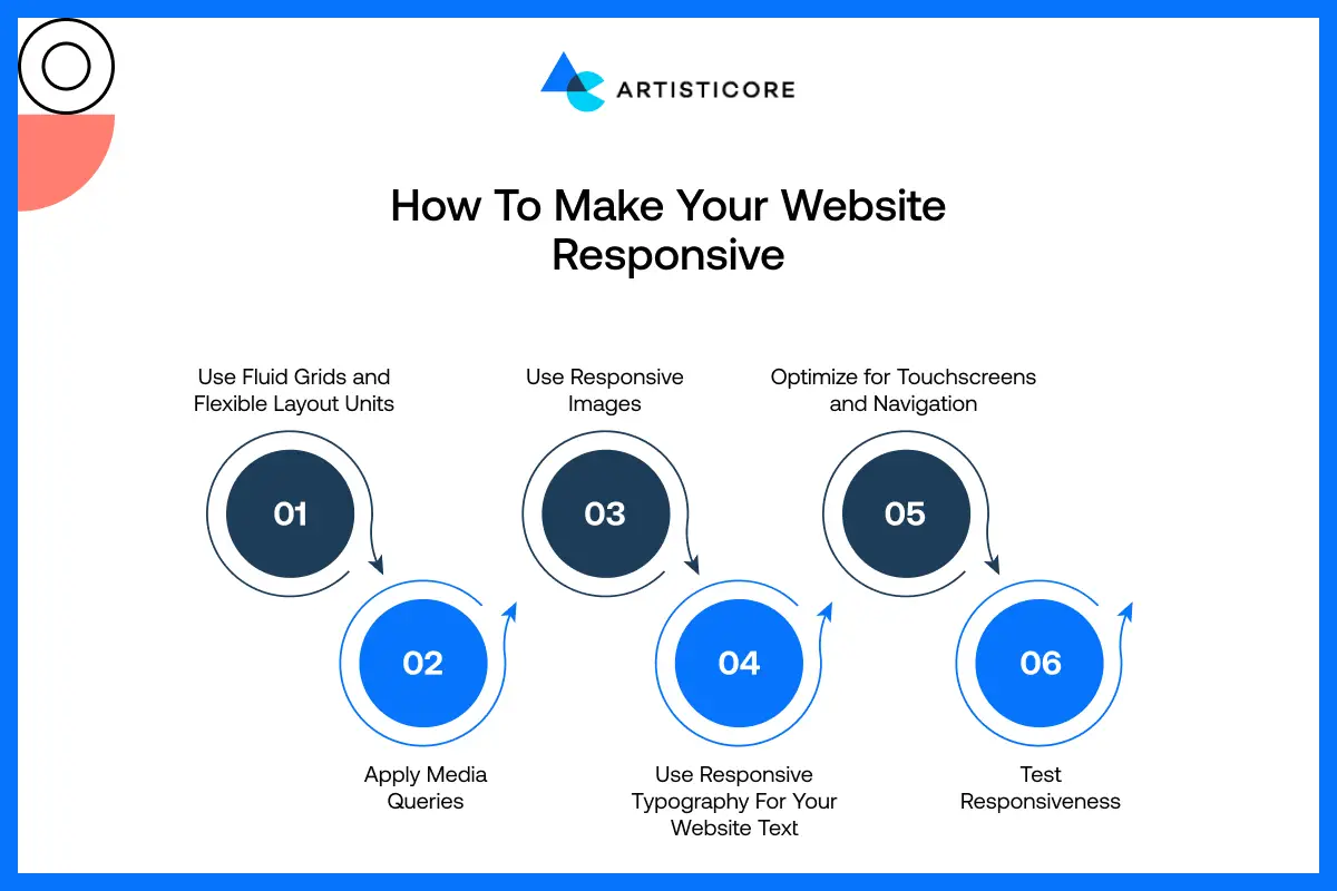
If you are wondering, “how do I make my website responsive” without partnering with responsive web design companies, then the following are the steps to create what is responsive web design:
Step 1: Use Fluid Grids and Flexible Layout Units
First off, create your site using fluid grids that use percentages rather than fixed pixels. Thus, your layout will be able to expand or shrink on its own. This will allow the content to be displayed well on all screen sizes.
Step 2: Apply Media Queries
You must then apply media queries. Based on the device screen analysis, it will set different styles per the screen dimension variable fonts, variable layout, and spaces.
This will totally change the site’s appearance according to the gadget. Thus, it makes your site look PRO.
Step 3: Use Responsive Images
You must go with responsive images. They can adapt the size on their own to fit their containers.
With the utilization of responsive images, the issues of exceeding the containers or getting deformed are solved.
In this manner, it keeps the visual attraction of the pages and gives quick loading on any device.
Step 4: Use Responsive Typography For Your Website Text
The application of typography that adjusts itself according to the device would be done. With this, it would change the size and spaces of the font, which would be better access for users regardless of the device they are using.
The content will be quite readable for the users thanks to the application of responsive typography. The users will not have to hassly zoom in and out or scrolling up and down.
Step 5: Optimize for Touchscreens and Navigation
You should design things like buttons and menus that are suitable for touchscreens. Make the areas where users can click very big and the whole navigation very simple so that users of mobile devices and tablets can visit your website without any problem and with no annoyance at all.
Step 6: Test Responsiveness
You must then test your site on all devices and screen sizes. Testing it allows you to find out any issues you don’t know about. Thus, it will make sure that your site runs well for all users.
11 Best Practices for Responsive Web Design
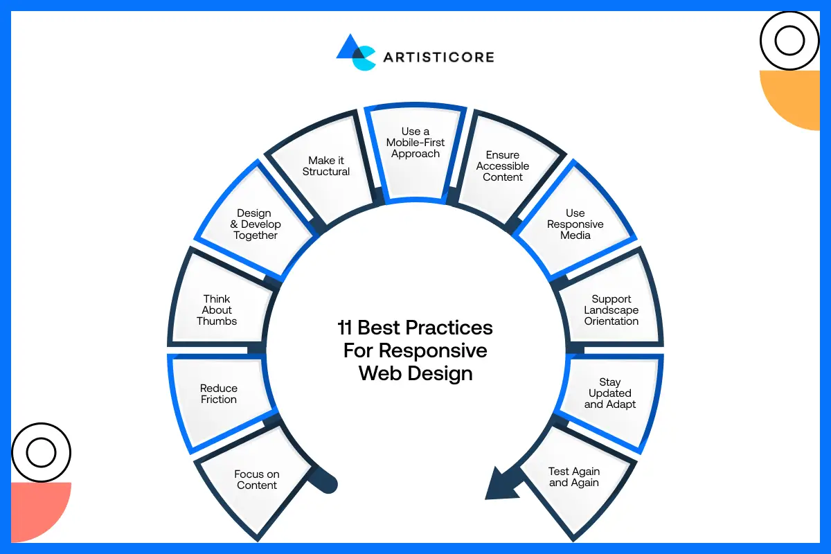
The following are the 11 best practices for responsive web design that all responsive website design companies use:
Focus on Content
You must put content that is of the greatest importance at the top of your list. Also, ensure that the text, images, and vital features are easily noticeable and accessible. This will let the users get the info they need.
Reduce Friction
Keep navigation and interactions simple. Avoid confusing layouts or too many steps for actions, so users can move through your site easily without frustration, boosting engagement and satisfaction.
Think About Thumbs
You must create buttons, links, and menus for smartphones. This is so that they are easy to tap with fingers.
Base your design on finger size and spacing to ensure that navigation is relaxing and accidental clicks are avoided.
Design and Develop Together
You must work with devs and designers just as when your project kicks off. This teamwork makes sure that the layouts, code, and visuals are all in sync and function correctly on all devices.
Make it Structural
Write clean code to create a good base for your site. A good structure will use RWD and will maintain uniformity across all devices.
Use a Mobile-First Approach
You must design for mobile screens in mind before scaling up to PCs. This approach ensures your site is mobile friendly. It will make sure it is optimized for smaller devices and loads well on all screen sizes.
Ensure Accessible Content
Ensure that all users have access to your site, even disabled persons. Provide legible fonts, distinct titles, alt text for pictures, and appropriate contrast for a completely inclusive interaction.
Use Responsive Media
It is a must for videos, images, and graphics to resize and adapt according to different display dimensions.
By doing this, your site looks good visually. And at the same time, the issue of smaller gadgets breaking up the content is avoided.
Support Landscape Orientation
Check that when the view is oriented from landscape to portrait, the site does not fail. Both text and images should continue to adapt so that the layout stays clickable and put together.
Stay Updated and Adapt
Web design style and tech are changing continuously. Therefore, you must follow these trends. Your site must be updated with the best and newest tech and features.
Test Again and Again
Always test your site on various devices, browsers, and screen sizes. Testing repeatedly will allow you to find problems early on. It will provide each user with a very good and responsive experience.
3 Best Responsive Design Examples
The following are the responsive web design examples of the 3 best responsive websites:
YouTube

YouTube uses a flexible video grid that changes based on the device. On tablets, rows show three videos; on mobile, it’s a single column.
The main menu moves to the bottom for easy thumb navigation, improving user experience.
Amazon

Amazon’s responsive design adjusts layouts for every device. Tablets show more content in a scrollable section, while mobile focuses on essentials like recent orders. The site stays easy to browse, keeping shopping smooth and efficient.
Ready to Build a Website that Works Everywhere? Let Artisticore Design a Fully Responsive Site for Your Business.
New York Times
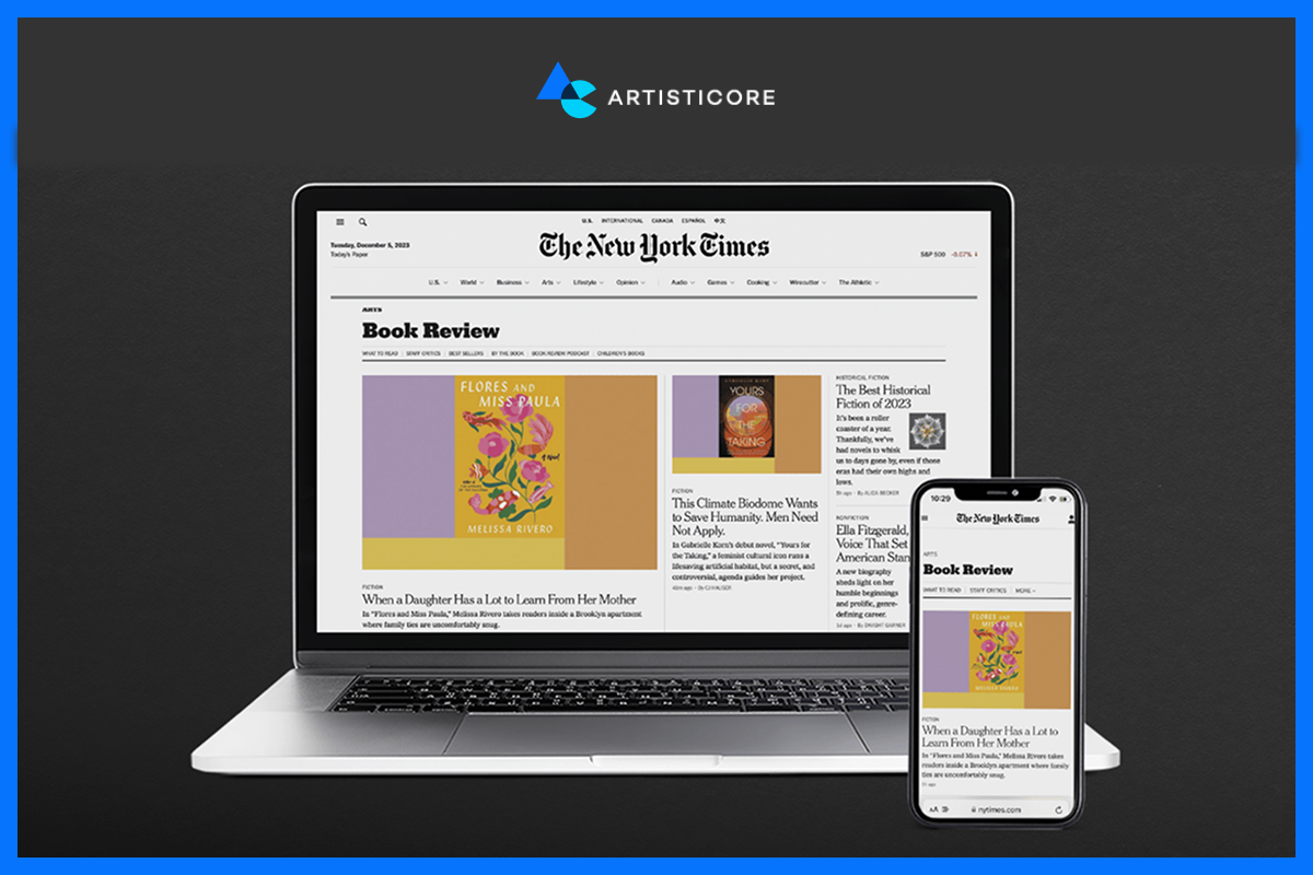
The New York Times changes its site presentation from a PC multi-column newspaper style to a mobile single-column layout.
The menus also take up less space and expand like an accordion. This is a great help for reading articles and browsing the news categories on small screens.
Get Started With Artisticore to Build a Responsive Website

Making a site that is visually appealing on all devices is a task for the pro responsive web designing companies.
This is where Artisticore’s responsive website development company comes in. We are the experts who provide Responsive Web Design Service to design and develop sites with RWD in mind.
Our responsive web designing company makes sure the site adjusts well to all devices. Artisticore’s design team uses RWD design to offer the best possible experience for your audience.
So, partner with Artisticore and let us create a site that works beautifully everywhere.
Final Thoughts
So, there you have it, folks. That is the end of this blog on what is responsive web design. We hope that the pointers we shared in this blog can help you know what is responsive web design. As you know, RWD is a must now. It is all about making your site accessible to people on just about every device. And RWD is the recipe for success for business and higher SERP rankings.
So, you must know the web design basics, best practices, and take cues from the best sites to use RWD for your site. However, if you need help using RDW for your site, then you can consider Artisticore for the job. More so, we are a responsive website maker that will help you create a site that looks and works well on all devices.

Sultan Hanif is a seasoned wordsmith, who brings technology trends and innovations to life through his words. A tech-savvy gamer with a passion for all things football, Sultan blends his technical knowledge with creative storytelling to empower businesses and individuals alike.
