Types of Typography: Font Style That Shapes Brand Identity in Web Design
Author :
- Importance of Typography Styles
- Knowing the Basics: What are Typefaces and Fonts?
- Elements of Typography
- Font Categories
- Classifications of Modern Typeface
- Typography Trends and Market Insights
- Impact of Fonts on Reading and Comprehension
- Why One Typeface Doesn’t Fit All
- The Rise of Interlude Reading in Web Design
- Need for Customized Typography
- Role of Typography in Web design and Brand identity
- Best Tools to Study Fonts and Typography
- Wondering How to Pair Fonts as a Web Designer?
- Conclusion
The art of typography is the back bone of the visual communication. Any letter, line or curve speaks a story of its own. Whatever types of typography you use in the design will impact both your brand voice and identity. Be it a logo font or a billboard one, choosing the right font meaning in text is making your brand talk and relates to the audience.
Fonts do compliment the look of the design but they also evoke emotions, affect choices, and create initial impressions.
Importance of Typography Styles
The types of font styles one chooses direct impact readability, identity, and emotion. According to a research posted in Toner Buzz’s blog, the font and typeface market is worth 965.4 million in 2021 and it will reach to 1.33 billion by 2031. This is enough evidence to understand that the use of different kinds of fonts is only going to expand in the upcoming years.
The designers are now experimenting with endless font types and typography to tell stories through, applications, websites, and print media.
What is more interesting is that fonts can also influence our thoughts. According to another research, difficult to read fonts like Monotype Corsiva can increase memory whereas, easy fonts like Arial makes content more readable. It means that categories of fonts determine aesthetics as well as how users perceive your message.
Knowing the Basics: What are Typefaces and Fonts?
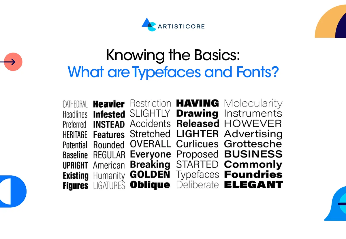
It is important to know what are typefaces and font style definition before getting into types. Having the strong foundation on the definition can ease in understanding the motive of this blog.
Well, a typeface refers to the similar design of the set of characters including letters, numbers, alphabets or punctuations. On the other hand, a font is a particular design within the type face. So, the typeface is the family and the fonts are the family members. Moreover, we can say that Helvetica or Garamond are the typefaces whereas, Helvetica Bold or Helvetica Italic refers to font style.
Elements of Typography
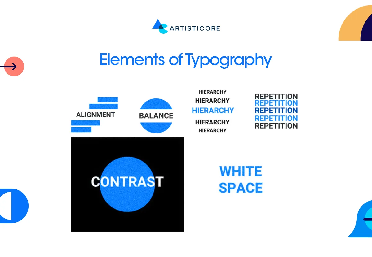
There are also different elements of typography that a designer focuses on to make a beautiful yet functional design. These include spacing, alignment, hierarchy, and contrast. All these elements of typography help increase both readability and tone. The definition of each font style provides its own visual rhythm, which helps to serve Purpose and Emotion to the content.
Font Categories
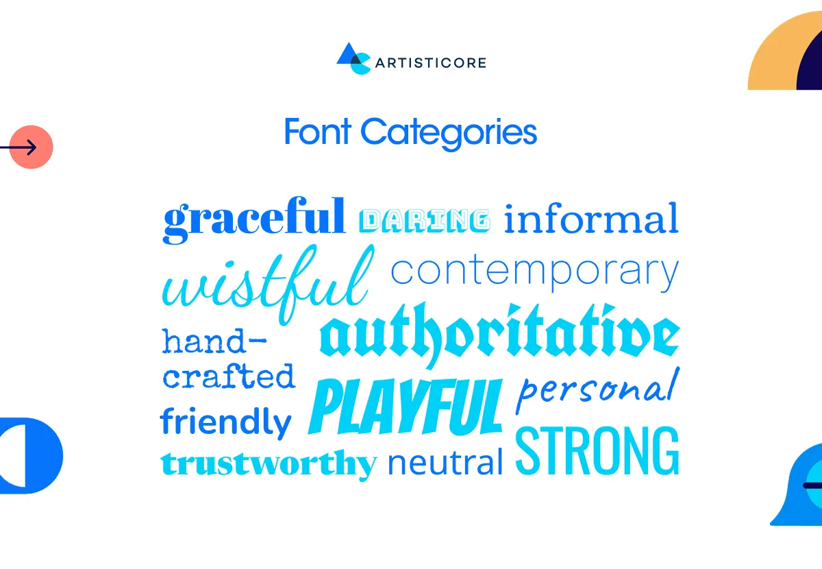
One question that you often find designers argue about is how many fonts there are? Technically there are thousands but when it comes to typology which is the study of typography, types of typefaces have six broad categories:
- Serif
- Sans-serif
- Slab serif
- Script
- Display (or Decorative)
- Monospaced Fonts
To make it easy for all, font classification is done by grouping the fonts according their common characteristics and visual strength.
Serif Typography
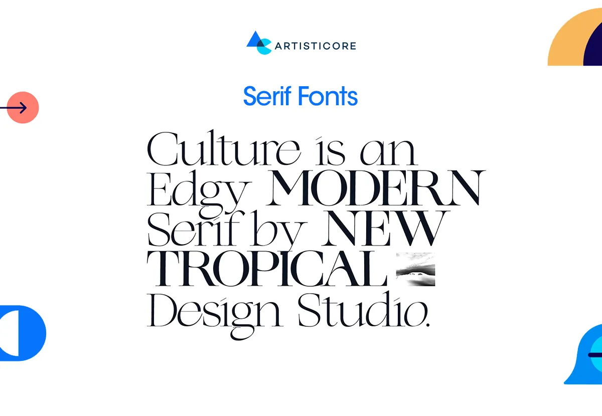
The are famous for their standard, reliable, and classy feel. The whole typography conversation started with serif fonts. This is one of the typeface types that brings trust and professionalism. The font is distinct because of its serif or tiny decorative strokes at the ends of the characters, making it look good in printed books, and newspapers.
Serif fonts are ideal for long and elaborated text content such as print designs, editorials, or academic publications. The tiny serif tails have the motion feel which guides users’ eye, improving flow and understanding.
Serif fonts work best with brands that cherish history and elegance. To better understand Serif typography, look at the Times New Roman font style, Garamond, Georgia, and Baskerville.
Serif Subcategories
There are 3 subcategories that are as follows:
- Old serif style such as Garamond appears soft, and rounded, commonly used in early calligraphy (e.g., Garamond).
- Transitional serif style such as Baskerville has stronger contrasts and more vertical stress.
- Modern serif such as Badoni appears straight with high contrast and low-curve.
Sans-Serifs Typography
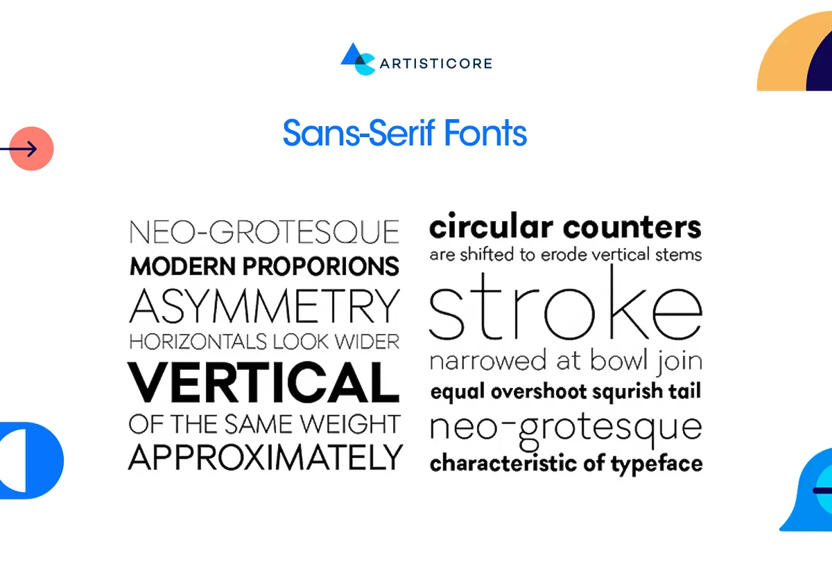
These have a modern, simple and versatile appeal. As the name implies, the font lacks serifs. They are geometric, clean and easily readable on the screens. This kind of typeface classifications are commonly used in modern design to provide digital clarity.
Sans-serifs is all over the webs. Mainly because of it’s easy to read and use across different. In simple terms, they are a fit for brands focusing on user interface and branding. Most of the tech companies and business start-up use this font for its innovation, friendliness, and forward-thinking appeal. The example of Sans-Serif fonts is Helvetica, Arial, Calibri and Futura.
At Artisticore, we take typography as the non-verbal language of design. We believe that the correct font can change your whole brand story letter by letter.
Sans-Serif Subcategories
There are 4 subcategories that explains sans-serif flexible appeal that best fit for digital and print designs
- Grotesque is referred as early sanserif’s with a slightly odd ratio, for example Franklin Gothic.
- Neo-Grotesque are more sophisticated with perfectly balanced forms such as Helvetica.
- Geometric style that requires the use of basic lines, such as circles and squares, for example Futura.
- Humanist is 4th subcategory, the inspiration comes from handwritten font, providing warmth and natural rhythm, for example Gill Sans.
Slab Serif Typography
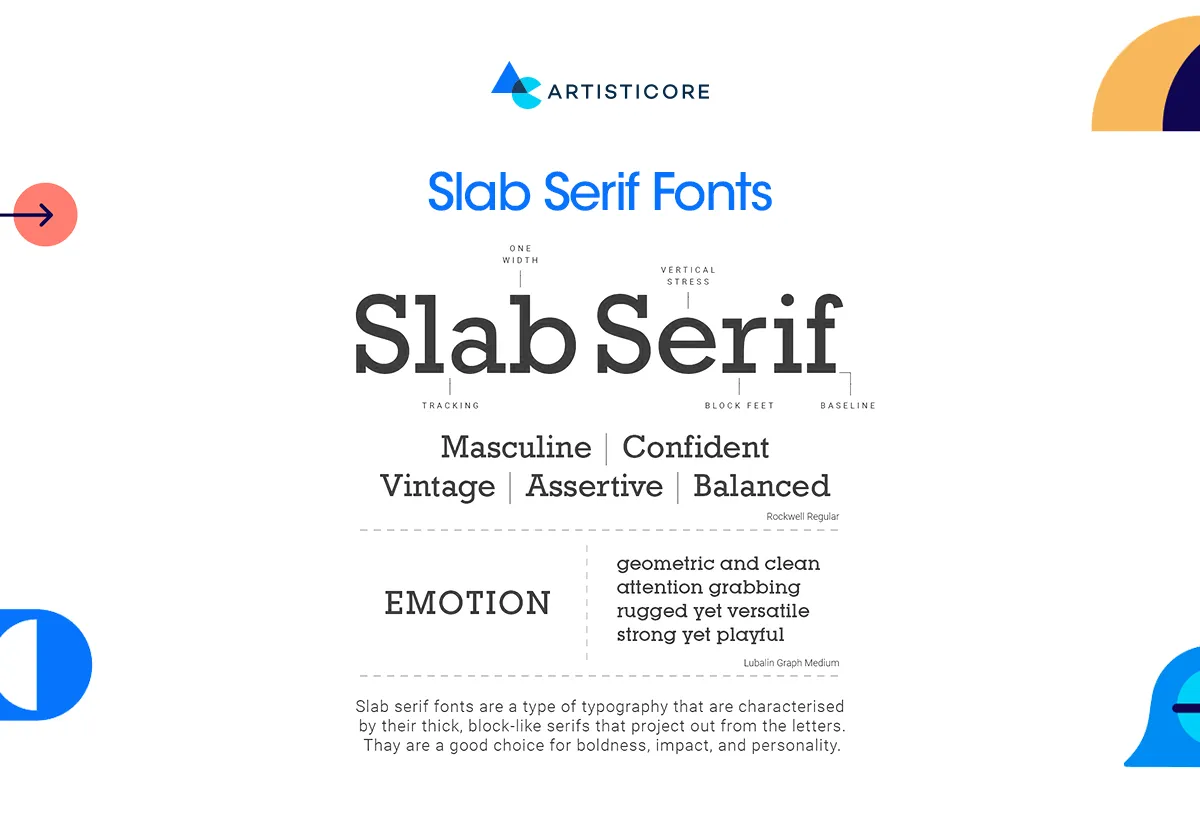
The font style with strong, organized, and noticeable appeal, refer as the giants in the serif family. These have thick, block-like serifs which give a solid and confident look. It is like when serifs speak authority, slab serifs scream confidence.
They are of perfect use in headlines, posters, billboards and logos. All these require instant appeal and focus and slab serif provides that. They are noticeable and gives a feeling of power. Slab serif fonts like Law, Courier and Clarendon are the result of traditional and modern typography, designed to be readable on a digit screen.
Script Typography
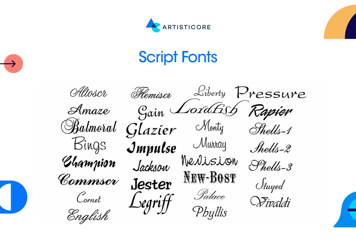
This category has a very beautiful, personal and bold appeal which adds life to handwritten piece of art. There are different kind of fonts available but this one adds emotional expressions and provide a very customized yet artistic vibe with its fluid strokes and artful curves. The kind that is adored by all kind of brands wanting to make an impact.
Script typography is a plus to luxury brands. Such fonts are perfect for logos, wedding invitations, and headlines but not for long descriptive text. Designers need to have basic understanding of all kinds of fonts as too much use of any font can be detrimental to the readability.
Brands like Coca-Cola, Pacifico, and Allura use script fonts to add creative and attractive appeal.
Script Subcategories
- Formal script such as Edwardian was inspired by 17th to 18th century calligraphy.
- Casual script such as Pacifico has less formal and more relaxed appeal.
- Brush script such as Brush Script MT mimics brush strokes, providing movement.
Display Typography
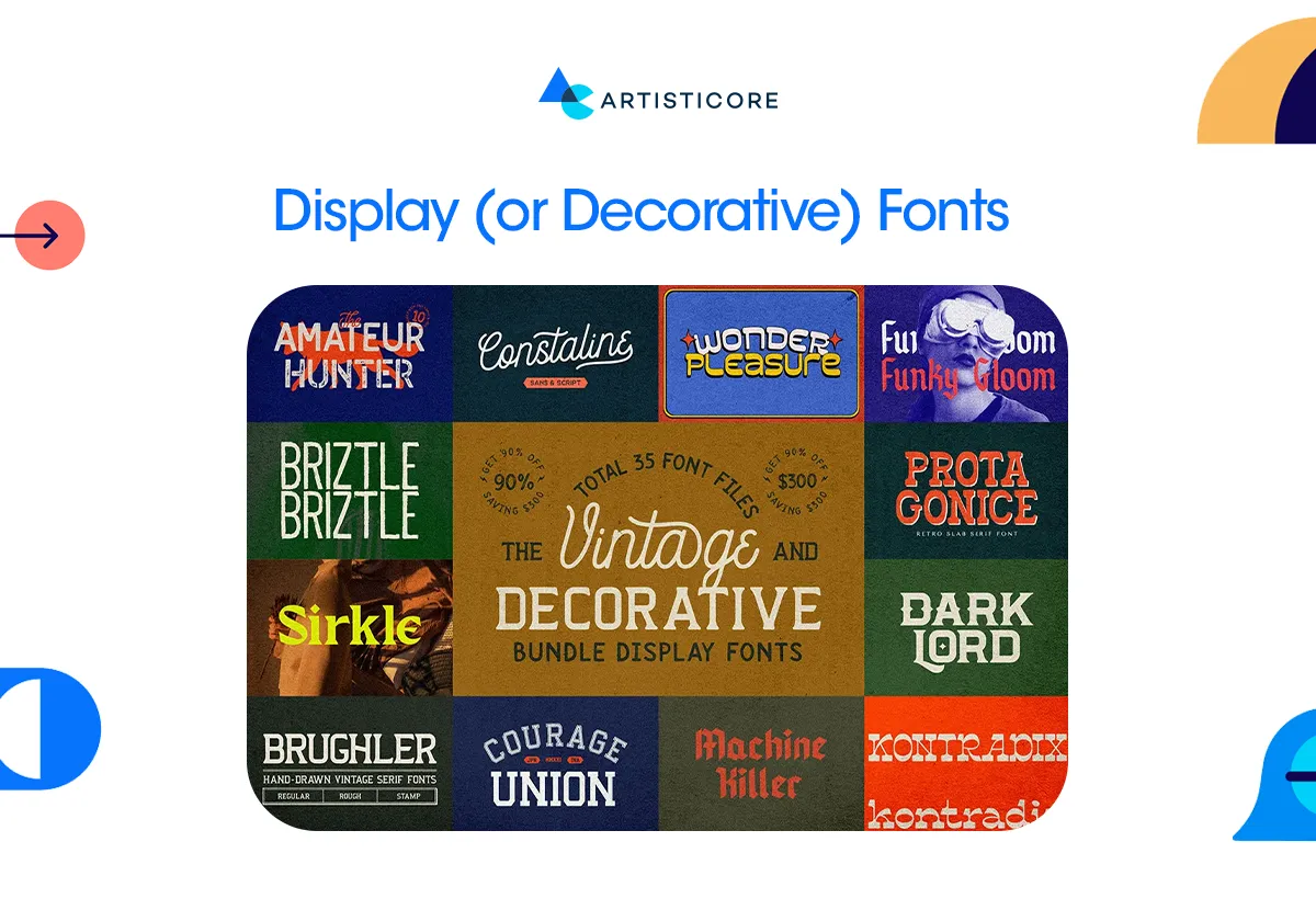
They are famous for their unique, memorable and unique appeal. In easy words, they are unlike any other fonts. Famous for being the extroverts in the world of fonts, display fonts both attract and appeal.
The font works well in headlines, CTAs, posters, marketing and branding. These are the areas where stimulating text and visuals are key more than readable font style. Display fonts as the name implies attracts through its expressive details, dramatic shapes, and a unique feature.
For designers, it is their favorite type classifications to work with because it gives them the freedom to experiment. The popular font examples include Lego logo font, Lobster, Impact, and Cooper Black. All these famous examples of display fonts explain how different typefaces can entice different emotions including playful, dramatic, elegant, or futuristic.
Monospaced Fonts
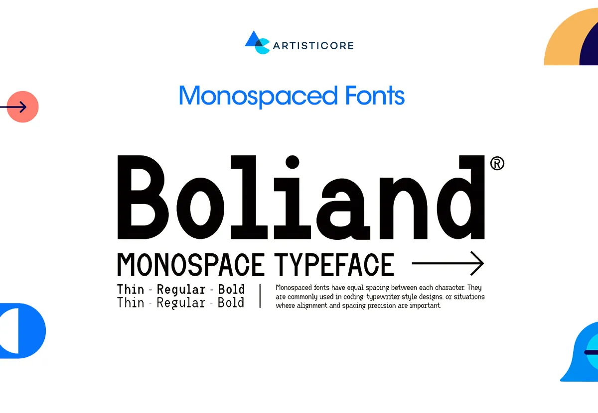
In most articles, you will only find five major font classifications as this one is not yet categorized publicly. Monospaced fonts are also known as fixed-width typefaces and they pay tribute to the era of the typewriter. Each character in monospace fonts has same amount of horizontal space, creating a uniform rhythm in text.
Monospaced typeface is commonly used in programming, coding or design systems where alignment plays an important role. They are easy to use and can be used in minimal branding or editorial design. However, they are not as frequently used in branding to till date.
The most popular examples are Courier, Source Code Pro and Consolas with a technical or vintage appeal. The font adds a sense of authenticity and order which tells us that it is not always important to be decorative when you can do well with the balance and uniformity.
Classifications of Modern Typeface
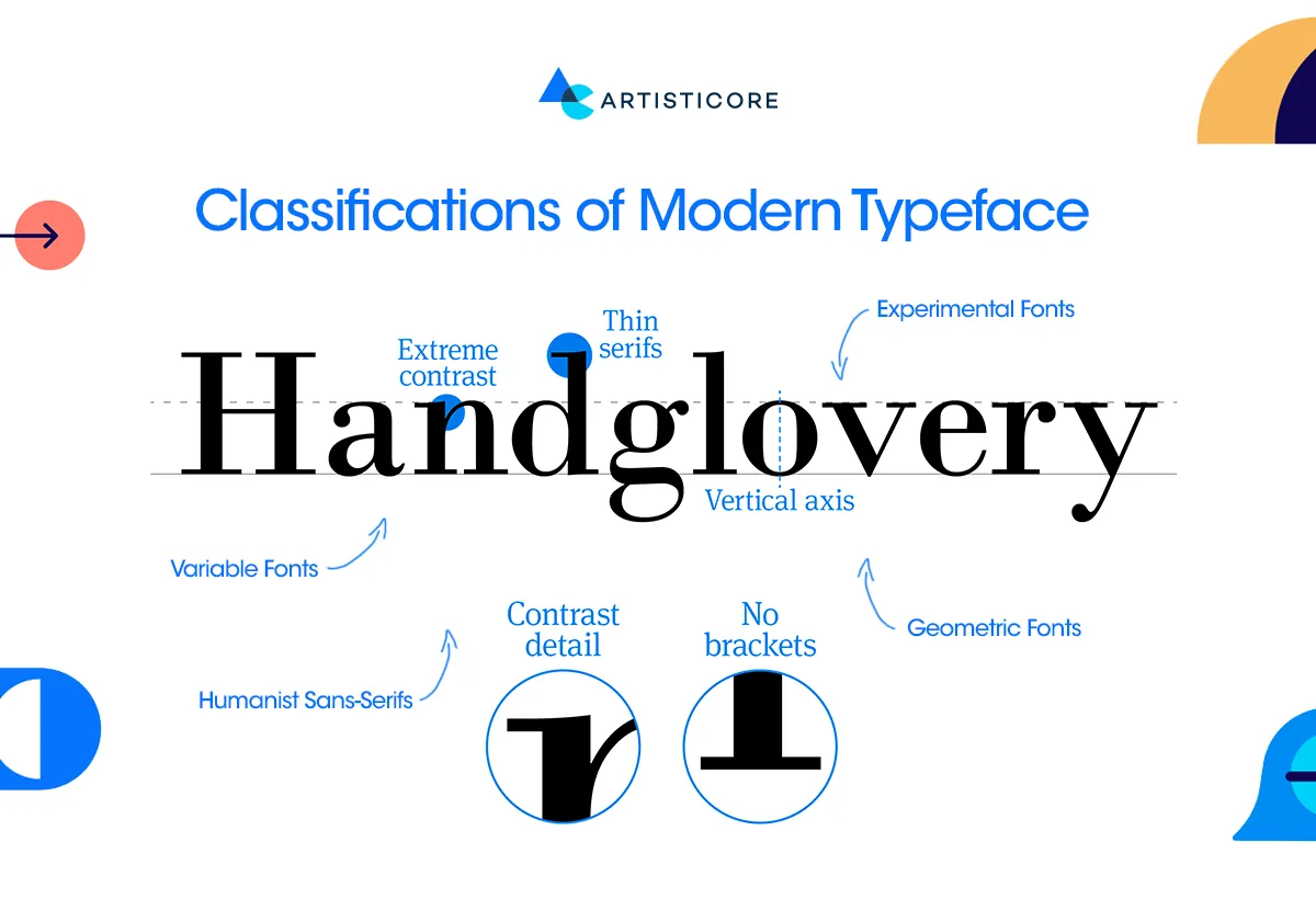
Nowadays, where brands and businesses are more digitalized, the focus of typeface has also shifted towards modern style. To add in creativity, designers find a new approach of mix and matching the old and the new font style. This helps designers satisfy brands with distinct font identity.
In design, we study different design elements and typography plays an important role from the start. By combining traditional and modern types of typography, it is possible to deliver design that suit brand voice and identity. Some of the new and emerging types of typography are:
Variable Fonts
These are the types of typefaces that can modify with change in weight, width, and slant. Variable fonts are the type that is adored by designers in responsive web design.
Geometric Fonts
As the name suggest, the font requires use of geometrical shapes that works well. By using clean mathematical shapes, designers outshine business branding and marketing goals.
Humanist Sans-Serifs
Unlike sans-serif, they have low contrast between the thin and thick strokes. The type is first designed by famous Steve Matteson because of it warmer and legible appeal. It is easy to read, understand and can be used for both headlines and body text.
Experimental Fonts
The type of typefaces that has broken all the rules of old typography. Experimental fonts are unexpected, attractive, new and interactive. Famous graphic and digital design companies use this kind of fonts to convey the required mood and brand personality.
In this era where visual landscape is expanding like anything, having the right knowledge of each type of typeface is important in creating flexibility and brand consistency.
Still confuse, contact Artisticore for proper consultation. We offer wide range of graphic and digital design services all across the globe.
Typography Trends and Market Insights
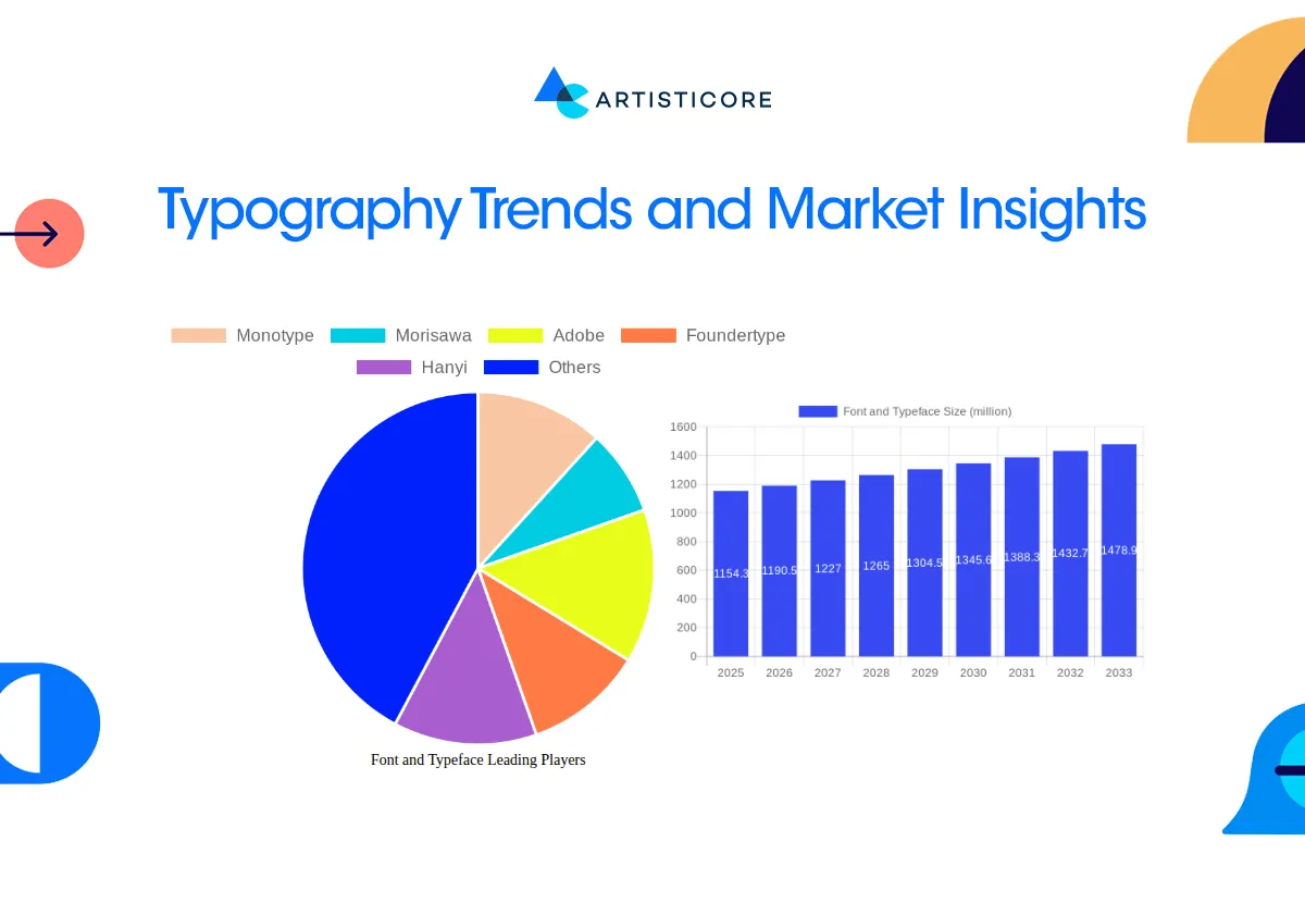
Typography is believed to be the design element that has everything to do with art. Well, it is not true because according to statistics, it is an expanding industry.
Global Value
According to a study by Global Growth Insight, the font and typeface market had a value of 965.4 m in 2021 which is expected to grow up to 1.33 billion in 2031. Such increase demonstrates the importance of various typefaces to the branding and digital experiences.
Geographical Demand
As stated in the reports of Cognitive Market Research, the font market has a solid geographical demand. The North America global font market value was 41.26% in 2021 and is expected to grow by 4.2% from 2024 to 2031.
Cultural Value
Font style has a cultural impact as well. In different regions of the world, different fonts are preferred. For example, as mentioned by a credible source Priceonomics, in the most playful state of US, Nevada, a high percentage of people prefer using script fonts. Moreover, Nevada is the most font-sensitive state with 10.34% of users employ fonts like Comic sans to make posters, infographics.
Save Money and Rebranding
When choosing from the different types of typography, even the practical decisions count. From the source Toner Buzz, we came to know that picking the right font type can reduce printing cost up to 77%.
Impact of Fonts on Reading and Comprehension
Font readability can influence the amount of time it takes for readers to process the information. There are difficult to read fonts but easy to recall fonts like Monotype Corsiva as documented in Harvard Business Review.
According to the study by (Wallace et al., 2022), fonts can slow down the reading pace by up to 35%. This is because some fonts are easier to process by the brain and the readers find it easier to retain information. For examples, fonts with open shapes and equal spacing (such as Open Sans or Georgia) are more readable on screens. Whereas, decorative requires time to understand.
Why One Typeface Doesn’t Fit All
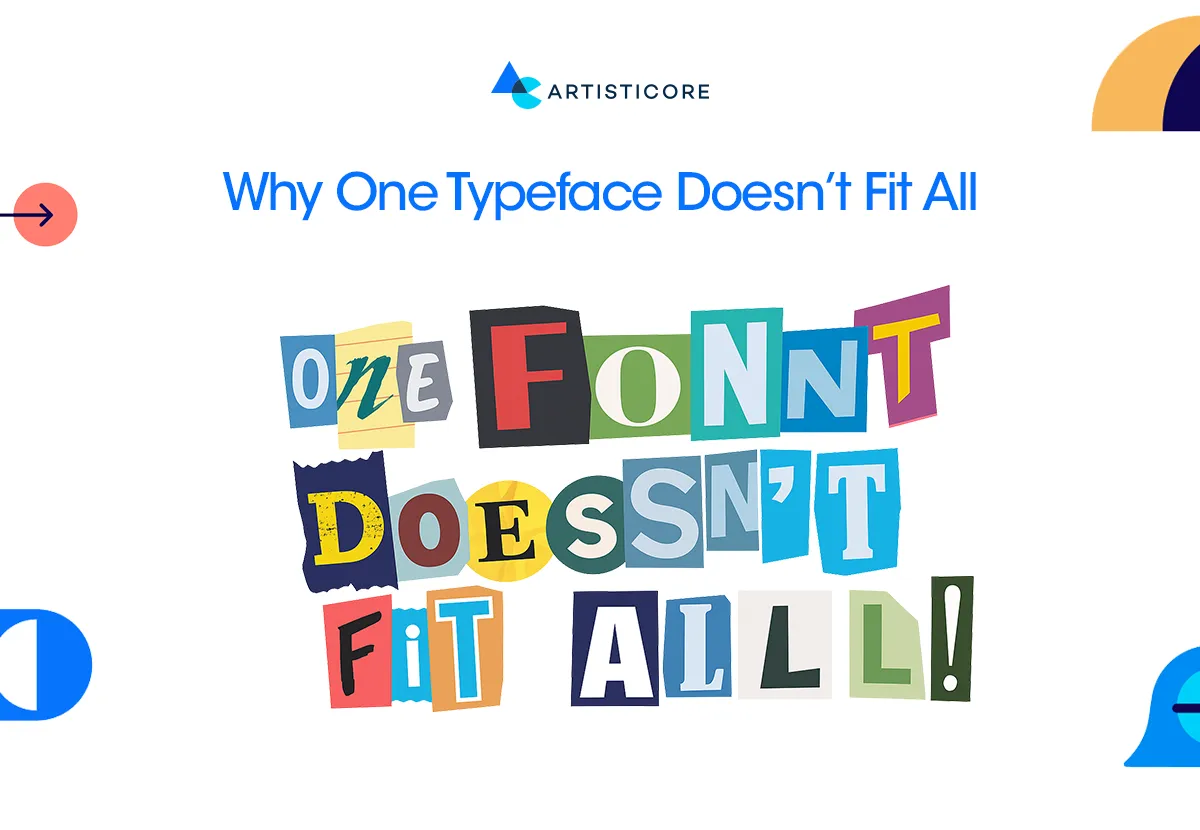
For reading purpose, it is a common knowledge that one single font can never be the choice for all. According to the study registered in ACM Digital Library, it was found that everyone reads at their own pace and comfort. The choice of choosing from the different types of typography is truly personal.
There are certain factors such as age, reading habits, and font display size that impact the idea of one fit font for users. So now, for designers, understanding redefines the concept of universal typography.
Instead of looking for the best font to use, look for the one that fits for your target audience. This practice can be fruitful as well as experimented by brand like Apple and Medium. They choose design fonts that suit their digital space and user needs.
The Rise of Interlude Reading in Web Design
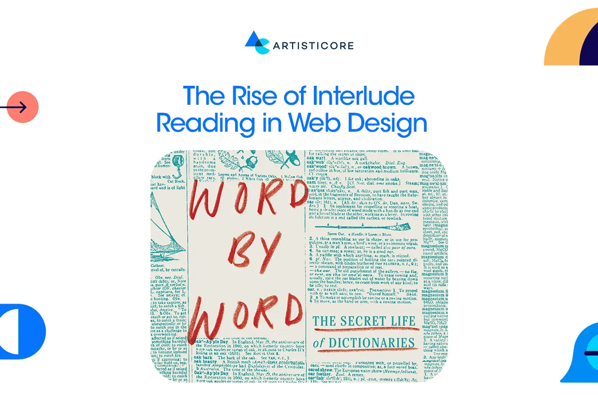
The practice of reading is not linear anymore; it is now fast and fragmented. Users are not reading word by word, they are now scrolling, skimming, and pausing according to their comfort. This practice is known as “Interlude Reading” which is a brief and intermittent activity between screens.
After reading these behaviors, the role typography has become more important than ever. Designers are more inclined towards fonts that are legible and responsive across platforms.
Another important lookout is having fonts that works best on mobile layouts. For examples, sans-serif fonts such as Roboto and Lato are prevailing because of their clean geometry. In the meantime, variable fonts are becoming a design utility. It allows easy flow between font weights and styles to provide responsive typography.
As the attention span is reducing, choosing the right font type can provide visual comfort and retain users’ attention.
Need for Customized Typography
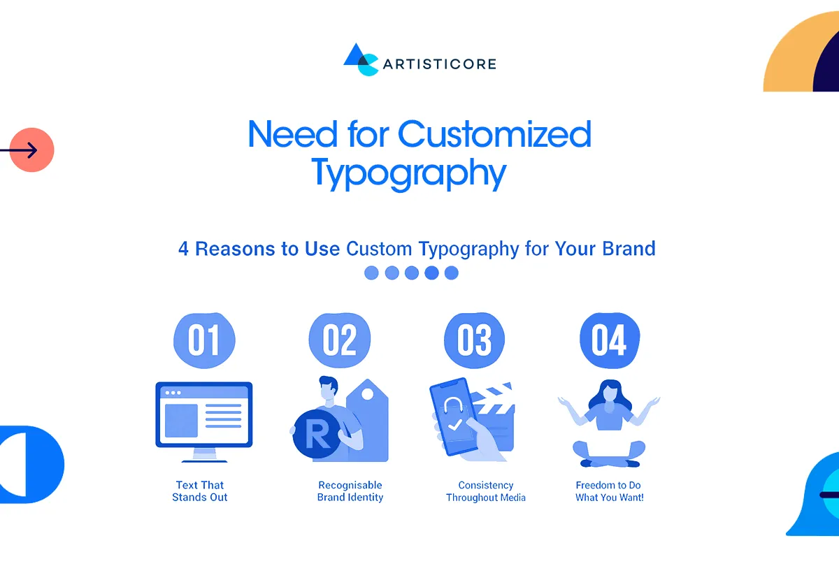
The future of design is based on personalization and the types of typography is no longer an exception. We are now heading towards personalized reading experiences. You can witness how online experiences are becoming increasingly customized to user choices.
To better understand, imagine you are on a website or an app that adapt font type, font size, and font spacing to your preferred reading style. What will happen? You will more likely to stay, read and interact right?
This is an AI based tool technology that makes brands become more accessible, professional and trust worthy. Users will only spend more time when they feel confidence.
Big and famous brands like Netflix, Google or Spotify Mix, has already adopted this approach. This approach is the ideal combination of technology and creativity, providing exceptionally personalized experiences in a more digital world.
Role of Typography in Web design and Brand identity

It is true that choosing the right type of typography is important to keep a consistent web design look and brand identity. The font will decide whether your brand message is going to be understood and remain memorable or not.
To this date, we have a pool of different types of typography, but the goal is to choose a font that fits the brand, its voice, its tone, and the target audience. Typography in web design is not parallel to garnishing mint on the dish, just to make it look good. It is rather about directing users and creating a sense of trust and influence on the overall user experience.
Reliable and Classical Feel
For brands wanting a professional and traditional web page look, Serif fonts is a perfect choice. This is one the types of typography that famous brands like The New York Times, Vogue, and Tiffany & Co. use. You can identify serif typeface in their websites and feel how it is conveying authority and eternal elegance. Serif fonts are ideal with luxury brands, editorial designs, and companies that need to convey stability and tradition.
Minimal and Modern Feel
The fonts of modern web design are sans-serifs. They are concise, creative and friendly which is why brands like Google, Spotify, or Airbnb use them. It provides a clean and easy to use interfaces that make digital reading easier.
Emotion and Personality Appeal
When your brand is creative or emotional, script fonts can add a touch of warmth to your web design. There are popular brands like Coca-Cola and Instagram who use this typography to add an emotional touch. From all types of typography, this one is an effective choice for web headers, logos, or promotional materials design.
Bold and Confident Appeal
Slab serif fonts, which Sony and Volvo use, bring power and order to bold and confident web identities. Their cubic, or geometric looks work perfectly for eye catching headlines, product pages or branding which requires authority.
For Accuracy and Form
Brands like GitHub and IBM use monospace fonts as they are based on technology. This kind of typeface provide with more accurate, consistent and functional appeal which is become the primary goal for them. Monospace font with its fresh and technical touch fits well for coders that develop interfaces.
Innovative and Expressive Feel
For this kind of appeal, display types works best as they are bold and attention grabbing. Creative brands like Disney, LEGO, and Fanta use display fonts to make a bold visual impression. These fonts work best to draw attention, making your brand easily recognizable.
Contrast and Harmony
To provides hierarchy and rhythm to the visual, the only trick is to make sure that your fonts are readable, brand driven and compliment the whole narrative.
Want to pick fonts for your brand story? The creative team at Artisticore develops tailored typography style to make each of your brand message memorable for all.
Best Tools to Study Fonts and Typography
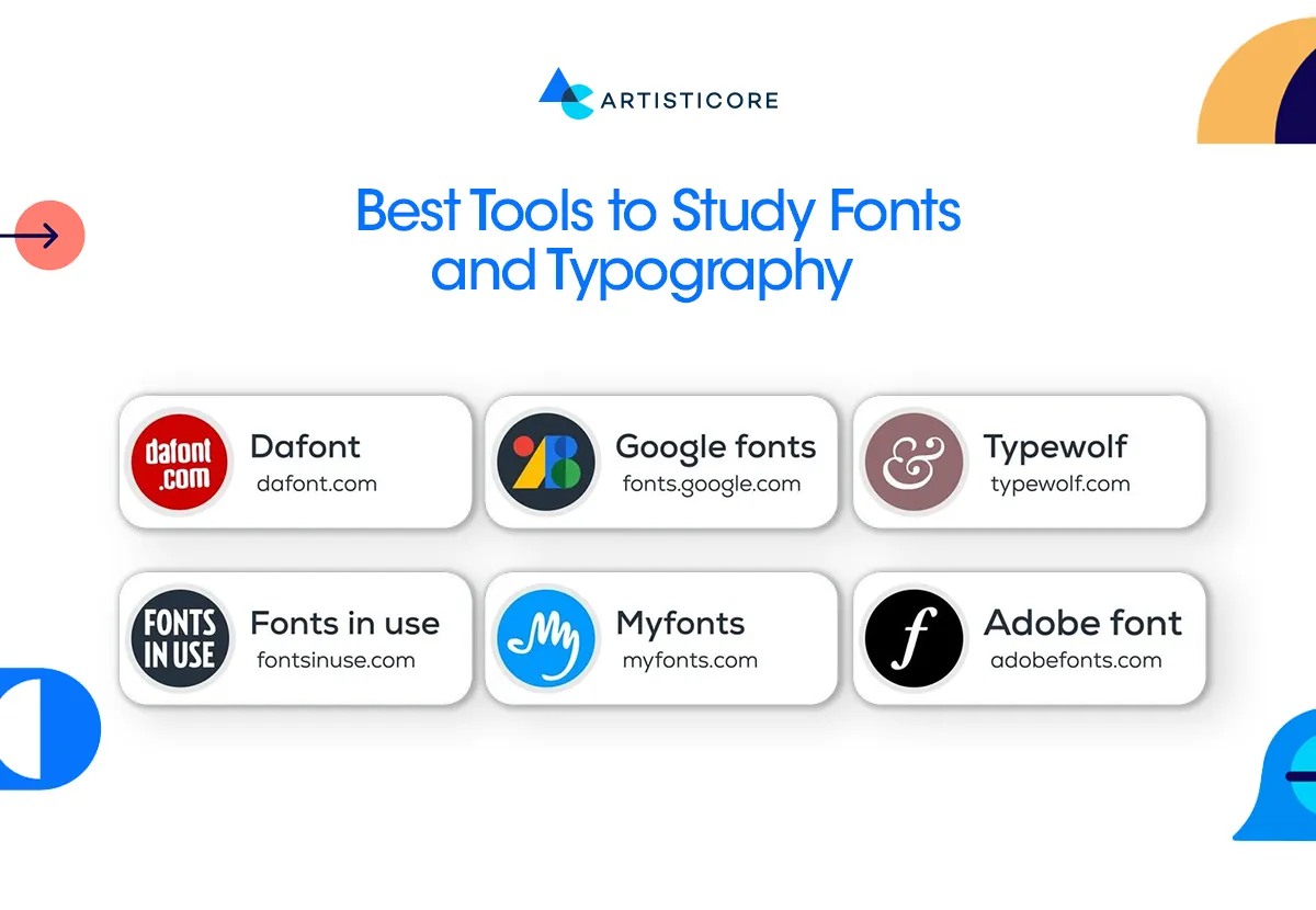
When you have the proper tools, you can easily study, explore, pair and preview fonts. With tools, it becomes so much easier to choose the right type of font. The following are some tools that you can use:
Google Fonts
It has hundreds of free, web-safe typefaces. They do not only load quickly but also look beautiful on any device. Google Fonts is just like a dream come true to every low-budget web designer.
Font Pair
This helps in finding the right font combinations. It gives you examples that help better understand which two types of typography can go together.
Adobe Fonts
It provides you with thousands of high-quality, and professional fonts that work with Adobe Creative Cloud.
WhatFont Tool
If you are at a website exploring and you wonder which font the site has used. Go to WhatFont Tool which is a Chrome extension. This will help you know everything with just a single click.
Type Scale
It allows you to make consistent font sizes and hierarchy, making your typography harmonized across all screens.
Fontjoy
Last but not the least, a token of magic from AI help. Fontjoy is an AI based tool that will automatically recommend you font pairs based on visual similarity and contrast.
Wondering How to Pair Fonts as a Web Designer?
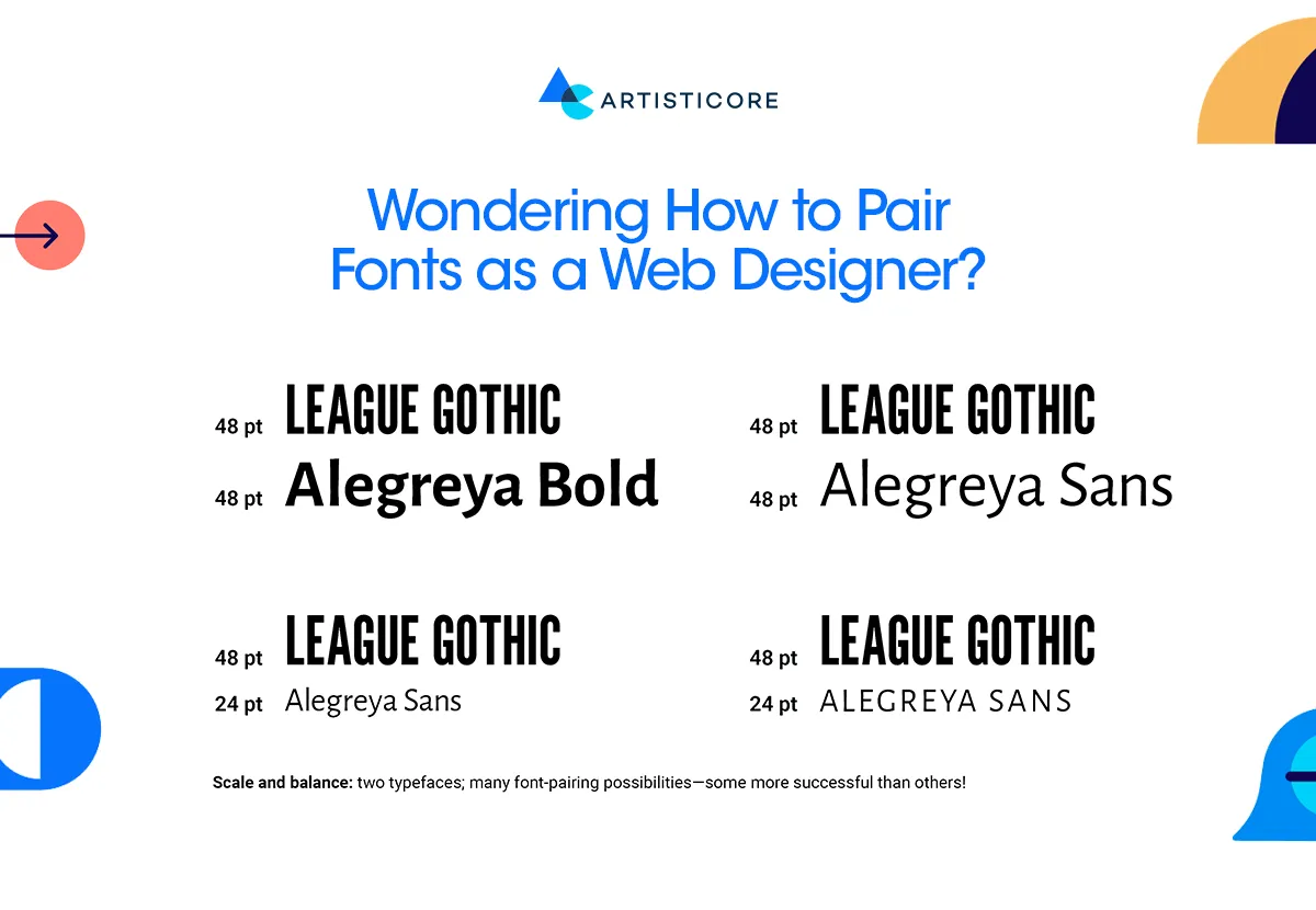
It may sound complex but it is very easy when you have the basic knowledge. This blog is written to give you that basic idea. The art of using the right fonts requires creativity and which one is going to entice that required psychological impact on the audience.
Combining typography types gives your design with texture and hierarchy. It leads your readers through the content naturally.
Some of the best practices that one can use are as follows:
- Use limited font combinations. Maybe two or three, but not more than three.
- Always choose the one that matches your brand identity, its message and tone.
- Make sure that the formal body font is not conflicting with a playful headline font. Apply the art of hierarchy.
- It is better to add contrast, weight and size to put emphasis on the font.
- Check accessibility to make sure the types of typefaces are visible on each kind of screen.
Conclusion
When working on the design elements like typography, do not go for any style but strategize. Take your time to find the correct one that can deliver what you aim to deliver. The types of typography you are choosing is going to change how audience engage with your content, your products and services. Even, it will affect how you want them to recall your brand in the future.
The types of typography is a pool and your job is to take the one that fits your story well. Strategize, whether you want serif professionalism of the serif, or sans serif clarity. In design, fonts play a key role in delivering your brand message. As they say, it is words that speaks to your audience but if you want to touch them, use the right font.
FAQs
A web font refers to Google Fonts can be obtained from online libraries. The best part about them is that they allow you to be creative as they are highly scalable. Whereas, system fonts are already installed on the devices. They are quick to load but lack creativity.
It is preferred to use two or three fonts, one as a heading’s font, one body font, and one accent font. This is because excessive use of fonts can clutter the user and overpower your design.
Sans-serifs Grotesques typefaces such as Franklin Gothic and News Gothic fonts are highly industrial. They are frequently used in headings and bold branding. Whereas, Humanist San-serifs, including Gill Sans, Optima and Myriad Pro, have more organic forms. The font type has inspiration based on hand writing that make them useful in friendly and readable text.
The goal is to add contrast and harmony in font design. This can be achieved if combine a serif font (to be sleek and old-fashioned) and a sans-serif (to be clear and up-to-date). For example, combine Playfair Display (serif) and Montserrat (sans-serif) to create a balanced and stylish look. The idea is to avoid having any chaos in visual rhythm which is possible if we avoid pairing too similar or incompatible fonts.

Hafsa Hanif is a talented content writer at WebnHubs, specializing in topics such as graphic design, web design and development, logo design, and animation. With her deep understanding of design principles and creative processes, Hafsa crafts engaging, informative, and SEO-optimized content that resonates with readers. Her expertise in SEO ensures that her articles not only captivate audiences but also rank well on search engines, helping businesses boost their online presence through compelling design-focused narratives.
