15+Website Layout Examples to Inspire Your Next Design in 2025
Author :
Website layout arguably stands out as the most crucial thing one wants to think about when setting up a new site. Why, you may ask?
A well-planned layout makes your site easy to use and offers a good experience to people exploring it.
Whatever you’re creating, be it a blog site, an e-commerce store, or even a business website, your site’s layout establishes the vibe first.
In this blog, we will define website layouts, explain why they are important, and provide over 15 examples of great layouts to inspire you in 2025.
Additional tips are thrown in here for creating layouts that look pretty and are super easy for users.
So, if you’re embarking on a design journey either at ground zero or are midway through, this guide provides website layout examples for you to take website layout ideas from.
Let’s get started already!
What is a Website Layout?
The layout of a website is similar to the blueprint or skeleton of a website. The layout includes how everything is positioned on the page. Examples of objects positioned on a page could be pictures, text, and menus.
Just as in a room you have a bed, a table, and a window placed in certain positions, websites comprise sections that format together to create a nice-looking, organized location.
A good layout establishes a good flow for the users who are looking for something specific quickly without having to go through several clicks and become confused or lost!
Importance of a Good Website Layout
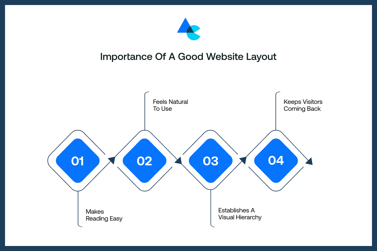
Great website layout design examples aren’t just about looking nice; they help people enjoy the site, understand your content easily, and want to keep coming back for more.
Here are some reasons why having a layout inspired by good website layout examples matters:
Makes Reading Easy
A clean and clear layout allows a person to read without confusion or tiring. This means a laid-out piece with a good amount of spacing between the text. The text is broken into small parts and has headings that divide it and make it easier to go through. After all, nobody wants to read a huge wall of words. A good layout makes it easy to read content.
Feels Natural to Use
Visitors tend not to ponder over where to click when the layout feels natural. Everything falls into place pretty much where you expect it, and menus hover up top while buttons stay visible. It feels like stepping into a space that is familiar with everything recognizable.
Establishes a Visual Hierarchy
Visual hierarchy refers to indicating what is the most important first. Titles that are bigger, bolder, or brighter tell the viewer, “Look here!”
It assists you in guiding the visual movement from one area on the page to another in an appropriate time order. This makes the whole experience easier and more fun to follow.
Keeps Visitors Coming Back
When a website is easy to use and looks nice, people remember it. They’re more likely to visit again if the layout made their first visit smooth.
A good website layout builds trust and comfort, just like your favorite app or game that you keep opening because it feels right every time.
Key Elements of a Website Layout
All great website layout examples have certain parts that work together to make it easy to use and nice to look at. Here are the key components of a website layout:
- Header: Headers appear right at the top of pages, typically on every single page. It includes a logo alongside the navigation menu and houses the search bar at the top right corner of the webpage. A clear header helps visitors understand their location and navigate your site with considerable ease around its various web pages.
- Main Content Area: Important content like text, images, videos, and services goes in this central page section. Viewers spend most of their time here, so it must be properly organized with a structured layout.
- Sidebars for Additional Content or Navigation: Sidebars typically sit to the left or the right of the page. Sidebars can be links, ads, or any other helpful information. They sit next to the main content and augment it without competing for focus.
- Footer With Links and Copyright Information: The footer is at the bottom of the page. It contains links to the privacy policy alongside social media profiles and various disclaimers or legal notes. Footer functionality enables finishing the page layout quickly and effectively..
- Consistent Use of Color, Typography, and Spacing: Consistent use of colors, fonts, and whitespace between elements lends an air of freshness to your website. Moreover, consistent web design elements steadily unfold across each page, creating subtle connections that convey professionalism.
Things that Make a Website Layout Great
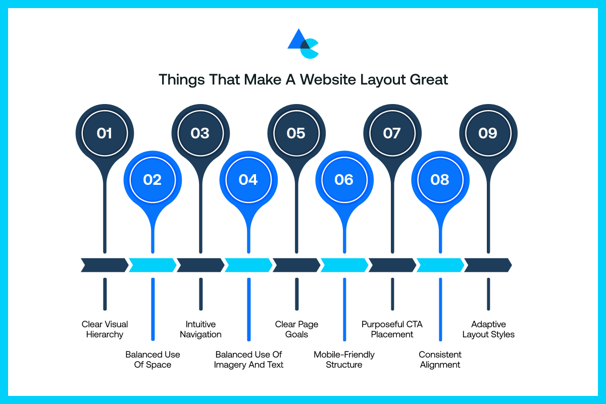
A great layout isn’t just about website layout design; it’s about how everything works together to help users understand, explore, and enjoy your website without confusion or frustration.
Here are some of the best things that all great website layout examples have:
Clear Visual Hierarchy
Visual hierarchy is the order of things that matter the most, with the important ones being at the top of the page.
Larger titles and bold fonts with contrasting colors attract the reader’s eye to important information.
It guides users towards next steps by hinting at where they should glance and what to click next. A page can appear as a mess without it, resembling a jigsaw puzzle missing its picture.
Balanced Use of Space
White space is a good friend of yours! It gives the eyes room to breathe and prevents the site from feeling hectic and overwhelming with lots of visual elements stuffed together everywhere.
White space used right across everything gives a sense of calm for readers and proper organization on the pages.
Intuitive Navigation
Visitors should never be misplaced or confused about what is happening on your site. Intuitive navigation means visitors can easily find what they are looking for – with menus that are easy to understand and links that lead to where they want to go.
The easier it is to find the information, the longer a visitor will stay on your site, and the better experience they are likely to have using your website.
Balanced Use of Imagery and Text
Excessive images can feel cluttered, and too much text can be boring. A well-crafted visual layout typically includes images alongside text in moderation, balancing both elements.
Images are more likely to catch the viewer’s eye and communicate things quickly, while words present the details.
Using both images and text in their rightful proportions will create an engaging and more understandable site for all audiences. This balance also plays a major role in different branding styles — whether you lean toward minimalist vs maximalist branding, your layout must support that identity with clarity and consistency.
Clear Page Goals
All pages on your site should have a clear purpose – selling products, confirming sign-ups, or just sharing information.
Having a clear layout is a way to support that purpose by drawing attention to its priorities. The layout will keep the customer on track and actually help the site do its job.
Mobile-Friendly Structure
People access websites on smartphones these days. So, the site design must function properly on small screens.
A mobile-friendly layout matters greatly because your site retains an appealing look, buttons are easy to tap, and the text is easy to read.
If it does not function correctly on mobile, for sure that visitor will leave quickly, and might not ever come back!
Purposeful CTA Placement
Calls to action (CTAs), such as “Buy Now” and “Contact Us”, should always be placed in a spot that audiences pay attention to.
An excellent design has the right amount of knowledge about when and where to place those buttons for them to be noticed.
The possible audience may want to proceed to the response if they are not hidden or confusing to the audience.
Consistent Alignment
A consistent and proper alignment of text, buttons, and images throughout your website is a nice touch that will create a clean and professional look.
Contrastingly, when the elements are randomly placed, they could appear rushed or unkempt. Consistent alignment creates cohesion so visitors can easily follow the content and indicates you are paying attention to the little details.
Adaptive Layout Styles
Today, websites need to be responsive to screens and devices. Adaptive layouts change according to screen size and stay visually ravishing on varying display dimensions.
Your adaptive layout will fit on whatever device people happen to be using, such as phones or desktop computers.
Responsive and adaptive layout significantly enhances a modern site and offers an easier user experience for all users.
Tips for Creating a Good Website Layout
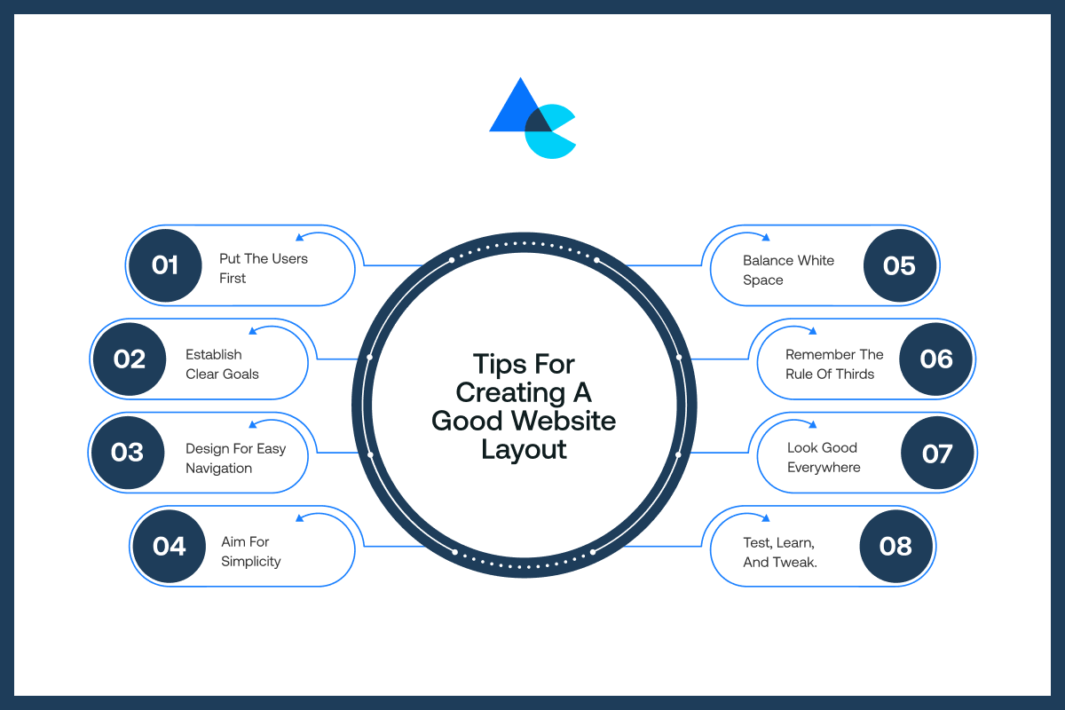
Before we get to website layout examples, you must know how to make a layout great. So, let’s look at some helpful tips on how to design a website layout that looks good and works even better.
Put the Users First
Always think about the people visiting your website. What do they need? What do they want to see first?
A good layout should make things easy for them, not just appear fabulously cool. Happy users who find stuff quickly tend to stick around and come back later pretty frequently, it seems.
Establish Clear Goals
Before you design, know what each page is for. Is it selling something? Sharing a blog? Getting sign-ups?
When your goals are clear, your layout can support them. This helps you focus the design around what matters most, and helps your visitors know exactly what action to take.
Design for Easy Navigation
Visitors shouldn’t have to search around or get lost. Create a menu that’s simple and easy to use.
Group pages in ways that make sense, and keep important links easy to spot. If navigation feels smooth, people will keep clicking and exploring more of your website.
Aim for Simplicity
Don’t attempt to shove everything on one page. Make it cleaner. A simple website layout loads faster, is easier to read, and is easier to understand.
Excess buttons, colors, and pop-ups only distract the user. A simple design does not mean boring; it means intelligent and focused design that only exposes the user to the most important parts of the job.
Balance White Space
White space isn’t wasted space. It is a space of the most use! It gives your content room to breathe and gets people to focus on what matters.
When everything is so tightly packed, it becomes unreadable. But when you use white space well, your site will feel open, neat, and more comfortable for the user.
Remember the Rule of Thirds
This design trick comes from photography, but works great for websites too! Imagine your screen divided into three equal parts.
Place important stuff along those lines or where they cross. It helps create balance, keeps things visually interesting, and naturally draws the eye to what really matters.
Look Good Everywhere
Your layout must function well across all screen sizes, including desktops, laptops, various tablets, and smartphones. Things must remain intact so buttons are tappable and text stays legible pretty much all the time.
A layout that works well in all places ensures that everyone is still inspired, regardless of the screen they have.
Test, Learn, and Tweak.
Design isn’t finished once launched. Experiment with other styles, seek feedback, and consider what you like.
Everything we try is an opportunity to see what works best. Even minor changes may produce significant results.
The very reason we test is to figure out what users prefer. All the little edits will help keep things current. Learning and improving should be an ongoing priority – our layouts can always get better!
15 Best Website Layout Ideas to Inspire Your Web Design
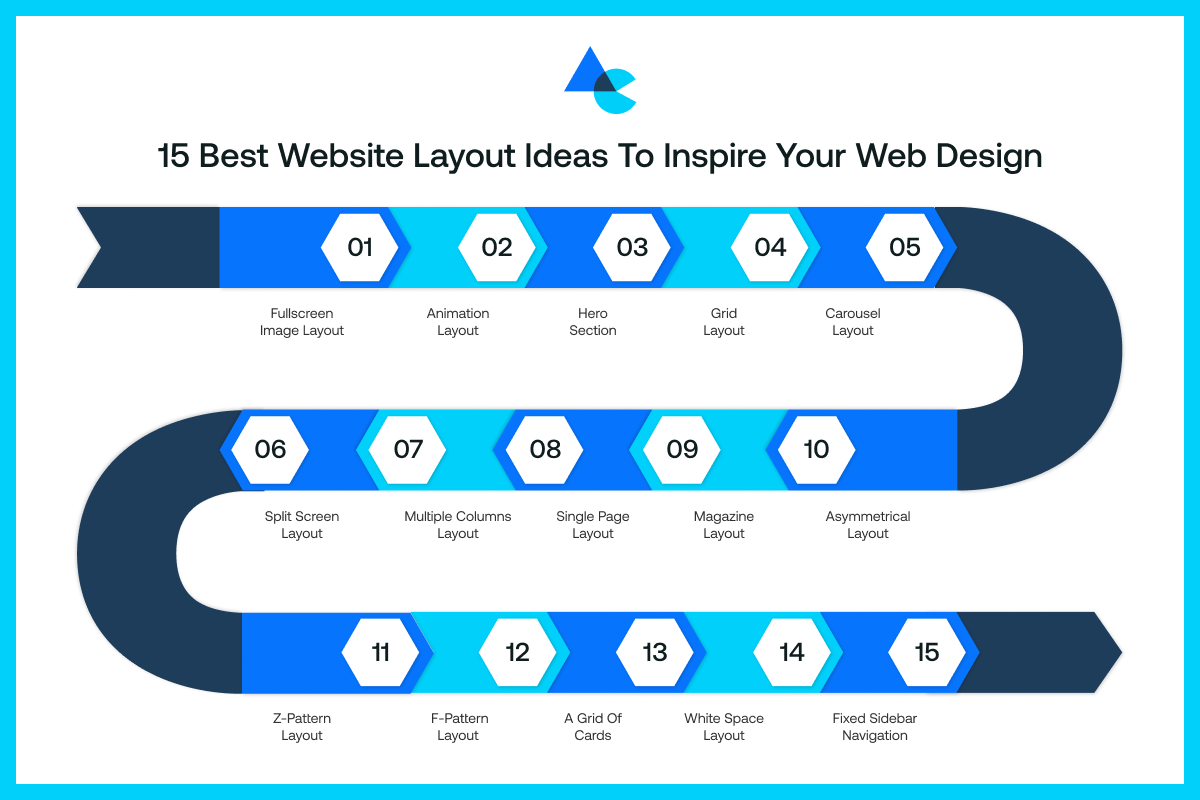
There are many website layout examples to choose from, but some stand out because of how well they look and work.
Here are a few eye-catching website layout examples for your next website:
1. Fullscreen Image Layout
This is the best website layout for SEO. This layout captivates users with a large image displayed full-screen. This layout would work well for something clearly bold, like a product, a location, or an announcement.
A bold main image is showcased on this layout with little text, keeping the page clean for making a strong initial impact.
A headline and CTA button may be included to steer customers toward desired outcomes effectively with some skill. Ensure the image loads rapidly on mobile devices and appears good.
2. Animation Layout
Animation is one of the best website layout examples. Also, animation on websites can refer to moving elements on the website to create an experience that feels more alive and interactive.
For example, icons that wiggle when you hover, smooth scrolling, or images that slide as they come into view.
All these features can deepen engagement with your website; combined with all the other aspects of your website, they will definitely make your site more enjoyable to use- but there is no reason to overwhelm the user with stimulation.
Animation can help lead a user’s attention as well, when there is a button to click or a product that’s featured.
Finding a healthy balance with animation is key; when there is too much motion, it can distract the user or just be slow. The goal should be to take advantage of animation where there is value.
3. Hero Section
The hero section is the big top part of your homepage. Typically, it contains a powerful image or background, a headline, and a button.
This is where you introduce yourself and what you do, quickly! It should be short and clear, and exciting enough for visitors to scroll down for more.
A well-crafted hero section makes people stop and engage. Whether you’re promoting a new product or your entire brand, this space sets the tone for everything below.
4. Grid Layout
A grid layout organizes stuff into rows and columns, somewhat like a checkerboard with plenty of space in between each item.
Grid layouts prove useful for displaying a good amount of content, like blog posts or products, allowing users to quickly skim through organized content.
Grid layouts can have a uniform size of all boxes or different size boxes throughout the layout. The use of a grid layout website allows users to find what they are looking for rather quickly in an organized manner, rather than overwhelming them with content.
Most importantly, grid layouts function effectively across both desktop and mobile environments when laid out responsively.
5. Carousel Layout
Carousels enable users to flip through multiple content pieces in one space, somewhat like browsing through a slideshow.
Carousels are the best website layouts when showcasing diverse stuff, and space is a major constraint. They help put content nicely without taking too much space.
Users can navigate through slides by swiping or clicking whenever they want. A banner-shaped carousel allows for a clean, laid-out, interactive page. It should also be simple and contain quality visuals, as well as not too much content or too long a slide.
6. Split Screen Layout
The split screen design provides a center point to split your page down the middle, vertically or horizontally, showing two things at once.
You may have text on one side, and a picture or video on the other. It’s a great design if you have two messages, two products, or if you want to compare two ideas.
It can feel very modern and visually balanced when done correctly. Above all, it allows you to draw equal attention to both visuals and content without it feeling weighty.
You often see this style used on website homepage layout designs or landing pages, and even page designs that showcase a product on both sides.
7. Multiple Columns Layout
This layout divides content into two or more columns, much like a newspaper or magazine layout. It works well when displaying features, services, or blog articles.
Multi-columns are great to break up long pages, even when listing many things, and it doesn’t make a user scroll on and on without stopping to take a breath.
Also, it keeps your content neat and makes it easier to follow. You can use it to display icons, short descriptions, or your topics grouped next to each other.
Just keep in mind that it should still look good on smaller screens where the columns stack vertically.
8. Single Page Layout
With a single-page layout, everything is contained on one extended page, rather than splitting your content across various pages.
Visitors simply scroll down to access all the content – about, services, pricing, and contact. A single-page layout works well for portfolios, small businesses, or landing pages where detailing a smooth storytelling transition is desired.
Navigation is simple and quick with a single page – fewer clicks, no loading pages equals users staying in the zone. Just remember to include distinct sections of content and anchor links to help users navigate the page while scrolling.
9. Magazine Layout
The magazine layout is based on real magazines and is full of content, including stories, images, headlines, and sidebars.
It makes sense for blogs, news websites, and content-rich sites because this layout encourages organization of everything so that it can be explored without feeling ‘busy’.
Many different content types can be placed side by side, such as text stories beside photo galleries or a text article alongside a video.
This layout feels pretty lively and rather trendy when done with finesse and professionalism. Make sure the overall design stays balanced and doesn’t monopolize the reader’s attention with too many visual elements.
10. Asymmetrical Layout
While the majority of designs are extremely symmetrical, asymmetrical designs violate the rules knowingly.
One side might be larger or bolder than the other side. This makes for an interesting, edgy look that acts as a grab for attention.
Asymmetrical layouts are great for modern brands or creative websites, where the imbalance makes a statement.
Large images can be combined with brief text. Also, elements can be offset in various ways beyond central locations.
Make the layout feel out of balance yet satisfying to the eye. This form of layout creates movement and brings some personality to your page.
11. Z-pattern Layout
The Z-pattern layout mimics the natural way that nearly all of us scan a page, from left to right, top to bottom, therefore resembling a “Z.”
This layout works well with landing pages and advertisements when you want a direct flow. Put your logo top-left, your important info along a middle line, and put a call to action on the bottom-right.
This layout keeps the user’s eyes moving smoothly through content, helping the audience notice the most important parts of a website layout.
12. F-pattern Layout
This pattern is based on the way people often read online. People typically scan across the top and then down the left side, forming a shape resembling the letter ‘F’.
The ‘F’ Pattern is an effective layout for pages that are heavy on text, like blogs or articles. Visitors can more readily spot your headline and key points up top along the left side of the page.
The F pattern really helps people find stuff they need without going through each and every word on the page. It’s remarkably user-friendly and organic with a keen focus on cleanliness.
13. A Grid of Cards
Card layouts are one of the most creative website layouts as they organize content in boxes resembling playing cards with their own image title and a small amount of text.
This style is used in portfolios, product listings, blogs, and various online platforms showcasing work or offering goods and services.
This layout makes stuff super organized and visually cool, thereby making it clickable. Each card can link to a new page, maintaining a clean appearance and providing an interactive browsing experience.
Cards are flexible – they stack nicely on mobile and can be manipulated easily. Card layouts are a creative way to showcase multiple pieces of content without crowding the page.
14. White Space Layout
White space, sometimes called negative space, is the empty space that surrounds elements on a page.
A white space layout employs plenty of space, creating a quite calm and simple design that feels serene and refreshing.
White space layout is a modern website layout as it gives breathing room to each page area, allowing text to be super readable and making visuals and images pop out.
Additionally, white space importance helps users move from one area to another easily. A white space layout feels clean, new, modern, and easy to read. Less clutter means more focus on the important elements.
15. Fixed Sidebar Navigation
This layout keeps your sidebar fixed in place as users scroll through the remaining content on the page with considerable ease.
It typically contains navigation menus or crucial links. Users can navigate your site freely anytime without having to scroll back up. It’s especially useful on blogs and dashboards, and on long pages with numerous sections.
A fixed sidebar streamlines the user experience and saves considerable time with its presence on the screen at all times. Keep it slim so it doesn’t take over the main content.
Why Choose Artisticore to Design Your Website Layout?
Artisticore creates smart layouts that actually work. We make responsive websites with good layout designs for various clients with differing needs.
Our team starts off by learning about your brand identity and user needs before getting to design work.
We pick the best website layout examples depending on your objectives, whether it’s selling products, getting sign-ups, or showing off your portfolio. We place every section, button, and image carefully with purpose. A unique website layout examples can make your business succeed.
Also, we ensure your layout looks fabulous on all devices, such as smartphones and high resolution desktop computers. Confusing menus and sluggish pages will be a thing of the past and will make them load remarkably faster with ease.
We bring your vision alive with creativity and strategy through full-screen hero sections and clean card layouts. Artisticore makes your website look good, so that it brings results for your business.
Final Thoughts
That is for this blog on website layout examples. We hope that the 15 types of website layouts we shared in this blog can help you choose the right layout for your website. Moreover, your personal website layout serves as the foundation of your entire online presence. It dictates the user experience of your brand and influences the ease of finding information, and decides whether they stay or bounce.
A good layout isn’t about putting stuff onto a page but rather making each piece count. The right layout turns casual visitors into customers with full-screen imagery and fast, mobile-friendly designs. However, if you need a little help to build a layout for your website, Artisticore is here to do it for you. Partner with Artisticore and let’s build something mind-blowing together.

Sultan Hanif is a seasoned wordsmith, who brings technology trends and innovations to life through his words. A tech-savvy gamer with a passion for all things football, Sultan blends his technical knowledge with creative storytelling to empower businesses and individuals alike.
