What is White Space in Web Design? Importance & Examples
Author :
- What is White Space?
- How Was White Space Originated?
- Why is White Space Used on Website Designs?
- How The Law of Proximity Highlights the Need for White Space
- Different Types of White Space
- Macro White Space
- Micro White Space
- Active White Space
- Passive White Space
- The Importance of Visual Hierarchy for White Space
- How to Use White Space in Web Design
White space, also known as negative space, sounds like “empty space.” But in web design and graphics, it is anything but boring. White space refers to the space between text, images, buttons, and other elements.
It’s what gives your website room to breathe. More so, it acts like a pause in a conversation, which helps the reader to follow along.
When used properly, white space in design makes a site appear neat, organized, and straightforward to navigate. White space allows people to concentrate on what’s valuable without overwhelming them.
From the beautiful Apple site to the Google homepage, some of the most popular sites in the world use white space to provide a wonderful user experience.
In this blog, we’ll explain what is white space, why it is important, and how you can use it in your web designs.
What is White Space?
White space, also called negative space, is the blank area between elements on a webpage. Many people confuse what is white space with the color white.
The space is not always “white.” It may be any color, background texture, or even a blurred image in the background. The reason why white space exists is to provide content room to breathe.
In this manner, your design does not appear cluttered. More so, it helps break content into digestible chunks. It also makes the page easy to use.
Without white space, sites can look messy. But when it is used, sites can look clean. More so, it directs the eye to the important sections of the page.
How Was White Space Originated?
Now that we know what is white space, let’s talk about where it came from. White space comes from old art and print design. For instance, old paintings, books used text and space for easy reading. That is the white space definition in art.
By using empty space, artists developed balanced and focused pieces in paintings. In a similar fashion, the same principles of white space graphic design are used in websites.
In it, the design used white space to make the site readable. That is because the screen can appear too populated with so much information in the design.
By leaving areas open and clear, simple designs were able to provide a more attractive and functional sense of content.
Why is White Space Used on Website Designs?
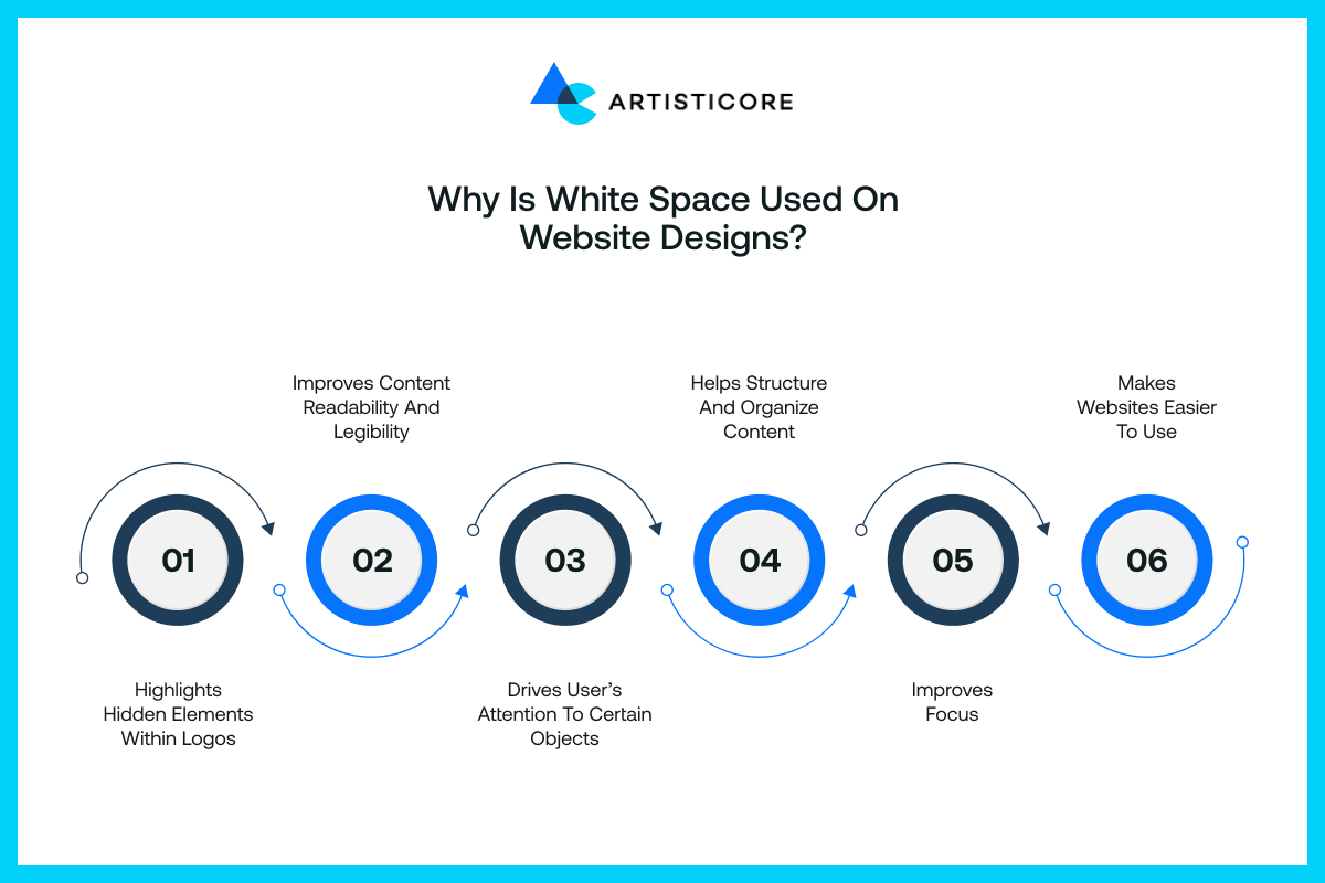
Whitespace design isn’t just for looks. Instead, it plays a big role in how the user’s experience on a site goes. It makes designs look clean and easy to use.
- Highlights Hidden Elements Within Logos: Some logos use white space in a unique manner. They do so by embedding shapes or symbols in them. This technique can make a logo look more impressive.
- Improves Content Readability and Legibility: Once there is enough white space between lines, letters, and paragraphs, reading will feel effortless. It stops the text from coming too close together. This allows users to enjoy your content with ease.
- Directs User’s Focus to Specific Objects: White space around an element helps highlight it. Designers use white space to focus user attention on significant things. These include CTA buttons, headings, or promotions.
- Helps Structure and Organize Content: White space is a form of divider. It separates sections, but it also groups related things together. Having a clear visual structure improves navigation.
- Enhances Focus: White spaces remove clutter from the way. This allows people to focus on the things that are important. It removes distractions when a user engages with content or takes an action.
- Makes Sites Easy to Use: A white space design is simple to navigate through. It’s easier to click on buttons, and it’s easy to read the text. The site as a whole is more pleasant to look through.
How The Law of Proximity Highlights the Need for White Space
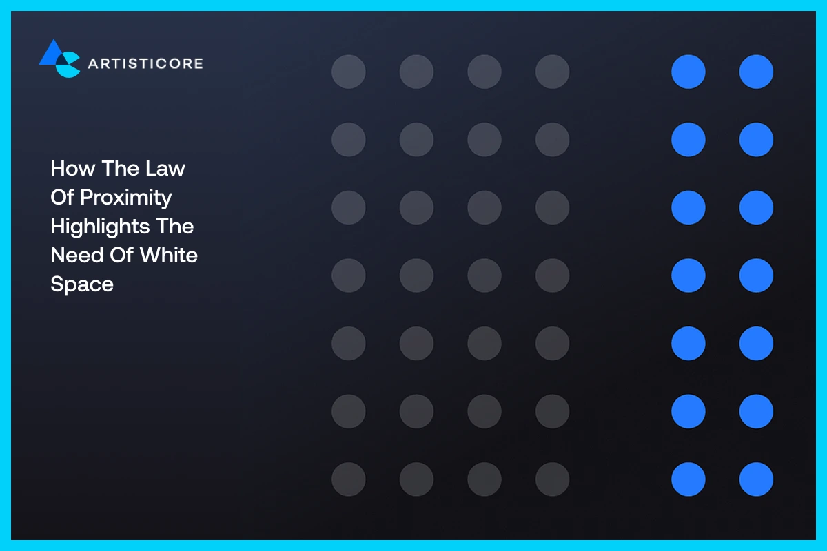
The Law of Proximity is a design principle that came from Gestalt psychology. It states that objects placed next to one another are related.
Likewise, the ones placed further apart are seen as more separate in their relationship. White space is a large part of this because it is the element that determines how close or how far apart things are on a page.
For example, when you put a button right next to the form field, the user will consider the two as one.
But when you include the white space principle of design, it will enable the user to concentrate on every one of the elements. Proximity can structure and arrange information so it’s visually understandable and readable.
Applying this law with elements of white space will mean that the information, standing alone, is easy to look at and is not confused with something else.
Different Types of White Space
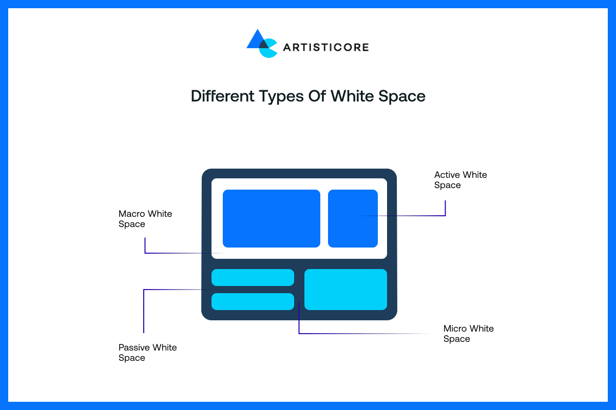
White space is not just one type. It comes in several different forms. And each one has a different function in web design.
Knowing what is white space and its types enables you to design better, more balanced layouts. Therefore, they are as follows:
Macro White Space
Macro white space is the large blocks of space between elements on a page. These elements include content sections and images. It provides space to breathe while designs can become spaced out.
Macro white space is most often found on homepages or landing pages. They provide clarity that is fashionable.
When used right, macro white space has the potential to make websites more scannable. It ensures users are moving consistently from one section to another in a natural way that doesn’t feel rushed or overloaded.
Micro White Space
Micro white space is the tiniest spacing occurring between letters, lines of text, and little items. It is the smallest whitespace.
But it does add greatly to readability. Since it is so tiny, there is a risk of underestimating how important it is.
But even tight spacing can make it hard to read. Whereas, good micro whitespace makes text legible and creates a good flow.
All the more important for blogs, articles, and any pages with a lot of text, promoting visitors to read without straining their eyes.
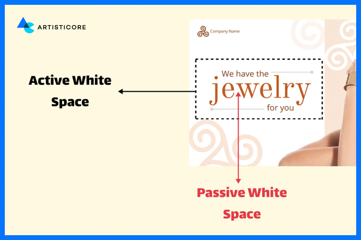
Active White Space
Active white space is every intentional use of space that provides focus for the user. Designers use white space to bring attention to an element.
These include a CTA button or headlines. An image of a product surrounded by a lot of active white space pulls your focus towards it. Hence, active white space is a powerful design tool.
It changes and controls focus. That is why it is used to establish a journey for the user without introducing any additional imagery or clutter to the screen.
Passive White Space
Passive white space is a natural, thoughtless space. It includes things like the margin space around a paragraph or the padding inside a button.
Though it’s not as intended as active white space, it serves a purpose by contributing to readability. It makes the design look neat.
Passive white space allows elements not to touch while keeping the design clean and not crowded. While “passive,” it is still important to have a positive user experience.
Want a Site that’s Easy to Use and Stunning to Explore? We Know How to Balance Content with White Space Perfectly.
The Importance of Visual Hierarchy for White Space
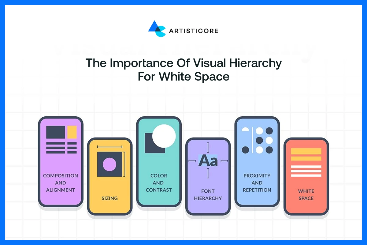
Visual hierarchy addresses communicating what to look at first, second, and so on. White space allows this by creating emphasis and flow in a design.
When certain elements have more white space around them, it creates a visual hierarchy. More so, the space helps draw your eye.
For instance, if a headline is surrounded by much white space, it will be able to hold attention prior to any other jammed text.
Employing white space facilitates crafting the flow by which users navigate content logically and smoothly. If visual hierarchy is not observed, even designs might look confusing.
White space can act like a spotlight. It shows what is important, which improves visual hierarchy and keeps users on target.
How to Use White Space in Web Design
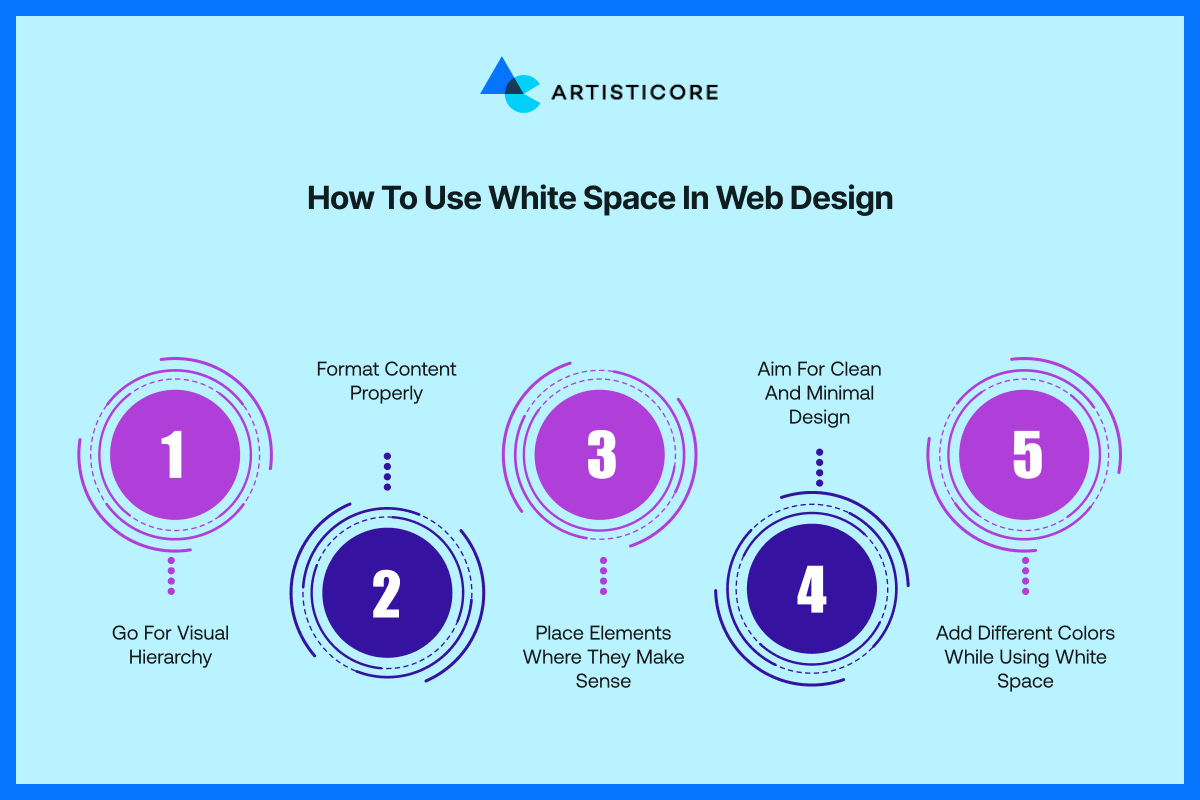
Using white space in web design isn’t just about leaving things blank. Instead, it is about making smart design choices that improve clarity, focus, and user experience.
Go for Visual Hierarchy
Organize your content so that users know what to look at first. Use white space to highlight key elements.
For instance, a headline surrounded by white space will always stand out more than one pushed into a paragraph.
Directional text helps visitors navigate a page in a natural order. This creates a smoother, more engaging experience.
Format Content Properly
Making the content shorter in length and having sufficient spacing makes the content easy to read, and the design easy to view by
Adding space in design and between headings, paragraphs, and lists makes the page clean in appearance.
Right formatting always puts a space in between words. It enhances the understanding of the reader regarding the text.
Readers are able to quickly scan or read the text of high-value content without needing to look through the entire page. That is why you must use the right formatting and avoid large blocks of text.
Place Elements Where They Make Sense
Good use of white space means placing items logically. Put related items close together and unrelated items away from each other.
This creates a visually logical structure that allows for better usability. By putting things where users would naturally expect them to be, navigation becomes an intuitive, smooth process for the visitors.
This enables them to look at what they are interested in rather than look for what they need.
Creating logically positioned items removes frustration and creates a natural, intuitive experience for the users.
Aim for Clean and Minimal Design
Less is more in web design. A lot of white space provides a sense of fresh, modern content, and it minimizes distractions and clutter.
Minimal design does not have to be boring. It is simply eliminating what is unnecessary and doing away with distractions.
The ultimate result is that the user now has a professionally appearing site that is easy to understand and easy to navigate, particularly if they are going to be reading and digesting your material.
Add Different Colors While Using White Space
White space does not need to be literally white; it can be any background color that enhances your design.
Using complementary colors in your negative space can only improve the visual interest of your layout.
It can also still provide enough space to give you breathing room. This way, your site is more balanced and cohesive, but still clear and focused.
5 Examples of White Space in Web Design for Your Inspiration
White space can be used in many creative ways, and some of the best websites in the world show how powerful it can be when done right.
Therefore, let’s look at some of these white space in design examples:
1. Apple

Apple’s site is one of the best white space examples. Apple has perfected the art of marketing its products by letting the products speak for themselves.
If you look at its website, generally you will find large, stunning, high-resolution images with little text and lots of white space.
This allows the eye to go directly to the product, the real star of the show. And where copy or CTAs do appear, they are usually small, in the background.
And white space is allowed to create a clean, simple, stunning layout. Apple’s method is an excellent proof of that famous saying: Less is more.
2. Medium
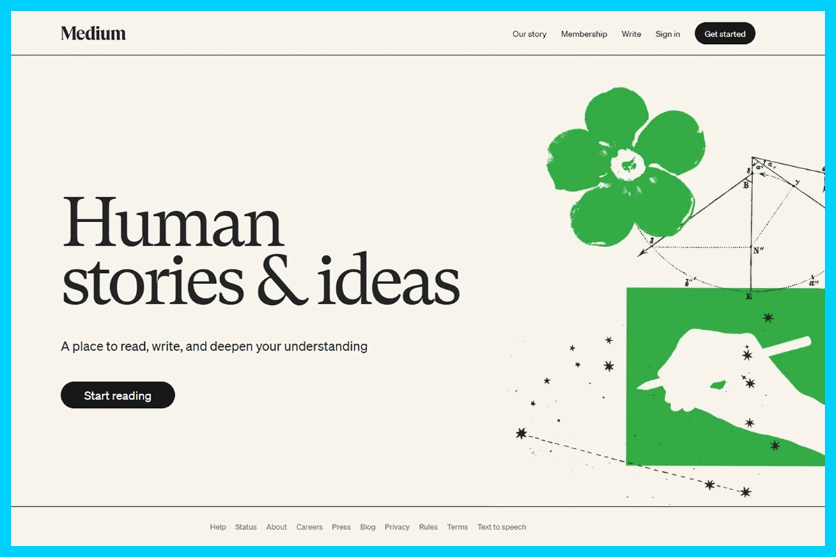
Medium’s look is an ideal example of how white space can improve readability. Its clean layouts, large margins, and easy line spacing make long reading a joy.
There is no clutter, only text, images, and other subtle things well spaced to permit attention.
The minimalistic design is neatly done and allows readers to focus on the content without distractions.
This also translates to Medium being a nice space for casual browsing, and inquisitive readers can jump into articles without hesitation.
3. Google
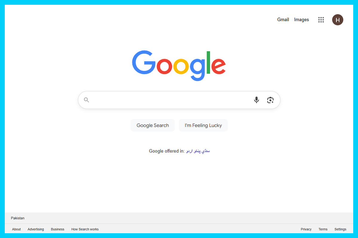
Google has one of the most recognizable examples of white space pushing the boundaries. It has almost nothing on it other than a search bar, a logo, and a few small links.
Incredibly, it has reached such simplicity that there is only a single task to focus on, which is search.
And the abundance of white space keeps the page from feeling busy. It also helps keep load times to a minimum.
Google has shown that complexity is not necessary to create a powerful impact – being simple can win too.
4. Shapefarm

Shapefarm’s portfolio website successfully conveys the manner in which white space can facilitate a pleasant, interactive, and seamless browsing experience.
Each component (text, images, graphics) is given space to breathe, and the layout appears thoughtful and well-proportioned, hence reading smoothly.
The breathing room tells the user to discover naturally on their own time, appreciating both the photos and the interaction, since there is no rush.
The white space in graphic design pairs beautifully with their creative photos, adding to their brand identity as unique game developers.
Looking to Boost Readability and User Experience? Our Team Design Websites that Are Easy to Use
5. Maison De La Luz
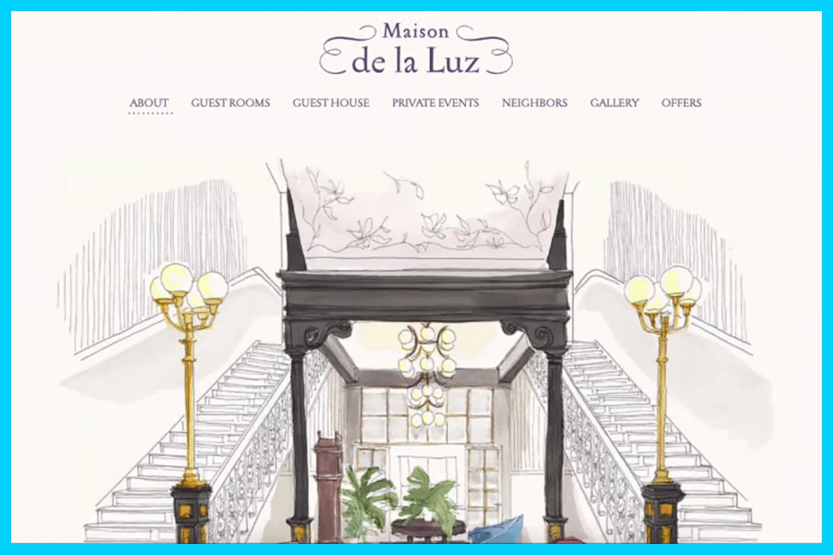
Maison De La Luz employs white space in a way that conveys elegance and luxury. The illustrated characters on their About page have great spacing and create an aesthetic rhythm as you scroll down the page.
Narrow margins and generous spacing to distance whitespace like an experience when you are in a hotel and exploring, drawing your eyes to the next content from image to text.
In stately charm, the whitespace creates a relaxing experience that you get to enjoy and connect with in visual detail.
Get Started With Artisticore to Design Websites With White Space

Artisticore web design agency is an expert when it comes to designing websites with white space. We know the white space meaning and understand that web design goes beyond color, typography, and images.
It is also about balance, and that’s what is white space all about. White space is one of the most valuable resources in web design, and we utilize it for neat, contemporary, and user-friendly websites.
Regardless of whether you require a structured, clean design or a busy, innovative design, our designers can create designs for you by using white space.
We constantly pivot our layouts to direct visitors in a manner that feels organic, emphasize elements that are key to your business, and create an engaging user experience.
Artisticore can design a website for you that feels great and is easy to access. Let’s strategize to create a design space that makes your content and brand pop!
Final Thoughts
That is all for this blog on what is white space. White space may feel like “nothing,” but in design, it is everything. It could give breathing room, enhance readability, and make your site feel more inviting to visitors. In every good brand, from Apple’s beautifully straightforward pages to Google’s eerily empty homepage, white space plays an important role in making a memorable user experience. In every case of white space, every gap plays a part.
Taking advantage of white space will help you organize information, improve readability, and provide a refined corporate image to your website. A design with white space will keep users interested, and there is a better chance they will come back. Therefore, start using white space, and you will see how much “blank” space will enhance your site.

Sultan Hanif is a seasoned wordsmith, who brings technology trends and innovations to life through his words. A tech-savvy gamer with a passion for all things football, Sultan blends his technical knowledge with creative storytelling to empower businesses and individuals alike.
