Top E-commerce Web Design Trends for 2025
Author :
E-commerce evolves rapidly and your website must keep pace with the ever-changing online landscape quickly now. New web design trends come out on a daily basis.
And they drastically alter online stores’ aesthetic appeal and functionality overnight. So, if your eCommerce website still has a look from the early 2020s, then it might be severely hindering your progress behind the scenes.
What significance does it hold precisely? Today’s shoppers gravitate toward online experiences exhibiting smooth, engaging, and visually striking. They visit sites that are free of frustrating hiccups and dull interfaces. A conversion-focused ecommerce design is no longer a luxury — it’s a necessity for turning visitors into customers. Modern website designs that feel intuitive are not just a nice extra thing to have but they keep customers clicking.
In this blog, we’ll explore the Top E-commerce Web Design Trends, from bold minimal designs to floating animations, from colorful layouts to fun scrolling effects.
These trends help sell more stuff by keeping visitors pretty happy and utterly engaged with your product rather effectively it seems.
We’ll keep things straightforward and easy for you to understand. If you’re an eCommerce site owner, then this blog featuring web design trends is for you. So, without any further ado, let’s dive in.
Advantages of Following the Latest Web Design Trends
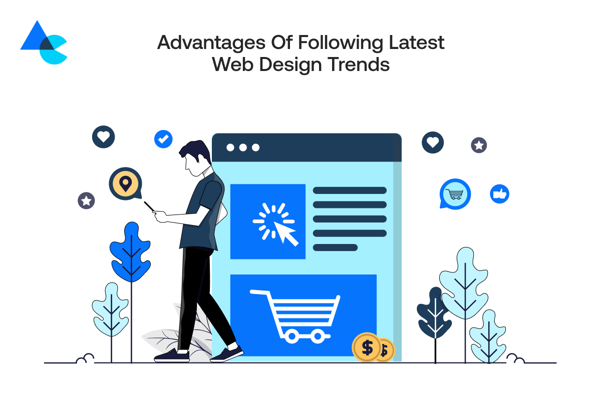
Staying on top of the latest e-commerce web design trends is more about giving customers the best possible shopping experience than it’s about making your e-commerce website look cool.
Visitors tend to linger longer rather noticeably and ultimately purchase something when your website looks sleek and user-friendly.
Trends come out from stuff users are really into and following them diligently helps you stay in tune with your audience’s expectations pretty well.
Plus, an updated design makes your brand appear professional and pretty trustworthy with a fresh new look.
And let’s not forget, that design trends frequently encompass enhancements in speed, mobile-friendliness, and accessibility, which are important for pretty much everyone.
Here are some key advantages of using the latest web design trends:
- Better User Experience: Modern trends focus heavily on easy navigation and superfast loading for cleaner layouts that make online shopping almost simple.
- Increased Engagement: Eye-catching designs coupled with fun elements like slick animations keep visitors thoroughly engaged and exploring for noticeably longer periods.
- Higher Conversion Rates: A smooth website with highly attractive features can very effectively help turn visitors into paying online customers pretty quickly.
- Mobile-Friendly Design: New trends emerge predominantly on phones first helping you address customers swiftly on mobile devices every single day.
- Boosts Brand Image: A really stylish website promotes professionalism and instills trust in your business venture remarkably well.
20 Modern Web Design Trends You Need to Follow
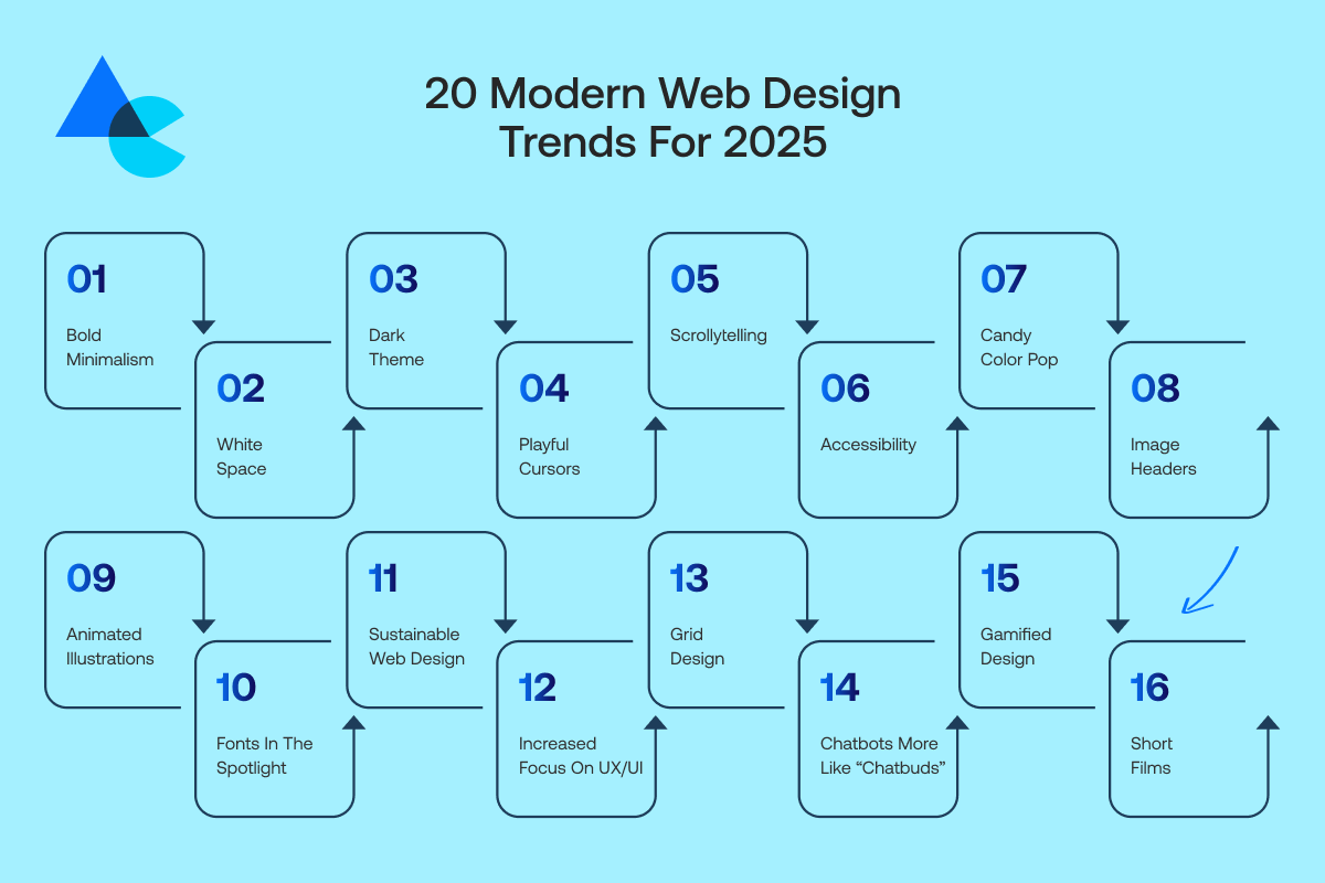
Want your e-commerce store to stand out this year? These top web design trends will help you create a modern, fun, and user-friendly experience.
1. Bold Minimalism
Bold minimalism revolves around simplicity yet somehow manages to strike a really striking chord visually.
More so, bold minimalism leverages stark layouts, huge typography, and just a couple of bright colors to bring eyeballs without cluttering digital real estate with too many visuals.
It zeroes in on crucial stuff namely your products and message without extraneous fluff. Faster website loading occurs courtesy of this trend and it makes stuff people are searching for readily discoverable online.
It looks stylish and modern while remaining easy to use. Bold minimalism gets e-commerce brands buzzing and it really makes products pop off shelves with crazy effectiveness.
2. White Space
White space also known as negative space isn’t merely empty space. It’s a potent instrument in crafting effective web design layouts rather skilfully.
White space is the secret for many of the coolest websites designs. It gives your content ample breathing space and helps eyes focus fairly easily downstream.
Using white space effectively matters greatly and it’s becoming increasingly crucial nowadays for designers.
It renders your website pretty slick and surprisingly uncluttered and not too bewildering overall.
The silence between melodies affords crucial moments a chance to resound vibrantly underneath fading echoes of preceding harmonies and forthcoming refrains.
White space helps online store customers clearly see products and prices without distractions amidst a lot of buttons and other visual noise.
This trick makes your site feel fairly calm and user-friendly.
3. Dark Theme
The dark theme looks pretty cool especially for night owls browsing stuff and it’s super easy on the eyes as well.
Deep blacks or grays supplant bright white backgrounds thereby making colors and images really pop quite vividly on screen effectively.
Dark themes will probably become super common on e-commerce sites by this year because they lend stores a pretty sleek modern aesthetic.
Dark themes ostensibly help conserve battery life on various mobile devices whilst reducing eye strain significantly under certain viewing conditions.
Shoppers revel in visually comfortable sites, especially during lengthy browsing marathons. Dark themes are the future of web design and if executed properly, they can lend your brand a cool vibe or perhaps an aura of luxury and minimalism.
4. Interactive 3D Elements
3D design isn’t just for video games anymore, it’s making websites way more exciting!
Interactive 3D elements allow users to now spin and zoom product models around pretty freely from various unusual angles and perspectives quite creatively. E-commerce benefits greatly from this trend.
Picture yourself eyeballing a fresh new kick from practically every angle before making a purchase utterly carefree online.
By this year many retailers will likely leverage 3D tech heavily helping shoppers feel like they’re virtually grasping products with unusual vividness.
It adds a fun playful vibe pretty quickly down at checkout counters with shoppers feeling rather confident afterward. Just remember 3D elements gotta be slick and load pretty quickly or users will likely bail.
5. Playful Cursors
Cursors can be super funky graphical arrows rather than boring little arrows appearing on the screen.
Playful cursors will take over most major e-commerce sites by this year quite rapidly and alter online shopping experiences nationwide.
They turn into different shapes or hues rapidly when hovering over various buttons and product displays very dynamically.
Some leave behind sparkly trails and pretty animations rapidly. Playful cursors can make a site feel surprisingly fun and somewhat interactive almost instantly with very little effort apparently.
It keeps shoppers thoroughly entertained meanwhile making your brand feel rather creative uniquely standing out pretty effectively.
Be sure not to overdo it; a cursor should still be relatively easy to control properly most of the time. When done right this tiny fad can make a really big splash surprisingly enough.
6. Scrollytelling
Scrollytelling turns your website into an immersive story that unfurls rather organically as users scroll downwards very slowly.
This trend deploys animations, images, and turning text that dynamically alter while a visitor scrolls down a page rather than displaying info all at once.
Kinetic storytelling is conveyed vividly through motion with tremendous flair. E-commerce stores pretty much leverage scrollytelling rather effectively to guide shoppers through some product’s entire crazy journey.
It keeps users on their toes and thoroughly enthralled while making your site pretty interesting. It feels pretty slick and natural when executed properly, not at all like perusing some stodgy advertisement.
It’s perfect for product launches or crafting landing pages with mesmerizing brand storytelling underneath various marketing strategies.
7. Accessibility
Designing a website with accessibility in mind essentially means creating an online website usable by people with various disabilities effectively.
Making e-commerce stores super accessible isn’t just sorta nice it’s downright essential for survival apparently.
It encompasses stuff like legible text pretty much everywhere and voice-over options alongside screen reader support and keyboard navigation with decent color contrast.
Accessibility helps everyone shop quite comfortably and safely with any device regardless of their ability.
Search engines greatly favor websites with accessibility features which often results in markedly better rankings.
Designing stuff with accessibility in mind pretty clearly shows your brand genuinely cares deeply about every single customer down the line.
It’s kind of a vibe that’s hella smart and pretty damn inclusive for people looking towards a radically future-ready world.
8. UFOs! (Unexpected Floating Objects)
UFOs, short for Unexpected Floating Objects, are pretty cool items that hover around on screen whilst browsing pretty randomly and freely.
Gently wiggling product images or bouncing geometric shapes might be floating icons that hover erratically above fun backgrounds quite steadily.
Little surprises sprinkled liberally add a ton of quirky personality and quite a lot of joy to your website. Brands are increasingly leveraging unconventional UI elements like UFOs in their designs to inject whimsy and make sites feel vibrant.
Elements can steer focus towards sales buttons or simply create a vibe that feels somewhat playfully quirky and engaging.
UFOs inject a thrill akin to discovering surprise stickers inside a cherished toy making online shopping feel utterly magical.
9. Collage Uploaded
The collage style is making a comeback rapidly going fully digital nowadays. Creative layouts mashup photos and drawings with stickers and text somewhat like a pretty digital scrapbook.
E-commerce brands showcase products in weirdly artsy collages with lots of flair and utterly unconventional visual arrangements nowadays.
It helps convey narrative pretty effectively or inject varied moods with subtle handmade textures and fleeting ambiance very surprisingly.
Collage layouts look fab for flaunting eclectic collections and lifestyle snaps making your site vibe super trendy and utterly personal.
Customer photos and product images can be layered together with reviews really effectively underneath sometimes. Standing out with visuals that are pretty creative resonates deeply with youngsters who eat that sorta thing up eagerly.
10. Candy Color Pop
Candy color pop is all about using fun juicy colors that grab attention with plenty of bright bold energy. Envision vibrant hot pinks and bright oranges that glow neon greens bursting with electric blues everywhere.
E-commerce websites increasingly opt for this aesthetic creating a vibe that’s simultaneously cheerful and pretty exciting.
Buttons sales and featured products are highlighted by these colors which make your brand feel rather more playful.
Vibrant hues are super popular among youngsters and avant-garde labels. Balance is key here and you don’t want eyes overwhelmed with too much visual info so restraint is exercised carefully.
Candy colors make your site look pretty modern and super fun when utilized effectively in a rather skillful manner.
11. Image Headers
Image headers are experiencing a huge resurgence this year apparently with lots of people using them again very effectively.
Designers now opt for ginormous eye-catching visuals rather than bland text at the top of the page to forge potent initial impressions instantly.
Headers often showcase product shots or lifestyle photos and sometimes feature creative graphics that showcase a brand’s edgy personality quite vividly.
A well-designed image header sets the mood for the entire page and grabs visitor’s attention very quickly with great effectiveness right away.
It can highlight key products vibrantly alongside seasonal merchandise or ongoing sales very effectively in digital marketing campaigns.
Pairing such visuals with bold text or really snappy call-to-action makes them way more effective in various marketing contexts.
Image headers are super effective at grabbing attention quickly in e-commerce stores and getting shoppers hooked on products within mere seconds.
When done right, they don’t just look great, they guide users deeper into the site.
12. Animated Illustrations
Animated illustrations are super fun and playful, perfectly suited for injecting life into a rather dull e-commerce website instantly. More so, animated illustrations turn slowly and tell stories via motion or react sharply to user scrolling actions with dynamic movements.
Online stores are leveraging this trend pretty effectively to build personality and foster rather memorable experiences for users apparently.
An animated character might guide users deftly through product tours meanwhile some moving image demonstrates vividly how some product actually operates now.
Animations help elucidate complex stuff quickly and keep users riveted simultaneously with fairly engaging visuals often displayed really well.
They load quickly on mobile devices and hardly occupy precious storage space making them super useful for shopping on the go.
Animated illustrations used wisely can turn a regular shopping experience into something utterly magical that visitors will thoroughly enjoy and vividly recall.
Just don’t overdo stuff and keep animations fairly smooth light and pretty purposeful.
13. Micro-Interactions
Micro-interactions are tiny animations or movements that happen when users do something on your website, like when they hover over buttons or click icons and add products quickly to their cart.
Little details like these can make a really big impact surprisingly enough they often do so very quietly.
E-commerce sites cleverly deploy micro-interactions making websites feel remarkably smoother and vastly more satisfying for users.
Envision a pulsating heart icon that throbs furiously upon clicking or a shopping cart that oscillates wildly whenever some new item gets added.
Moments like these foster fairly quirky interactive vibes with a palpably human feel. Micro-interactions provide super helpful feedback showing users their action worked pretty well afterward with some visual flourish obviously.
They craft websites that are easy on the eyes and super enjoyable thereby possibly netting gazillions more clicks and subsequent purchases. It’s a small touch with big benefits.
14. Fonts in the Spotlight
Fonts are no longer just for reading. They are becoming the stars of the show! Bold typography rather creatively manifests as a huge trend these days within design circles particularly for web-related projects.
Oversized typography and fancy letterforms are wielded effectively to bring eyeballs share a vibe and steer users through webpage content rapidly.
E-commerce sites deploy dramatically quirky fonts very effectively for product names and bold declarative calls-to-action on various web pages.
A strong font choice instantly conveys brand personality as classy, fun, edgy, or relevant with varying degrees of success.
Fonts under glaring scrutiny also mesh fabulously with austere designs helping key messages stand tall amidst a sea of stark simplicity. Style matters greatly but readability matters even more. That is why fonts are key for simple website designs.
Best designs strike a perfect balance between super cool typography and really easy reading material for most people. Right fonts make words shine brightly under certain circumstances.
15. Sustainable Web Design
Sustainable web design is all about creating websites that are better for the planet. More brands are paying attention to how their websites impact the environment.
This trend focuses on reducing things like data usage, server loads, and energy consumption. How? By using lighter images, cleaner code, faster loading times, and fewer animations.
It is sorta akin to going green for your website, being eco-friendly in a majorly impactful kinda way.
Sustainable design helps your site load quicker and work better on mobile devices making shoppers happier and benefiting Earth greatly.
Showing customers you genuinely care about eco-friendly practices builds trust and forges brand loyalty remarkably well amongst environmentally aware consumers.
People increasingly flock to eco-friendly businesses which showcases your brand as a stalwart of sustainability in a rather great way.
This trend embodies a rather nebulous notion of being remarkably eco-friendly and pretty efficient and also kind to planet Earth.
16. Increased Focus on UX/UI
UX stands for User Experience and UI denotes User Interface quite frequently in design circles nowadays obviously.
They work together pretty intensely on crafting super user-friendly websites that people find easy and fun to use.
User experience and interface design have become crucial nowadays. E-commerce stores are really making sure their websites look fabulously good and also feel pretty good.
A secret to good website design is that buttons click with ease, pages load swiftly and shoppers find what they need without getting hopelessly lost in a sea of confusion.
Shopping should feel remarkably smooth and simple with significantly reduced frustration levels overall. A solid UX/UI design prompts users pretty deeply to linger quite a bit longer and ultimately buy lots more stuff online.
Customers tend to return when a website looks pretty and functions smoothly with decent usability features implemented rather carefully.
That’s why this burgeoning trend is gaining traction rapidly all about prioritizing humans.
17. Grid Design
Grid design employs rather obscure conceptual boxes for neatly arranging website elements in a somewhat orderly manner on screen.
It makes stuff look pretty clean and balanced. Grid layouts remain popular nowadays since they make e-commerce sites surprisingly easier to browse for loads of online shoppers.
Products are frequently arrayed in neat rows on store shelves making comparisons easy for most shoppers suddenly.
Grid design helps various screen sizes display your site properly on devices ranging from super small phones upwards surprisingly enough.
It creates a smooth structured layout eerily without looking boringly monotonous. Using grids doesn’t necessitate a dull layout and you can still inject vibrant hues or snazzy graphics within grid boundaries freely.
It’s like putting creativity inside a clean frame. Simple, smart, and shopper-friendly, that’s why grid design is here to stay.
18. Chatbots More Like “Chatbuds”
Say hello to friendlier chatbots, aka “Chatbuds”! Chatbots are getting quite an enormous personality overhaul these days.
They feel more like super helpful buddies rather than robotic voices. New chatbots deploy quirky lingo and emojis with laid-back vibes making customers feel fairly relaxed quite quickly and totally understood.
They’re also wicked smart and can assist with orders, answer questions, and sometimes spit out product tips based on your personal style pretty accurately.
What’s most fabulous anyway? Shoppers can get assistance pretty much around the clock since help is readily available 24 hours a day seven days a week.
People adore super helpful support really quickly and Chatbuds make shopping feel pretty personal with kindness.
Having a super helpful store assistant virtually inside your phone is rather like possessing a nifty digital sidekick.
Your Chatbud stands ready with a goofy grin whether stuck on some gnarly problem or just plain ol’ curious nowadays.
19. Gamified Design
Gamified design means adding game-like features to your website to make shopping more exciting.
E-commerce stores are using points, progress bars, badges, and spin-to-win wheels to keep users engaged. It’s like turning your website into a mini-game!
Customers can earn rewards by making an account or reviewing stuff and completing super cool challenges pretty quickly.
Such an experience makes folks keenly desire to interact more and stay remarkably longer only perhaps returning fairly later.
Winning a discount is pretty cool and people tend to love that stuff so it builds loyalty pretty effectively.
Just like games, gamified websites give people a reason to explore and enjoy the experience. It makes shopping feel more fun than just clicking “buy.”
The trick is to make it rewarding without being too complicated. When done right, gamified design turns your store into a place people want to return to again and again.
20. Short Films
Short films are becoming a powerful way to connect with online shoppers. More so, short videos typically under sixty seconds tell some story about your brand or product or maybe even customer experience.
People can hit play and get an idea of your brand right away rather than reading through lengthy blocks of text.
Short films showcase product functionality really well and share super cool behind-the-scenes stuff or feature ecstatic customers pretty effectively.
They’re emotive and surprisingly easy to share on various social media platforms with alarming rapidity almost instantly online nowadays.
A short film embedded cleverly in the website header or product section instantly grabs attention making the brand feel super relatable pretty quickly.
People recall narratives rather than text pretty vividly and super short films facilitate telling those stories quite effectively in a visually fun way.
A picture worth a thousand words and a short film might just be worth sale after all.
Why Choose Artisticore to Use Web Design Trends for Your Web Design & Development?
Artisticore stands out as a stellar team alongside you in crafting sleek e-commerce websites that amaze users with ease.
We follow the latest web development trends as well as web design trends and deploy them effectively helping your brand stand out remarkably among customers who shop fairly easily.
From playful cursors and scrollytelling to bold minimalism and short films, we bring your online store to life using the latest tools and ideas.
We know that businesses vary wildly in character. That is why we take time to understand your brand and products deeply before cherry-picking trends that fit your audience rather perfectly.
We create a new website design that impresses visitors from the get-go. More so, we make sure that the website works really well, loads swiftly, and holds user attention till final purchase.
Our design team is full of creative thinkers and tech experts who love turning bold ideas into ravishingly beautiful websites.
Artisticore will help new stores and established brands refresh their image by crafting a website that embodies their unique creative spirit fully.
You’re staying ahead of trends rather than just keeping up with them under our guidance. Great design is inherently clever rather than merely trendy and superficially fashionable for a fleeting moment or season.
Final Thoughts
As we move through the web design trends this year, it’s clear that e-commerce web design styles are all about creativity, connection, and user experience. Fun trends like quirky mouse pointers and bright hues alongside more considered options like eco-friendly design make online shopping quite exciting and pretty human. Building websites that feel slick and stick in customers’ minds isn’t merely a matter of looking trendy nowadays apparently.
Refresh your design now and seize fresh trends if making your brand shine online matters greatly. You’ll be poised for success tomorrow with Artisticore as a partner in harnessing web design trends effectively today. Great design starts right here and right now with Artisticore.

Sultan Hanif is a seasoned wordsmith, who brings technology trends and innovations to life through his words. A tech-savvy gamer with a passion for all things football, Sultan blends his technical knowledge with creative storytelling to empower businesses and individuals alike.
