Types of Logos with Examples: Select the Right Logo for Your Business Growth
Author :
- What Is a Logo, What Does It Do?
- This Guide Offers…
- 9 Different Types of Logo Styles
- The Power of Color in Logos and Business Success
- Future Trends in Logo Design
- Tips on How to Choose a Logo That Works for Your Brand
- Mistakes That Brands Make with Types of Logo Design Styles
- Conclusion
- Level Up Your Brand, Don’t Wait Now!
Do you ever wonder what are some logos that people identity even hardly looking at it? It is not just logo in action but a whole lot of work and vision into action. The kind of logos and designs you use directly affect the speed at which people find your brand trustworthy.
According to a blog posted by Linearity, choosing the right types of logo designs can boost brand recognition by up to 80%. It is also mentioned that 59% of customers prefer buying from brands having familiar logo style types.
What Is a Logo, What Does It Do?
![]()
If you are digging about logo descriptions and it refers logo as a mere decorative sign, do not trust it.
Logo is the first point of contact between your brand and its audience. Be it on the billboard, website, or an app, your logo types design must tell people who you are and what to do.
Different types of logo design convey different kind messages. Using appropriate logos generate recognition, authority, and long-term trust.
This Guide Offers…
Businesses normally use Wordmarks and lettermarks logo types but nowadays, you will also find them using symbols, mascots, and dynamic logos.
In this guide, we are going to discuss different logo design styles, impact of colors in different logo styles as well as the 2026 trending logos. By the end of this guide, you will know the errors brands make in logo designing so you don’t make one on your turn.
9 Different Types of Logo Styles
Wordmark Logos
![]()
Let’s start with the traditional ones, a wordmark logo. Think of the famous Coca-Cola typeface or the simple colored font of Google. Wordmark logos has everything to do with your brand name. They do not make use of symbols or icons, but simply good typography to make your name memorable. A wordmark is the most beautiful when it is simple. As it is done right, it immediately identifies who you are and your brand becomes easily recognizable everywhere, including on business cards, and billboards. This style amazingly works wonders on businesses that have an unusual or memorable name and aids in establishing a professional yet accessible brand that can be trusted and easily remembered by customers.
Considering a wordmark brand name?
Lettermarks (Monogram) Logos
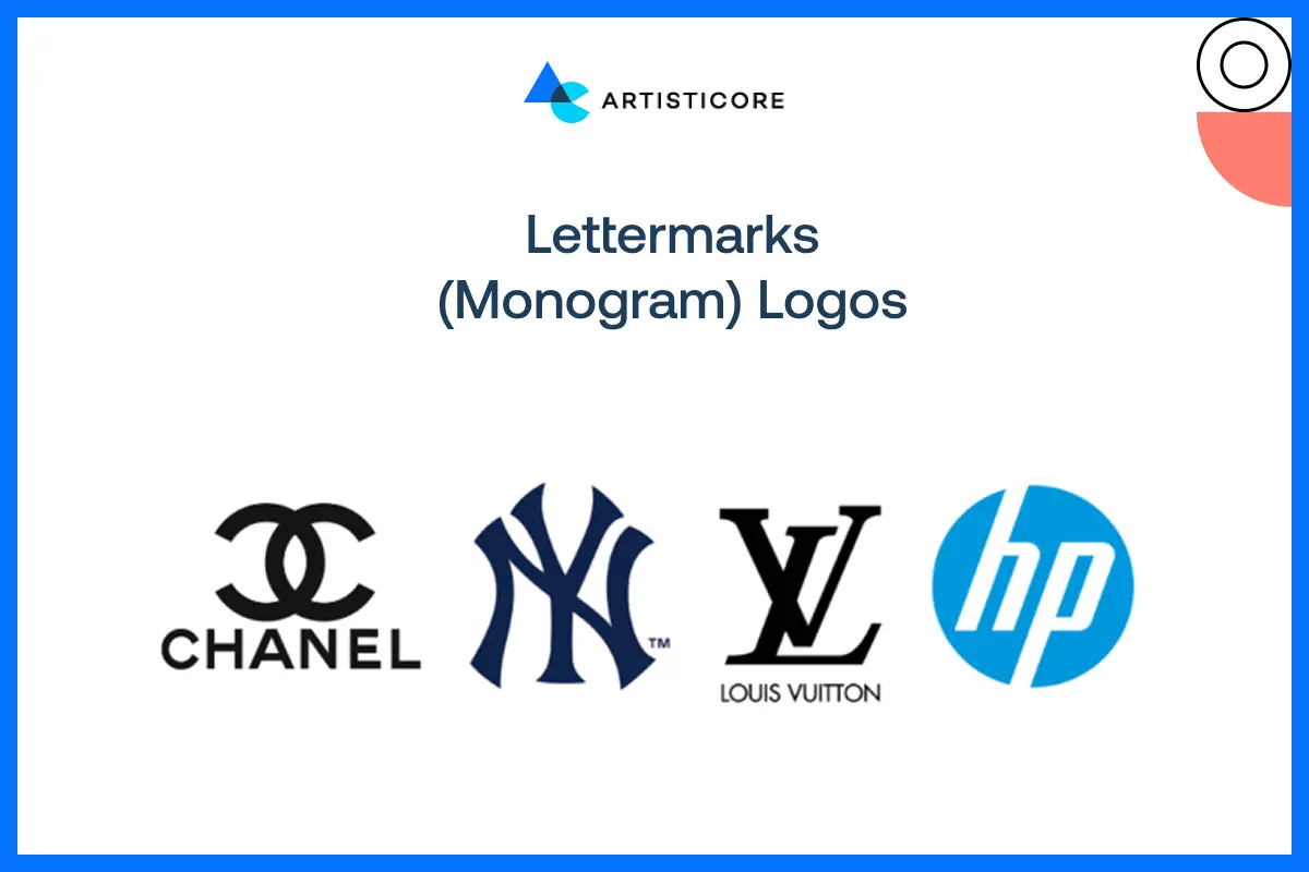
In other cases, names are lengthy and that is where lettermarks are dazzling. Think IBM or HBO. They contain logos incorporating initials rather than complete names which summarize your brand in a snatchy way. Lettermarks are ideal when you desire to make your appearance as simple as possible and still be identified. They are clean, multifunctional and can be easily scaled to fit small areas such as social media avatars or app icons. Select fonts that reflect a personality, i.e. serif font in case of tradition and power, sans-serif fonts in case of modernity, and custom fonts in case of individuality. Lettermarks reduce complicated names into memorable, iconic marks which are easily recognized by people when used effectively.
Brandmark (Symbol or Icon) Logos
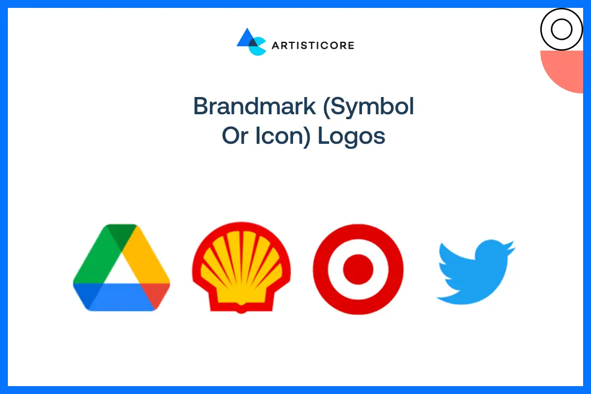
Brandmark logos make use of images rather than text. Imagine the apple of Apple, or the bird of Twitter. These signs have a purpose, convey the brand name, and remain in minds of people. Do you know that the human eye can process visual information 60,000 times faster than text? Well, this is exactly why powerful brandmark are famous. They are easy to spot. The issue is to make a symbol memorable and understandable without the company name attached. Brandmarks are a potent means of international fame when they work, as they are not limited by the language. The symbol has to be straightforward, multipurpose and connected to the brand story. In cases of startups or brands that have visual stories, a striking symbol can make a long-term influence on you by visually citing your values without saying a single word.
Wondering if your brand needs a symbol logo?
Combination Mark Logos
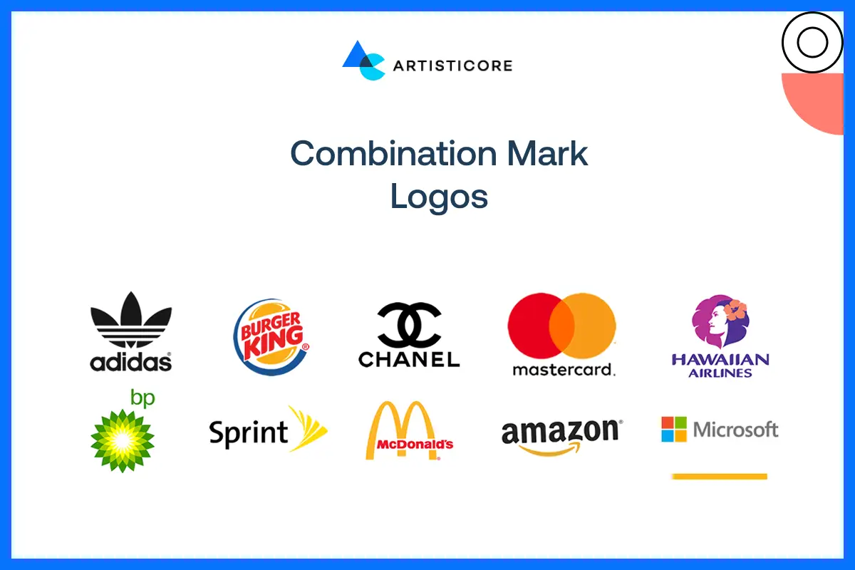
Combination marks serve as a hybrid of the two worlds, that is, text and symbols. Think of Burger King or Lacoste. These types of logos are versatile as you can use the text and the icon either combined or not. It does wonder for brands that are trying to make a mark by making them visible and strengthening identity. Combination marks are versatile on all platforms like digital and print and merchandise. You get both, the familiarity of a symbol and the articulateness of a wordmark. Statistics show that combination logos would enhance cross platform brand recognition by more than 40%. This is what makes them suitable to businesses that are interested in gaining wide exposure. Combination logos maintain a uniform branding and it is also flexible enough to fit on different screens.
Emblem Logos
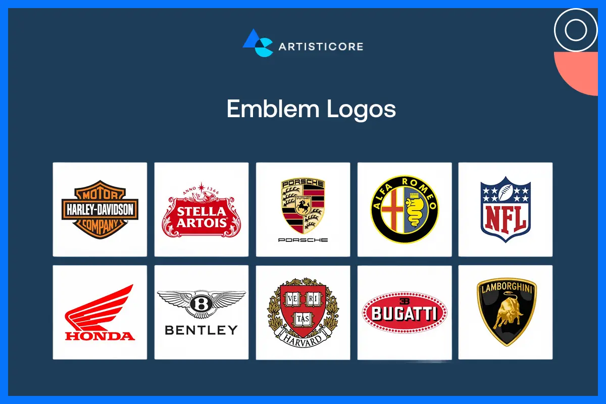
They are like badges or crests, old but you will find them in famous brand logos like Starbucks and Harley Davidson. In such types of logos, there is text inside symbol to deliver a more formal and classical feel. They work well in sectors such as education, government or sport to display power and credibility. The greatest problem is that of readability. When you reduce them in size, such complex designs feel cluttered. But, when done well, the emblems convey heritage, quality and professionalism. The emblem logos are ideal types of logos because they are made with art and authority together. It is a promising option for brands who want a timeless appearance and want quick recognition.
Mascot Logos
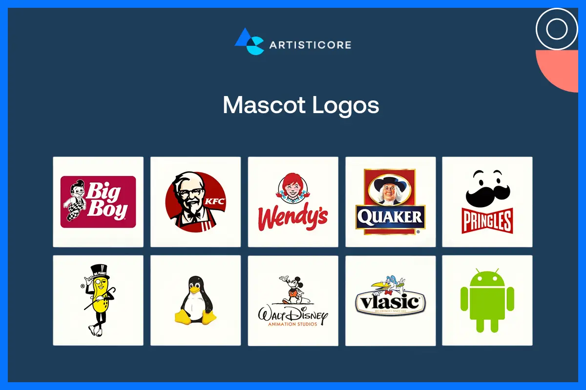
Mascot logos add human or character factor into your brand. Colonel Sanders in KFC or the Michelin Man are the famous logo character design examples. The best thing about these types of logos is that you can easily spot them. They are extremely memorable because of how unique they are. Mascot’s logos are also expensive to design because to make them, you need to connect with the audience. Furthermore, you need to produce a personality that makes your brand both relatable and memorable. During the design process, you need to have the right balance of both playfulness and professionalism. If you appear too cartoonish, there are chances that no one will take you seriously. If you are too formal, you may not appeal. Mascot logos work best if your brand is for children or communities where friendliness and personality can make a brand stand out.
Abstract Logos
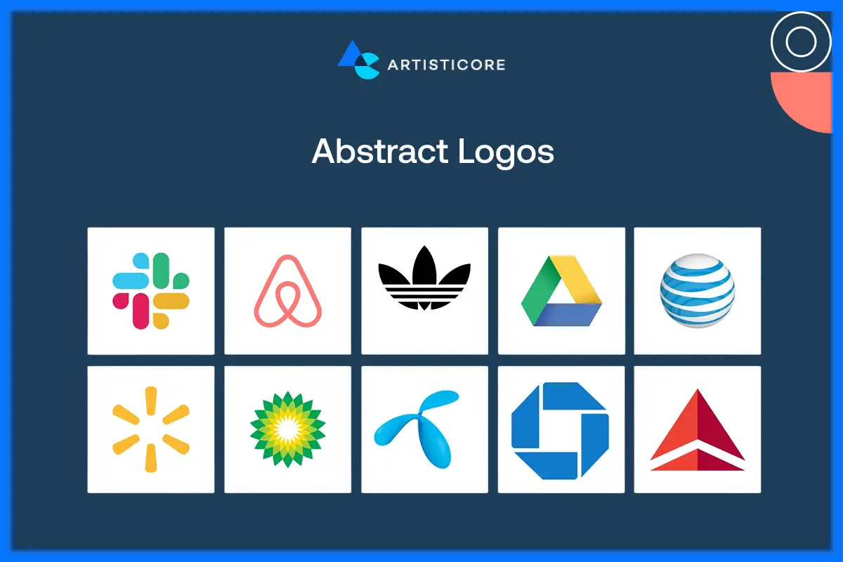
They are not literal letter but geometric designs and famous brands like Swoosh of Nike or the three stripes of Adidas have used them as their logo. They are unique and extremely adaptable logos. If you like creativity, you can easily use them to beautifully represent your brand. Abstraction marks are great when you need a symbol that you can interpret in many ways. It creates a feeling of movement, energy, or creativity which is lovely. They are easy to remember, as they do not have any literal descriptions. One more thing, you can easily transfer them to any other media. It is the question of clarity; an abstract logo, however, should not lose its connection to your audience and need to capture the brand essence.
Dynamic Logos
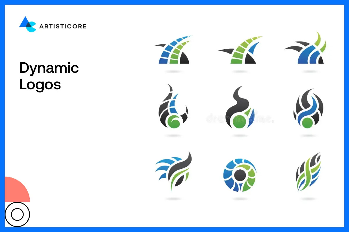
They are the chameleons and do you wonder why? Because they adapt easily on all platforms, screens or sizes. They transform in ant shape, color, or pattern according to the situation without losing quality. The best examples of dynamic logos are MTV and Google Doodles. They fit best in the digital space where brands can easily customize them to fit any campaign or event. They are not only captivating but modern and extremely flexible. With them, you can have use any platform to communicate with your audience consistently. Linearity reveals that brands with flexible logos have 25% more digital interactions. If you are a brand who likes innovation, you can use dynamic logos because it generates excitement. They will also help you remain relevant, and build brand identity with adaptable and mindful design.
Letterform Logos
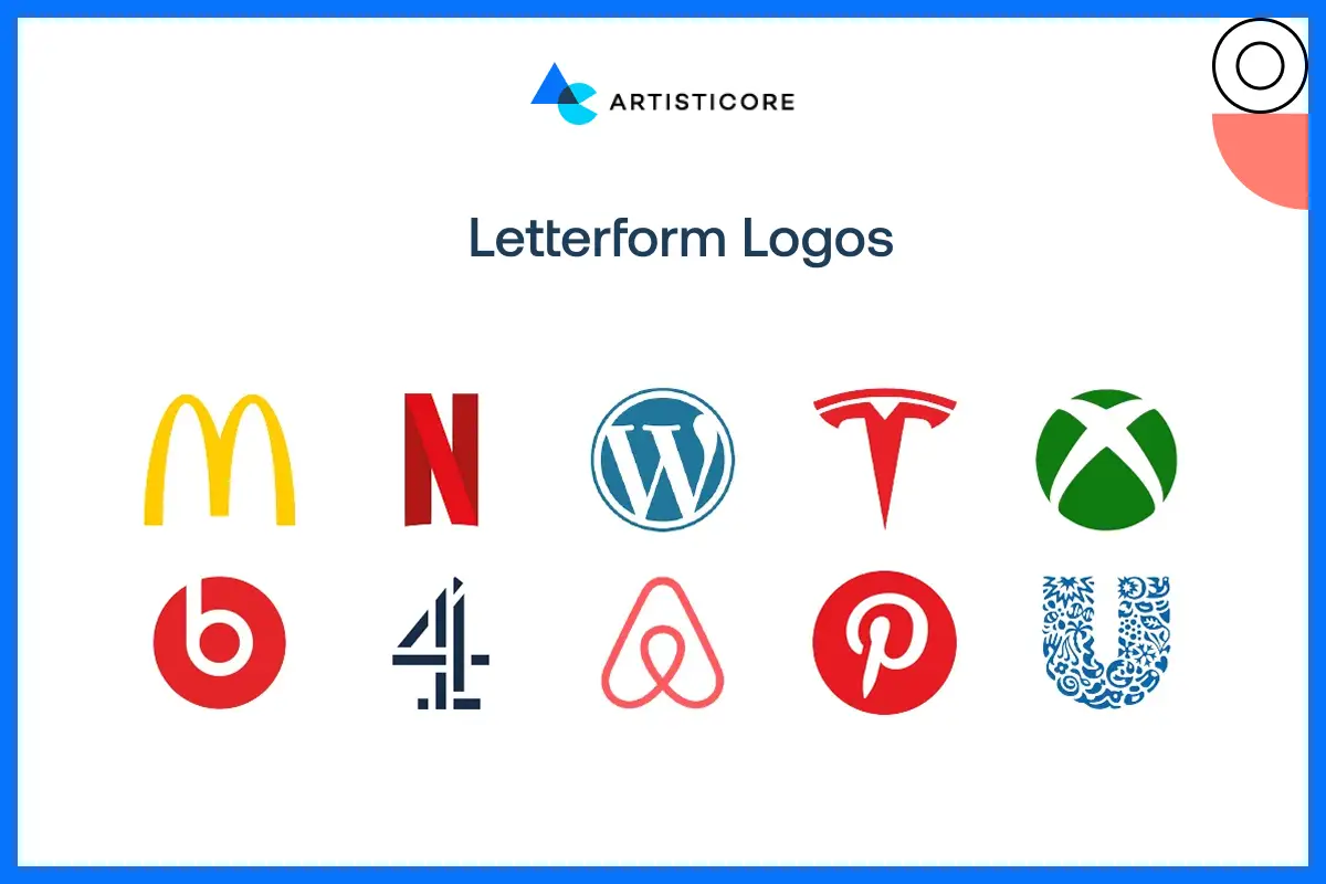
Letterform logos use one, stylized letter that identifies your brand, such as McDonalds M, or Hodas H. They are short logos that are easy to identity and work on every medium. Letterforms are unique because it compresses your large brand name into one single letter. They get you instant popularity. One letter, be it unusual typeface, witty forms or subtle design but it should be appropriate to your brand character.
Submark / Favicon Logos
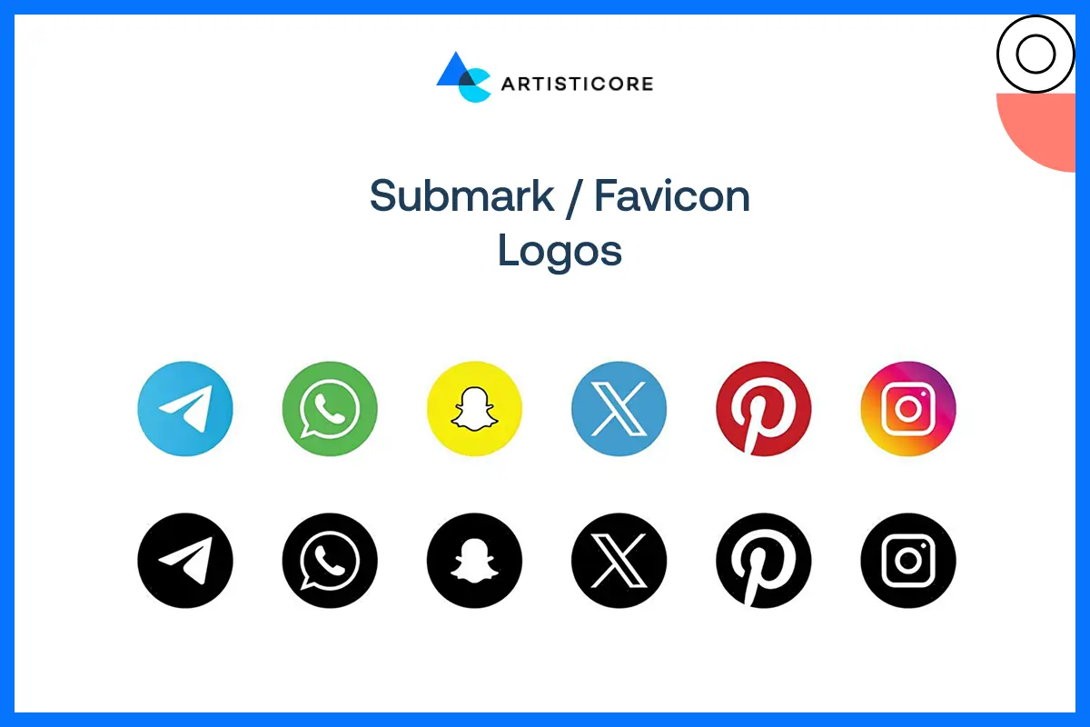
Submarks and favicons are minimalistic. They are the tiny copies of your main logo. You can use them on apps, social media, or any browser tabs. Yes, they are small but they do make big impression. They make your brand memorable. A submark is basically an icon, initials or a simplified wordmark. Have you seen the Twitter bird? You can recall it of course! Or the tiny camera on an Instagram logo? They are tiny but easy to spot, easy to recall and they did make an impact. In this time, a submark is going to deliver consistent as well as professional branding.
Responsive Logos
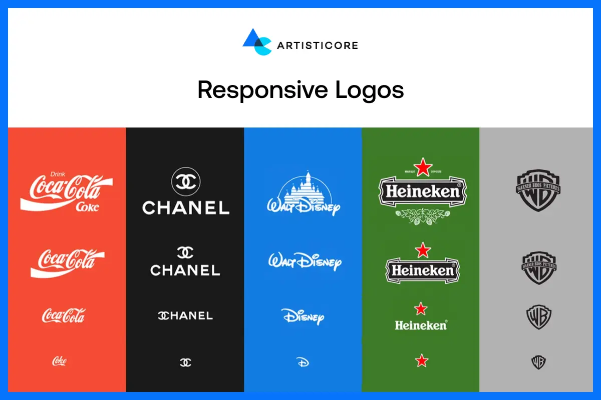
Responsive logos are flexible because they can change according to any screen size, or medium. For example, if it’s a website, the logo will respond according to it. If there is an app, the logo will fit on it according to its size. You do not have to worry whether it is on a large display or small, because the logo will fit. Responsive logos are the types of logos that do not lose recognition, clarity or style. This is one of the reasons why modern brands need to have them designed for themselves. They make your brand look professional and alike at every scale. There is no doubt that responsive logo design is a must and a good purchase in this modern world. Especially, if you want your brand to appear flexible, modern and fit to the standards.
The Power of Color in Logos and Business Success
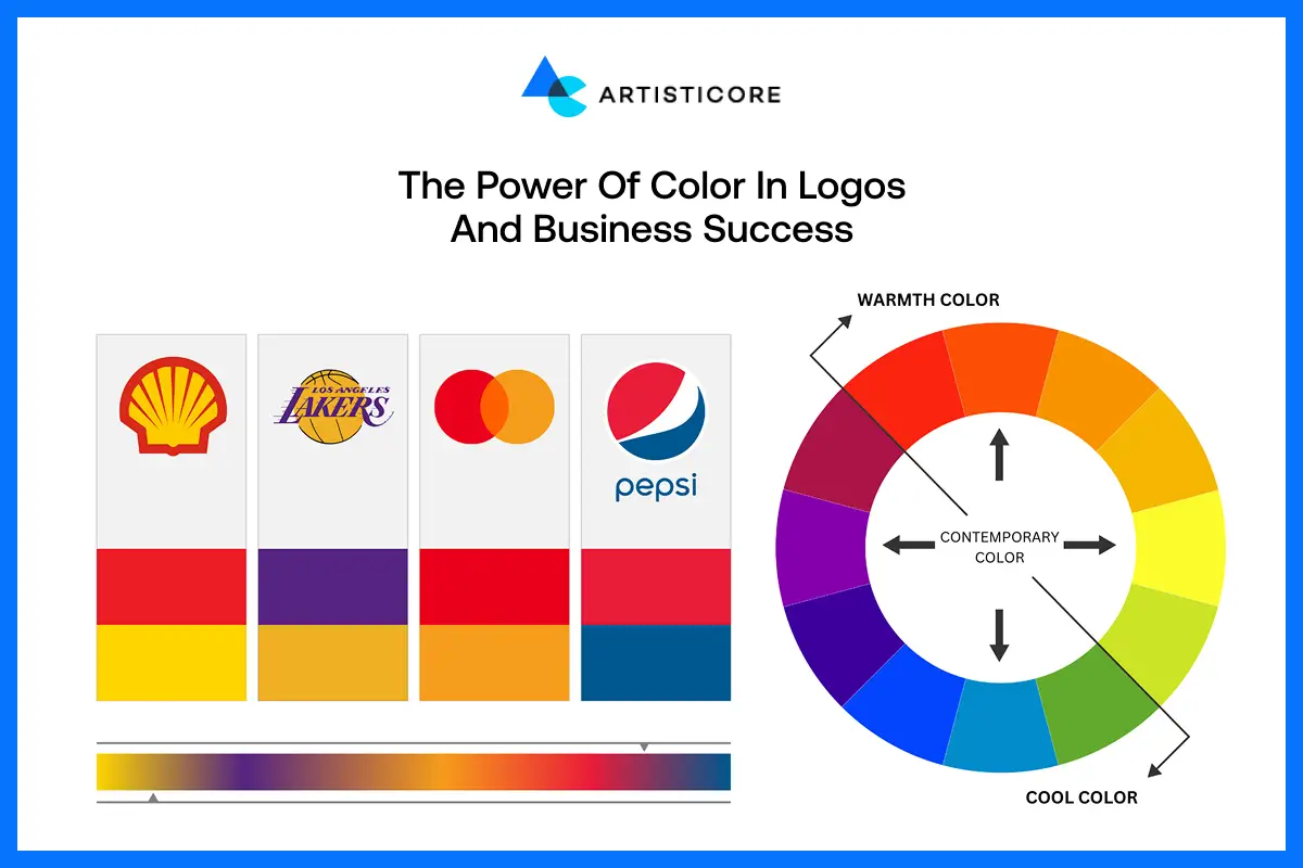
Do you wonder how some types of logos you can easily identify? A lot of it comes down to color. The use of color in types of logs has not everything to do with the beauty. Color helps people make the decision because of kind of emotions they feel from it.
According to a study, logos that work well with color can raise brand awareness by 80% as 90% of the purchases are based on colors. It is also mentioned in the same study that properly designed logo help with increase in revenue growth.
Whether it makes people loyal to your brand or helps to lure new talent, picking the right color in types of logos conveys personality.
A tip for your according to the current statistics that can help you choose one color for you brand is: Most of the world’s top brands have used blue color in their logo design.
Future Trends in Logo Design
![]()
The types of logos are changing more than ever. According to Digital Silk, 25% of adults believe that the brands must change their logo in every ten years.
Minimalism is not going away. As mentioned in a study by Cropink, 70% of new commers prefer minimalistic and eco-friendly types of logos.
Businesses must use dynamic logos because they respond well on all platforms. If you want to go personalized, try to go with individual logos as they are on the rise as well.
As AR / VR market in on the rise and will continue to be in the coming 10 years, using AR-enabled logos is going to help you stand out.
New technologies such as AI-generated logos, voice search enabled designs, interactive or game based logos are creating a future. Now, types of logos are not only going to represent brand but tell stories and relate with audiences in a more interactive and engaging manner.
Tips on How to Choose a Logo That Works for Your Brand
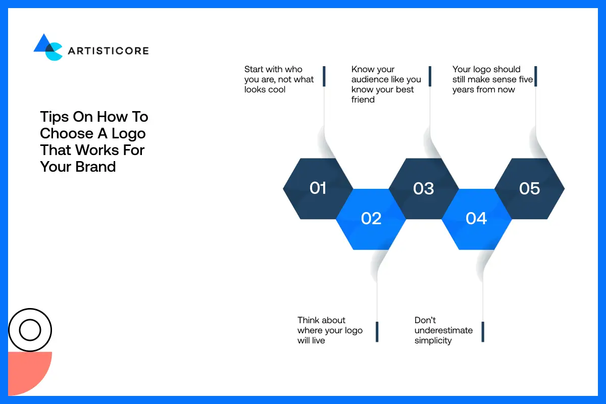
There are few tips that can help you select the perfect style of logos for your brand. First thing first, do not just stick to the beauty. Try to look beyond by focusing on your brand identity.
Ask yourself questions related to your brand, for example who you are and what are you selling? If the logo you’re choosing suit your brand personality, then you’re good to go.
Another thing is to think of the industry standards. Do not go too simple or too complex, go for something in between. The logo you’re designing or getting it designed must work on all the mediums.
And yes, budget is also one important factor. Learn about all the logo style examples and how much it is going to cost you to achieve your brand logo ideas.
Choose from type logos that are more recognizable, flexible and consistent in the long run.
Mistakes That Brands Make with Types of Logo Design Styles
![]()
Overcomplicated Designs
Complex logos might appear impressive; however, they can easily be confusing to the viewers. A design that contains too many elements becomes unclear and difficult to recognize. Keep it simple to ensure that people can remember and read your logo easily on any format.
Following Trends Blindly
Fashionable logos do look attractive today but they will soon be out of fashion. Using trends can be risky because it can outdate your business in a few years. Instead, go with classic logo design that speaks of your brand.
Poor Color Choices
Colors do excite emotion of any kind. The wrong color palette can deliver a mixed message regarding your brand. Make sure your colors match your audience, industry and the emotion you wish your logo to create.
Weak Font Selection
Choosing the right types of logos for branding say a lot about your brand personality. If you designing logos for new company, try to stick with fonts that are easy to read. New brands often appear unprofessional because they choose a difficult font style. So, choose fonts that suit your brand voice, and are readable at any size.
Ignoring Scalability
Your logo will be on business cards to billboards. A logo that is not responsive on different platforms can lose details. Try to choose a logo design that fits beautifully everywhere.
Lack of Uniqueness
A similar logo to that of competitors may water down your brand image. To be memorable and unique, one needs originality. Make sure that your logo shows your brand and values.
Neglecting Versatility
Make sure that your logo responds on different media such as black and white, digital and print. If you do not focus on its versatility, you can struggle with its value. Check your logo on platforms to make a consistent impression.
Conclusion
Knowing all about logos can be fun to some while overwhelming to others. But one thing for sure, it will help you make the right decision for your brand. All the different types of logos in graphic design have their own way of expressing themselves.
Choosing the one from a whole pantry of logo categories needs strategy instead of trends knowledge. Try to make sure that your logo speaks of who you are and must connect to your target audience.
When the logo you choose does not work well on different platforms, it looks unprofessional. A properly designed logo on the business card or the website will build trust. It will add confidence; help you get early recognition and communicate on behalf of your brand.
Invest your time in studying the logo type examples and money in designing one. And then see how it leaves its mark for years.
Level Up Your Brand, Don’t Wait Now!
You have viewed the types of logos, examples and errors. Now it is time to make your brand memorable! Be it a symbol, combinations mark or dynamic logo, Artisticore will make your vision come true. Get in touch and have your brand to be remembered!
FAQs
A majority of the people will notice a wordmark logo first. Google, Coca-Cola, and FedEx are brands that use their name in a special font. It is easy, straightforward, and you can see it easily on every corner of the websites, packaging, or social media. Wordmarks are the ones that remain in your brain, and that is the reason why they are so popular.
As a startup, it is smarter to use a combination logo It combines both a symbol and brand name. People can easily understand and recall it. Consider Burger King or Lacoste, the name and the icon go hand in hand. If you use combination logos, your clients will easily find remember you. This one is popular among startups because it is scalable and versatile.
As a startup, it is smarter to use a combination logo It combines both a symbol and brand name. People can easily understand and recall it. Consider Burger King or Lacoste, the name and the icon go hand in hand. If you use combination logos, your clients will easily find remember you. This one is popular among startups because it is scalable and versatile.
Yes! Lots of brands change their logos with time. Google, Airbnb, and Spotify have updated their logos to remain current or more flexible. There are some brands who took the risk to use dynamic logos and it worked for them. You can use any shape, color or even animation but make sure to align it with your brand.
A majority of brands are lucky enough to have multiple versions for example, a primary one that is used mostly. There is a secondary one which can be used in alternate layouts. You can either choose a submark or favicon which can be used in smaller spaces. There are more choices to choose from such as letterform or an animated mark that you can use in digital platforms. This way you can make your branding looks ideal at all locations, be it business cards to apps.

Hafsa Hanif is a talented content writer at WebnHubs, specializing in topics such as graphic design, web design and development, logo design, and animation. With her deep understanding of design principles and creative processes, Hafsa crafts engaging, informative, and SEO-optimized content that resonates with readers. Her expertise in SEO ensures that her articles not only captivate audiences but also rank well on search engines, helping businesses boost their online presence through compelling design-focused narratives.
