How to Design an eBook Cover? A Comprehensive Guide
Author :
- The Importance of the Right eBook Cover Design
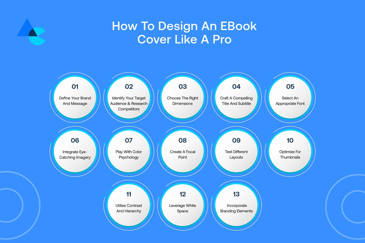
- How To Design an eBook Cover Like a Pro
- Step 1: Define Your Brand and Message
- Step 2: Identify Your Target Audience and Research Competitors
- Step 3: Choose the Right Dimensions
- Step 4: Craft a Compelling Title and Subtitle
- Step 5: Select an Appropriate Font
- Step 6: Integrate Eye-Catching Imagery
- Step 7: Play with Color Psychology
- Step 8: Create a Focal Point
- Step 9: Test Different Layouts
- Step 10: Optimize for Thumbnails
- Step 11: Utilize Contrast and Hierarchy
- Step 12: Leverage White Space
- Step 13: Incorporate Branding Elements
- Tips for Designing Good eBook Covers
Ever heard the saying, “Don’t judge a book by its cover”? Well, when it comes to eBooks, most people do judge by the cover.
That’s why an excellent cover design is extremely important. People see it first and can either stop and look or scroll right over it.
Whether you’re writing your very first eBook or styling up an old one, this guide is for you. It will help you how to design an eBook cover that grabs attention even if design isn’t your thing.
That’s because we’ll walk you through all the steps and explain everything in this blog.
So, let’s get underway and learn how to design an eBook cover that looks fantastic.
The Importance of the Right eBook Cover Design
Before we learn how to design an eBook cover, it’s vital to discuss its importance. Your e-book cover is the face of your book and the very first thing readers notice about it.
Readers will skip it if the cover is dull or confusing, regardless of whether the content is perfect inside. A great cover attracts attention, conveys what your book is about, and prompts readers to want to know more.
The correct e-book cover doesn’t merely look great—it tells a story. Your book’s mood theme and message are starkly revealed in a single glance instantly and quite vividly.
Cover art should be a vivid reflection inside whether starkly luminous or faintly muted. Your eBook cover can make or break your chances of getting noticed in today’s world where people scroll fast and decide quickly.
A professional, clean design builds trust, shows effort, and can even boost sales. It’s not just makeup but rather a savvy marketing strategy.
Also, if your cover design is eye-catching in thumbnails, social media shares, and online shops, it can make your book more distinct wherever it appears.
And if you want readers to cease scrolling and begin reading, ensure your eBook cover is created from the very beginning. It really can be the difference between being overlooked and being unforgettable.
How To Design an eBook Cover Like a Pro
Now let’s learn how to design an eBook cover. While it might sound super tricky at first glance but designing it becomes simple when broken down into manageable tiny steps.
Key steps for how to create an eBook cover like a total pro are as follows:
Step 1: Define Your Brand and Message
Before designing, consider what your eBook is ultimately about. Is it creative, educational, funny, or serious?
Let your brand and message come through on your cover. Choose a theme to suit the tone of your book.
If your eBook is lighthearted, go for playful fonts and colors. If your eBook is businesslike, use sharp and clean designs.
Ensure your cover gives readers an idea of what they can expect to find inside your book.
Step 2: Identify Your Target Audience and Research Competitors
Consider your audience. Are they teens, adults, or business people? This will assist you in choosing the correct colors, fonts, and imagery.
Take a look at the covers of similar books to yours. Notice what does work and what doesn’t and then find out how you can do better.
Learning from other people is a good way to get ebook cover ideas.
Step 3: Choose the Right Dimensions
eBook publishers such as Amazon or Apple Books require particular cover size measurements. Ensure your cover is the same size as they need so it appears well across every setup.
Typically a resolution size is 1600 by 2560 pixels. Your cover might look blurry or get chopped off entirely if the size isn’t quite right.
Pick the right size way before designing starts and it’ll save tons of time and loads of trouble down the line later.
Step 4: Craft a Compelling Title and Subtitle
A clear and catchy title ranks high among the first impressions people get when they read something.
Keep text simple and related to your topic so people can understand it pretty easily. Use powerful words to generate curiosity or a promise of what they will gain.
A good title and subtitle combination will get your readers to open your book and begin reading.
Step 5: Select an Appropriate Font
Fonts do have character! Fancy fonts can feel stylish whereas bold fonts feel pretty darn strong and remarkably clear.
Choose a typeface that resonates with your publication’s vibe and remains legible down in tiny sizes rather effortlessly. Using loads of fonts isn’t exactly well and basically, two should be plenty.
One works best for the title and another for the subtitle usually pretty well. Words pop off a page when language is stripped bare and kept ridiculously simple.
Step 6: Integrate Eye-Catching Imagery
Pictures bring your cover to life. Incorporate imagery such as photo illustrations or quirky icons that somewhat fit your book’s overall vibe and somewhat obscure topic perfectly.
Ensure picture quality remains razor-sharp and utterly unblurred or warped beyond recognition on various displays.
One strong image can be more than enough for design purposes sometimes. Use visuals that evoke feelings or curiosity to incite people to want to click on your book.
Step 7: Play with Color Psychology
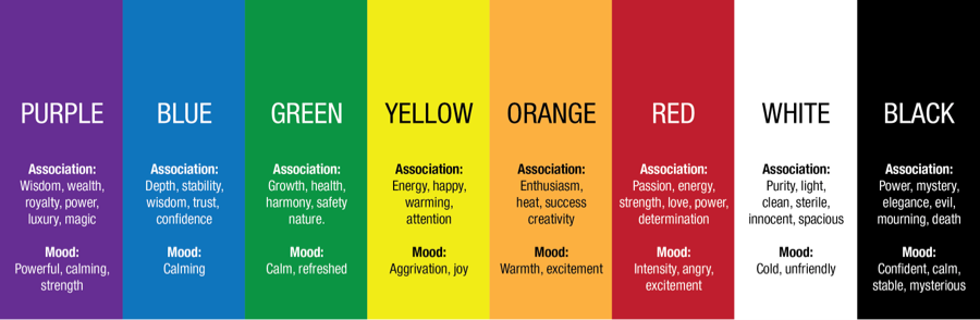
Colors can change how people feel. Vibrant colors like fiery red and sunshine yellow radiate energy while blues and muted greens exude soothing trustworthiness quietly.
Ponder deeply about the emotional resonance your book should make and select colors that resonate with such themes or overall feelings.
Ensure colors mesh fairly well together and don’t jar or utterly clash with each other. A cover’s attractiveness can be amplified by a befitting color scheme and thus make it stick out from others remarkably.
Step 8: Create a Focal Point
Your book cover should contain a key focal point and have one thing standing out alone—that is your focus.
That can be the title, a picture, or a quirky shape. This directs the eye and makes your cover more interesting. Avoid overwhelming the area with too many objects.
Keep it minimalist and bold, so the observer can glance directly at where they should look and be attracted to find out more.
Step 9: Test Different Layouts
Don’t settle for your first layout! Experiment with moving things around — swap the position of the title, reposition the image, or alter the spacing.
One slight change can make all the difference. Have a look at two or three variations and determine what you like best. Ask your friends or target audience what their opinions are.
Testing different layouts enables you to discover the most attention-grabbing, well-balanced, and professional design for your eBook cover.
Step 10: Optimize for Thumbnails
A lot of people think of eBook covers as small thumbnails appearing on their phones or computers.
That is why your cover should work well when it is small-sized. Ensure your title is legible and your image remains recognizable.
Steer clear of thin fonts or minute detail work barely visible when your design is reduced in size. A fantastic thumbnail instantly draws the user in and compels them to click and learn more.
Step 11: Utilize Contrast and Hierarchy
Contrast makes your design more noticeable. Put light text over dark backgrounds or bold fonts alongside delicate pictures.
Hierarchy means displaying what is most important in your design—typically the title first, then the subtitle, and finally the author’s name.
Using size, color, or position will do this. They make your cover more readable and direct the viewers’ eyes in a proper order.
Step 12: Leverage White Space
White space is not necessarily white—it is just empty space where your design can breathe. Do not put all your content in a small area.
Let text, images, and other elements have ample space around them freely. It makes your cover look super clean and modern thereby becoming easier to read.
Employing white space effectively conveys expertise and lends a somewhat professional air to your design.
Step 13: Incorporate Branding Elements

If you are publishing a series or establishing your own author brand, make your covers consistent across your books.
Employ the same font, logo, or coloring in all your titles. This way, your readers immediately recognize your style.
Include your logo if you have one, or incorporate design elements consistent with your website or social media. Branding creates trust and gives your eBook a more official and refined look.
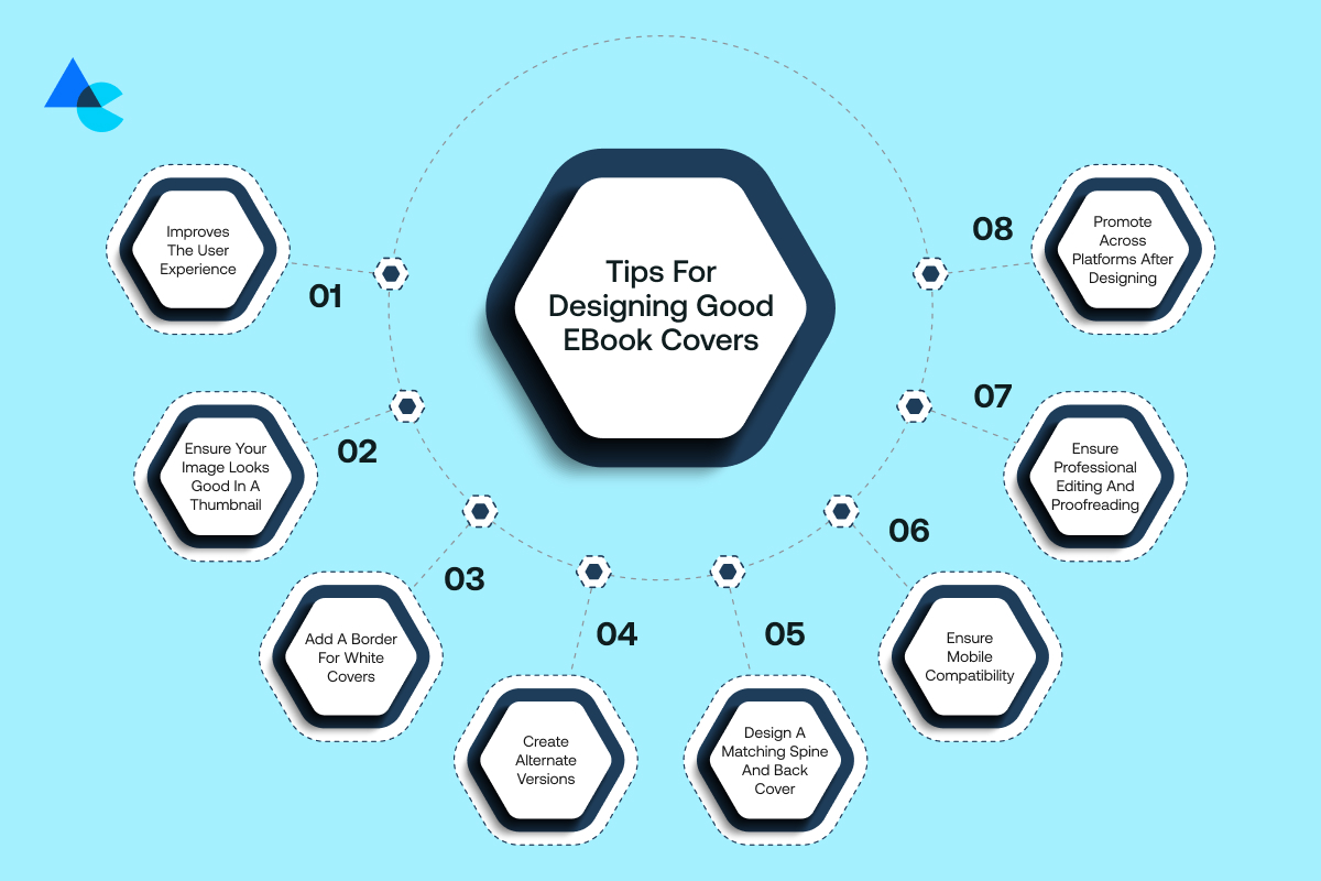
Tips for Designing Good eBook Covers
Now that we have learned how to design an eBook cover, here are some extra tips that can help you make your eBook cover even better and more eye-catching.
Keep it Simple and Timeless
Steer clear from cluttered designs or current styles that will soon become outdated. A neat and clean cover appears more businesslike and will serve you well in the long run.
Use a couple of strong elements and make your book theme evident. Timeless designs are more memorable and recognizable later and will stand out more in readers’ minds.
Ensure Your Image Looks Good in a Thumbnail
Your e-book cover will commonly be viewed as a small thumbnail and thus needs to be easily readable and sharp-looking at a small size.
Steer clear of complex visuals or very small details that are lost when minimized. Check your cover at a small size to ensure it still appears good and communicates the intended message.
Add a Border for White Covers
If your cover background is white or light in color, it can get lost when viewed against white web pages.
Adding a thin border will define the boundaries and make it more visible. This minor touch keeps your cover tidy and makes it more noticeable across all platforms.
Create Alternate Versions
A good idea is to create a couple of different variations of your cover. You will want to have different formats based on social media, email promotions, or websites.
Experiment with altering the size, the layout, or the colors somewhat. Having variations makes your eBook adaptable and poised to promote anywhere online.
Design a Matching Spine and Back Cover
If your intention is to publish your eBook in the future, don’t overlook the back cover and spine! They need to complement your front cover in terms of style and colors.
Add important elements such as a blurb and author bio. A completed design makes your eBook look more finished and polished.
Ensure Mobile Compatibility
Lots of readers and shoppers buy eBooks from their phones. Ensure your cover art will look good on a small screen.
Employ large fonts and good-quality pictures. Keep your design neat so the text remains legible. Having a design suitable for a mobile will make your eBook more accessible to readers.
Ensure Professional Editing and Proofreading
The finest design won’t matter if your cover contains errors or blurry text. Double-check absolutely everything and get it reviewed where possible through a designer or editor.
Professionalism and trust are displayed through clean and error-free design before readers have even opened your book.
Promote Across Platforms After Designing
The final tip on how to make an ebook cover is that once your cover is finalized, showcase it! Post it to social media, your website, and in your e-mails.
A good cover will get your promotions noticed. Use it in campaigns, teasers, and product posts. The more they view it, the greater the chances they will click and read.
Which Software to Choose for Designing an eBook Cover?
Picking the right design tool depends on your skill level and what kind of features you need. Let’s explore your options as they are just as important as learning how to design an eBook cover.
Drag and Drop Editors
These are easy-to-use tools perfect for beginners who want to create great designs without needing advanced skills:
- Canva: Canva is easy to use with loads of templates, images, and fonts. Ideal for quick and stunning eBook cover designs with no design experience required.
- Kindle Create: Amazon-built, Kindle Create aids you in formatting and designing covers suitable for Kindle books. Highly Kindle-friendly and easy to use.
- Adobe Express: A more streamlined alternative to Adobe software, Adobe Express provides drag-and-drop capabilities with high-quality design material and easy sharing capabilities.
- Snappa: Snappa is excellent if you want quick designs. It offers you templates and a large image library to get your designs done within minutes.
Advanced Editors
These tools offer more control and features, best for those with some design experience or who want full creative freedom:
- Adobe: Adobe Photoshop or Illustrator provides you with total control using advanced tools, layers, and effects—ideal for unique, quality eBook covers.
- Affinity: A strong competitor to the likes of Adobe, this software provides pro-level functionalities at a one-time cost. Great for advanced editing and vector work.
- GIMP (GNU Image Manipulation Program): GIMP is a free and open-source equivalent of Photoshop with advanced capabilities but can take a while to master if you’re new to design.
- Scribus: This free desktop publishing software is ideal for crafting entire layouts such as eBook covers. It is ideal for professionals who need print-level accuracy.
Which Publisher to Choose?
Once your eBook and cover are ready next step involves choosing the right platform for publishing it effectively online Here are some great options:
- Amazon Kindle: The world’s largest eBooks platform. Publishing through Kindle puts your book in the hands of millions of readers, with excellent tools to format your book, monitor your sales, and earn your royalties.
- Google Play Books: Having a large user base on Android means Google Play Books is the ideal choice. Simple setup, international availability, and smooth integration with other Google services for increased visibility.
- Apple Books: Apple Books is the perfect vehicle for engaging iPhone and iPad users. The service provides readers with a clean reading experience and access to readers who are passionate about quality, refined eBooks.
- Smashwords: Smashwords promotes your eBook across several platforms and enables you to reach more readers. It’s simple to use and offers both free and paid publishing routes.
- Barnes & Noble: You can publish directly to Nook readers using the B&N Press system. It is ideal for writers who wish to have significant visibility in brick-and-mortar and online bookstores alike.
- Kobo:: Widely used in Canada and international territories, Kobo provides strong distribution and valuable marketing tools. It’s an excellent way to extend your readership outside the U.S.!
- Lulu: Lulu allows you to publish and print your book or eBook. They are ideal for direct-to-reader sales with full pricing and customization capability.
Why Choose Artisticore to Design an eBook Cover?

If you don’t know how to design an eBook cover and want experts to do it for you, you can choose Artisticore.
We don’t just produce covers at Artisticore—we craft your narrative with design. Our ebook cover designer works with you and your team to get to know your brand, your message, and your readers.
Whether you’re publishing your very first eBook or continuing with a series in growth, we offer an eBook cover design service to design unique covers that make a statement and speak to readers.
From bold graphics to ideal fonts, each and every aspect of ebook cover examples is carefully designed. We ensure your cover appears great across all devices, platforms, and formats.
And we do it all professionally, so you can have a stress-free design experience. We are your ideal partner if you need a cover that appears fantastic and will sell your book effectively.
Final Thoughts
That is all we have for this blog on how to design an eBook cover. Creating an eBook cover is more than creating something good-looking, it is about capturing attention and communicating your message at a glance. A good, carefully considered cover can increase your book’s visibility chances, get clicked, and get read with a greater frequency. From the selection of the right fonts and colors to making the design compatible with all the devices, each and every line and design matters.
Whether you are a novice using the drag-and-drop software or bringing in professionals like Artisticore, ensure clarity, creativity, and connection always. Keep in mind, that your cover will be the very first thing people will see—so make it pop and convey your message. Using proper design, your eBook is transformed from a document to an experience that draws people in.
FAQs
The dimensions may vary across platforms, but a common size for eBook covers is 1600 x 2400 pixels. Always check the specific requirements of the platform where you intend to publish your eBook.
Consider your genre and audience when choosing a font. Ensure it’s legible, even at smaller sizes, and aligns with the mood and tone of your book. Experiment with different fonts to find the perfect match.
Ideally, start brainstorming and designing your cover concept early in the writing process. This can help shape the visual identity of your book and serve as motivation. Refine the design as needed after completing your manuscript.
While DIY is an option, hiring a professional designer is recommended for a polished, market-ready cover. Designers bring expertise in composition, color theory, and industry trends, ensuring your cover stands out.

Sultan Hanif is a seasoned wordsmith, who brings technology trends and innovations to life through his words. A tech-savvy gamer with a passion for all things football, Sultan blends his technical knowledge with creative storytelling to empower businesses and individuals alike.
