How to Design a Logo: A Complete Guide to Craft a Memorable Brand Identity
Author :
- Introduction: Why Learning How to Design a Logo Matters
- How to Design a Logo: Defining Your Brand Identity?
- Exploring Competitors and Industry Trends
- Choosing Your Logo Design Style
- Want Minimalism?
- Looking to Experiment?
- Get Recognized with logo Simple designs!
- Selecting The Most Appropriate Types of Logos for Branding
- Wordmarks logos
- Lettermark logos
- Symbol logos
- Abstract logos
- Emblem logos
- Combination logos
- Dynamic logos
- Importance of Color Psychology in Logo Design
Introduction: Why Learning How to Design a Logo Matters
A logo is not merely a graphic icon; it is the core of your brand. It is your brand symbol that everyone will see and remember. They say, be wise when choosing a logo. It is simply because a logo speaks your brand values, style. A logo is your company’s face that sets a tone. With a logo, you can either go bold or remain simple and classic. No matter, what your business aura is, using the perfect logo design tips will get you good outcomes.
People often mistake the role of a logo design with how beautiful and appealing it looks. Yes! it does appeal your audiences but it also does a lot more. For example, it creates trust, familiarity, and uniformity throughout all platforms. This will appear on your site, your package, on your social media and through your marketing efforts. People should be able to relate your brand story to your logo when they see it.
These days, it is easier than ever to create a logo. There are tools such as Wix logo design, where you can create one yourself, or collaborate with experts who will make sure that no detail lacks an aspect of your business.
“Design is the silent ambassador of your brand.”. – Paul Rand
How to Design a Logo: Defining Your Brand Identity?
Do not jump on choosing colors and planning sketch ideas! First, define your brand identity. Remember, the logo design itself is not your brand but it carries the correct emotions that hit the target audience.
When we see brands like Adidas and Coca-Cola, it instantly clicks that the brand is related to shoes and beverages. You see what a brand logo did here? It conveys the meaning that we hold on to up till now. This is exactly why you can’t fail to hit the target.
A logo without a clear understanding of who you are and what you represent is of no importance. Begin with defining your values, mission and target audience. How do you want people to feel about your logo? Professional? Playful? Innovative? These feelings will be the design driver.
And yes! consider brand guidelines at an early stage. Transparency in colors, typography, and tone make your logo blend with the rest of your identity. This is where logo and branding interrelate. Quality logos strongly represent the brand you create. Whether it’s a design for business or a freelance company, the logo must align with your brand identity to stand out.
Exploring Competitors and Industry Trends
When learning how to design a logo, one of the smartest first steps is analyzing what your competitors are doing. Explore graphic design company logos and business logos concepts in your industry. Notice what works and what doesn’t, such as clarity, scalability, or creativity.
Competition is not something to copy by studying it. Rather, it will assist you in determining the logo design best practices that you can adopt whilst making sure that your brand appears distinct. Question: Are their logos stale or stylish? Do they look familiar? Do they effectively communicate values?
Trends also play a role. Being a start-up, you can take ideas from cool simple logos. However, a corporate design logo can serve a law firm, displaying business vibes. The logo must not be stale. It must remain timelessly professional. And when you use the proper logo tips, you save a lot of time that goes making frequent changes.
“Trends fade away, but strong ideas last.”
Desire a logo that makes you stand out? Artisticore designs are industry specific.
Choosing Your Logo Design Style
The next step in how to design a logo will be choosing a style. Do not just go for standard logos. Remember to keep the interlink between design style and your brand in mind. The style of your logo must convey a personality, be it minimalist, modern, classic, or playful.
Want Minimalism?
In case you prefer minimalistic yet classical logo, look up to famous brands like Apple or Nike. I am sure you have recalled them by now. Exciting right? How a tiny symbol has the greatest effect on the global audience?
Looking to Experiment?
Are you a fun loving brand who’s target audience is youth? Choose a fun logo design or experiment with what exists to come up with something new. Youth loves creativity. To experiment, you can use Wix logo generator where you can find existing Wix logo design to choose from.
Get Recognized with logo Simple designs!
Logo simple ideas work best for brands/businesses wanting to gain recognition. These are easier to recall because of the use of clean lines and less elements. But, do not ever be shy to change your style to fit the tone of your brand.
Moreover, for brands wanting to deliver a bold and edgy feel must choose fierce style. Whereas, brands wanting to showcase heritage can choose classic design. Selecting a style makes your logo fit your story and customer expectations.
“Simplicity is the refined sophistication.” – Leonardo da Vinci
Can’t decide what style best fits your brand?
Professionals at Artisticore can help you to make the right decision.
Selecting The Most Appropriate Types of Logos for Branding
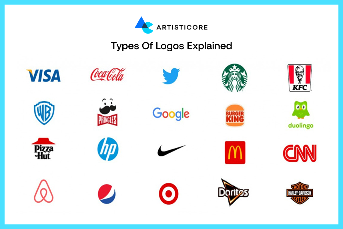
Learning how to create a good logo is not just about colors or fonts. It is mainly about choosing the types of logos for branding. There are many types of logo designs available to take inspiration from. Remember, your decisions to choose the type of logo will influence the way audience view your brand. Understanding how you can use logos to brand your name allows you to find a style that fits.
Wordmarks logos
They put your brand name in the limelight. Well-known brands such as Google and Coca-Cola are built on this kind of typography. It is an excellent selection when you desire simple brand logos that are easy to read and recall.
Lettermark logos
They make long names easy to remember. Think IBM or CNN as they have used lettermark logo type. This is particularly effective in corporate logo design, where the professionalism and recognition is important.
Symbol logos
Wondering what a logo is that conveys immediately? Here it is. Symbol logos are designed using pictorial marks. Nike swoosh or Twitter bird are the perfect example how an image can be iconic.
Abstract logos
Such logos are crafted using distinct shapes. Famous brands like Pepsi or Adidas have used abstracts in their logos. It shows how a shape can represent a brand without the use of words. These are ideal when you desire something unique and international.
Emblem logos
Tradition and authority comes with emblems. Seals, crests, and badges such as those of Harley-Davidson or Starbucks are perfect when companies seek to have quality logos that have a sense of heritage.
Combination logos
They are crafted by combining text with images. This is a very unique logo type that is user friendly. It also fits the logo design best practices, making the design both readable and creative.
Dynamic logos
The kind of logos keep evolving. Wondering which brand/business keeps changing their logos? Well, its Google Doodles and MTV. They do this to fit trends, events, and culture, and hence remain unique and timeless.
If you’re still wondering how to create a logo that stays relevant? Then simply consider your audience, your industry and what will appeal them the most. If you want to remain consistent, go for conventional yet different logo styles. But, you can always create a buzz with a cool simple logo design.
Want to stand out? Select a type of logo that tells your story with Artisticore.
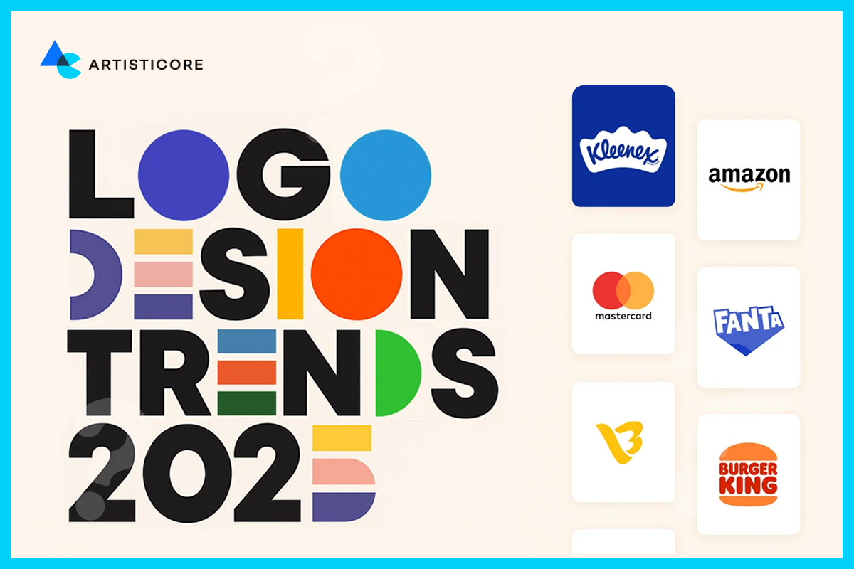
Importance of Color Psychology in Logo Design
![]()
The job is not done when you have no idea about how color works in general or in the process of how to design a logo. Color psychology is not something that you can overlook in this process. Even generally, color has everything to do with what a certain thing makes you feel.
Each color evokes a feeling. For example, blue creates a feeling of trust, red creates energy, yellow creates hope, and black creates sophistication. These color associations help brands link directly to their audience. Let’s just admit that we all are slightly inclined towards a certain color palette. If you ever have to design a logo for yourself, you will choose colors based on what you want your audience to feel about your brand. As an example, blue and gray are commonly used in designing corporate logos because of its authoritative look. Green is used by eco-friendly or health driven brands. Designing brands choose different colors for different logos to remain in the spotlight.
Black and White vs. Colored Logos
The black-white color scheme is flexible and classic. It is normally used frequently by designer brand logos such as Chanel or Prada. Never had a Chanel bag but can recall the writing logo of it. Such logos remain elegant across the globe, helping you learn how to make a good logo using black and white.
On the other hand, a multicolor logo design makes brands relatable and alive. Plus, who doesn’t like colors. Logos of Google and eBay are the perfect example of colored logos, inducing playful emotions in audience. If you are wondering how to draw a logo using monochrome or multicolor palette, then you know where to go. Whether you want simple logo ideas that fit or want to make an impression, you can never go wrong with either of them.
Role of Color Combinations in Crafting Best Logos
It is never a good idea to stick to what people in the past have done. If you mind speaks for different color combination, go with it. The best logos are not only based on single color. Wondering how to come up with a logo that differentiate but still make a noise among audience? Choose any color combo as long as it looks balanced.
For example, harmony is achieved with similar hues such green and yellow. To have a contrast, use complementary hues such as blue and orange. Having two or three shades is scalable to print, screens and merchandise. When design for branding, play around with color combinations as colors speaks more than words.
Artisticore is turning heads by applying color psychology in each logo design.
Want one for you?
Typography That Talks About Your Brand Voice
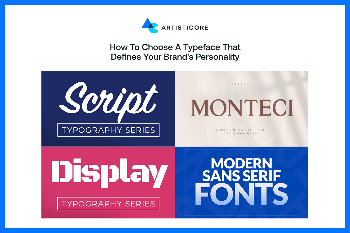
Typography is not only about letters; it is about personality. Serif font is traditional and professional whereas Sans serif is modern and simple. Handwritten or script styles can be either creative or beautiful. In the process of learning how to draw logo, you need to choose the appropriate typeface. This will help your message aligns with the values of your brand. This is an important step in the logo design process, since fonts are as easy to remember as symbols.
Readability and Versatility
An excellent logo should be effective on business cards, billboards, and on-screen. Too fancy fonts may appear artistic but will not work at small sizes. Rather, use two fonts strategically such as bold sans serif and subtle serif to bring balance. The following tips to designing a logo make it clear to any person looking at your logo in the header of a web site or on a piece of merchandise. Consider writing logo text as much as you would design an icon.
Personalized Fonts and Flair
Many graphic designers find custom typography unique. Unique fonts can shape the personality of a brand, whether they belong to luxury fashion brands or new startups. If you’re a beginner, you can also take help from like Wix developer. Such tools help you tweak spacing, kerning, and alignment in standard fonts. Typography is not just about letters; it is a visual element that makes the first impressions. Whats a logo font that does not keep your identity feel new and memorable? Remember that the choice of font type can make or break the aura of your brand.
Artisticore assists in searching the font that will make your brand memorable.
Shapes, Icons, And Structures That Create Recognition
![]()
Shapes form immediate associations. Circles denote togetherness, squares denote stability and triangles denote innovation. When trying to figure out how to create a logo, it is useful to work with simple sketches. It brings abstract ideas to life. The classic designs tell us that less is usually more.
The Role of Icons and Symbols
Words have limited capacity to convey meaning, icons fill the gaps. A tree may be a symbol of growth, whereas an arrow is the indication of a move. It is easier to ask yourself what is a logo? when you observe the ways these symbols resonate with audiences at an emotional level. They are links to your brand story.
Layouts and Negative Space
Good layout is well balanced and does not clutter. Negative space such as the arrow in FedEx shows how subtlety improves memorability. Even the crude sketches can become refined marks. Having the knowledge of how to edit a logo helps you fine tune your logo as your brand expands.
Ready to get a logo that lasts?
Let Artisticore tells you how to design a logo with accuracy and innovation.
Create Logo Design with Tools
![]()
Would you rely on a logo that functions well online but ineffective in print? You don’t right! When deciding how to design a logo, you can choose between DIY tools and professional software. Sites such as the Canva and Wix logo generator provide faster outputs, whereas Adobe Illustrator and Photoshop provide control. Mockups are also used to test your design to make sure it feels right on different platforms.
Refining and Editing
Designing a logo is not a onetime activity. It is continuous process that needs refinement. You need feedback and revision to make your logo as good as possible. When you try align with the recent trends, the process of how to design a logo continues. Remember, good ideas are refined into great ideas. Scalability is another aspect which is also important. Whatever you design, it must be readable on social platforms and billboard.
Finalizing and Using It Across Branding
The final step in how to design a logo process refers to getting your logo design ready to the world. The logo must be available in all the formats including PNG or SVG, so save it in all formats. You can also use trademark basics to protect it. Also, do not forget to use your logo on business cards, websites and packaging material. Having your logo on all the business materials enhance recognition among the audience.
Key Principles in How to Design a Logo
An effective logo is easy, memorable, multi-purpose and classic. It must be distinguished yet consistent with your brand image. When you design a logo yourself or take any professional help, keep your eye on your brand values. The logo you make for your brand will appeal your audience and get you recognized.
Tips for Creating a Standout Design
Clichés will make your logo just another face in the crowd. Check your logo in black and white to verify strength without color. Consider scalability and its adaptation across mediums. Remember, the best logo design is the one that tells a story, does yours?
Concluding Remarks
Your logo is not your complete brand but the building block. It sets brand guidelines, colors, and voice. Once you set the voice, it is important to be consistent with it across different channels. This will create trust and familiarity. Creating brand identity starts with a mark that is remembered.
Learning how to design a logo means understanding identity, clarity, and consistency. It is not an image, but a symbolic story in logo design about your brand.

Hafsa Hanif is a talented content writer at WebnHubs, specializing in topics such as graphic design, web design and development, logo design, and animation. With her deep understanding of design principles and creative processes, Hafsa crafts engaging, informative, and SEO-optimized content that resonates with readers. Her expertise in SEO ensures that her articles not only captivate audiences but also rank well on search engines, helping businesses boost their online presence through compelling design-focused narratives.
