How to Design a Newsletter: Step-by-Step Guide
Author :
- What is a Newsletter?
- Importance of a Good Email Design
- Drives Engagement
- Increases Open and Click-Through Rates
- Improves Conversion Rates
- Fosters Customer Loyalty and Relationships:
- 8 Key Elements of a Good Newsletter
- Is Readable
- Tells a Story
- Contains Engaging Content
- Focuses on the Audience
- Includes Clear CTAs
- Personalized for Recipient
- Starts With an Attention-Grabbing Subject Line
- Has a Right Layout
- What is the Right Layout for a Newsletter?
- How to Design a Newsletter
Designing a newsletter may seem daunting but it’s surprisingly easier than you’ve been led to believe.
A well-designed newsletter keeps you in touch with readers and builds strong relationships by sharing exciting news.
We’ll break down how to design a newsletter that people want to open and thoroughly read in this step-by-step guide.
We’ll cover it all in simple words. from picking the right layout and writing super catchy content.
At the end of it all, you will know how to create a newsletter that will grab readers’ attention and keep them coming back to connect with you.
So, without any further ado, let’s get right into it.
What is a Newsletter?
Before learning how to design a newsletter, let’s look at the newsletter itself. So, if you are wondering what does a newsletter look like, then a newsletter serves as quite friendly letters landing in people’s inboxes.
It keeps them somewhat updated about your business’s new developments. Sharing news updates, special offers and fab tips with subscribers happens via this cool and social method of communication.
You can think of it as a sort of mini magazine that is delivered to your readers’ inboxes, in a form that can regularly remind people of you and provide a sense of connection.
Newsletters are used by businesses, schools, and clubs, and you probably receive them from your favorite YouTube star or blog!
A decent newsletter gives value so people actually bother reading it rather than deleting it unopened like some boring spammy thing.
Staying connected with folks means having a newsletter as your ace card.
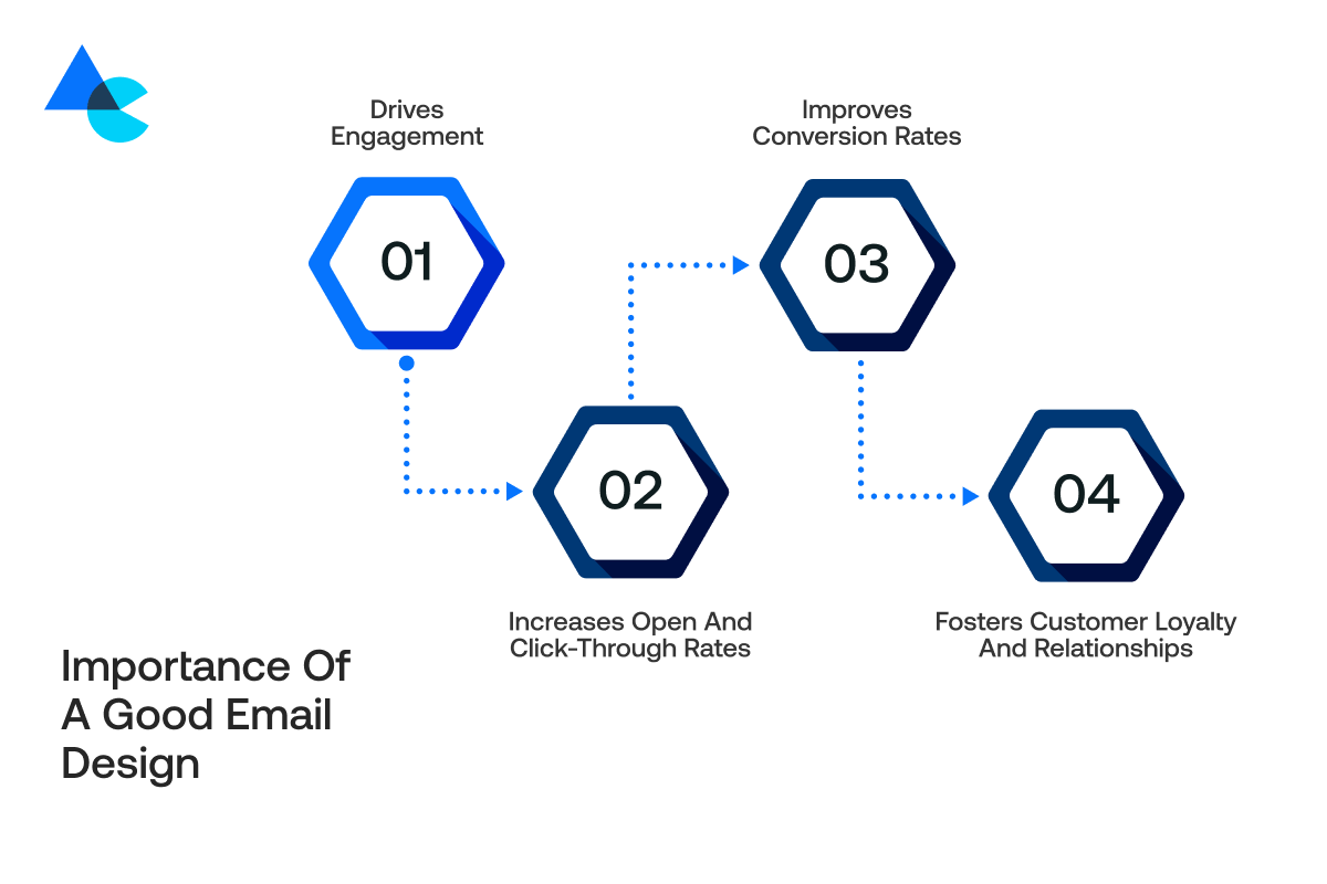
Importance of a Good Email Design
You must know the importance of a newsletter when you learn how to design a newsletter. A good email newsletter design does a lot more than look pretty.
Here are some reasons why newsletter design is so important:
Drives Engagement
When your newsletter is visually appealing and easily readable, your audience has the impulse to click and find out more. A good design pulls your audience in while piquing their curiosity.
It’s like the best invitation ever, one that was fun and they didn’t want to pass up. Your content was clear and your links made reading easy.
Readers tend to comment or share stuff and visit websites when the content seems pretty clear and links really stand out.
The design sparks involvement and people get stoked about the stuff you’re tossing around.
Increases Open and Click-Through Rates
Emails that appear fascinating at a glance tend to get opened more often. This phenomenon is referred to as the open rate. Eye-catching visuals and subject lines combine quite effectively with the good design making people really eager to see stuff inside.
Once they’re reading, clear buttons and links help them click through to your website or shop. This means your click-through rates go up too. Better design = better results. It’s a win-win for you and your readers!
Improves Conversion Rates
When readers are satisfied with what they see and easily recognize what you want them to do; the chance of them acting is increased – buying something, signing up, etc.
This is referred to as a conversion. A clear and simple design with clear calls-to-action (CTA’s) will help navigate people through the next steps.
It’s like giving them a map to follow with an open hand! The easier a process you can provide the chance of them saying “yes” to the offer increases.
Fosters Customer Loyalty and Relationships:
A beautifully produced newsletter pretty much proves you actually care about your readers and take their opinions into account.
People feel remarkably special receiving cool emails from you that are somewhat helpful and memorable in a good way. It builds trust and makes them want to stick around longer.
They will eventually perceive you as a pretty reliable brand or person worthy of their trust over a long period.
Good corporate newsletter design helps foster robust relationships and retains readers avidly seeking more stuff pretty much all the time and with great enthusiasm.
8 Key Elements of a Good Newsletter
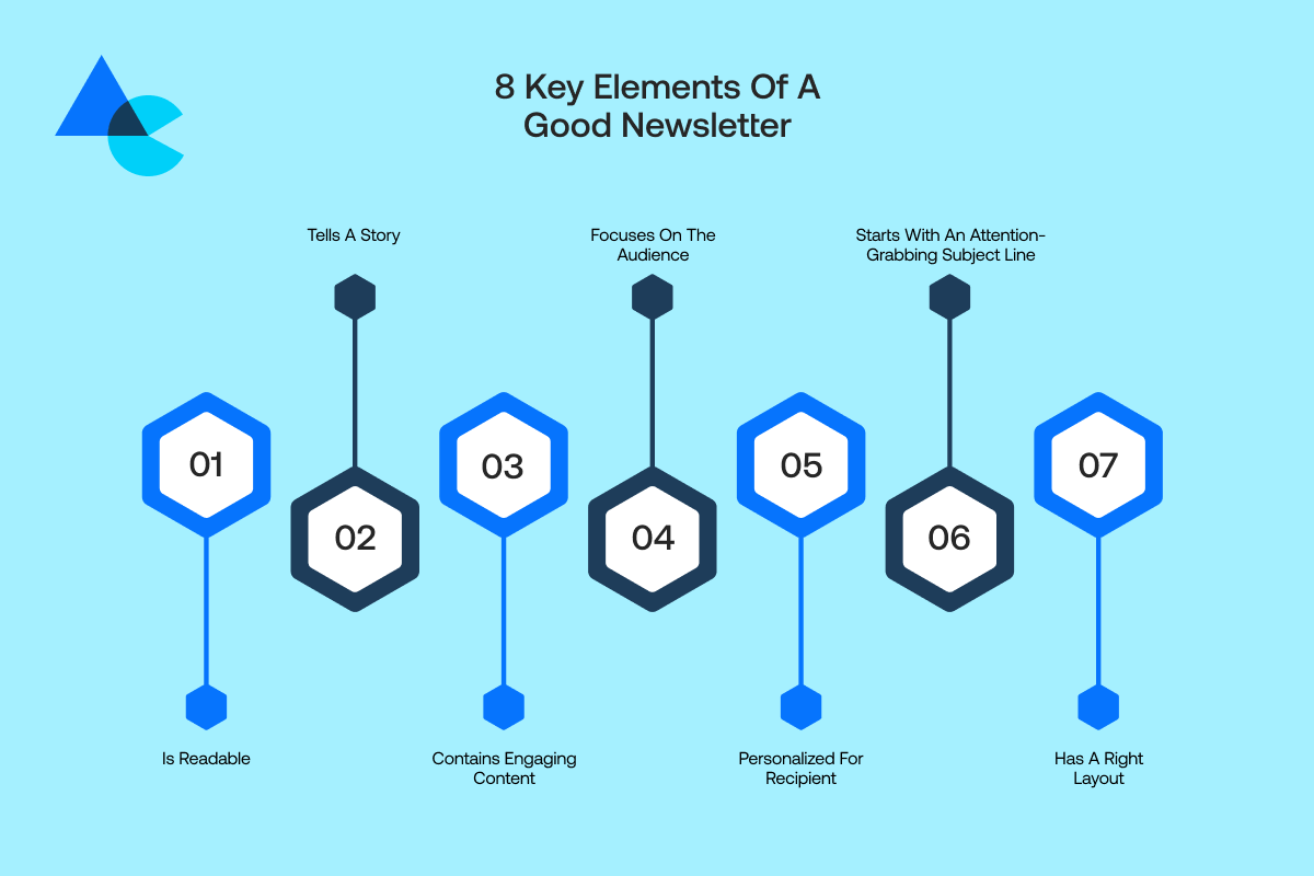
Now when it comes to knowing how to design a newsletter, it means you must know the basics of a good newsletter.
Therefore, these key elements are what make a good newsletter, and will help you create emails that people actually read, enjoy, and want more of!
Is Readable
If your newsletter is unreadable, then no one will read it! A good general rule is to keep your fonts simple, headings simple, and paragraphs short.
Do not squeeze too much text together, leave enough space between each element, so your email does not feel formidable. Also, consider using bullet points because they are easier to follow – visually speaking.
If people can easily scan your content and discover your intended meaning, they will likely keep reading. A readable newsletter communicates an understandable message and pleases the eye!
Tells a Story
People love stories! Narrating a straightforward tale within a newsletter often renders your message more captivating and endearing to readers most times.
Maybe it becomes a customer success tale or an illustrative example of someone deriving benefit from your product.
Stories tap deeply into the human psyche making the brand relatable and feel way more human in a very profound manner.
Readers become invested in your journey when sharing honest experiences that transform their perception of what you do. And a good story sticks with readers, even when they X out of your email!
Contains Engaging Content
Your content must not be dull! Spice up your newsletter with super helpful tips and fascinating facts or maybe some exclusive offers that grab attention really quickly.
Sprinkle in some quirky photos or super grainy videos and GIFs and keep it lively with heaps of visual flair.
People tend to stick around longer and look for your next emails when visuals captivate them to read on.
When determining the content, consider what your readers want to learn and not just what you would like to say.
Engaging content entices subscribers to come back repeatedly for fresh material.
Focuses on the Audience
Your newsletter should ostensibly cater squarely to readers rather than merely serving your own interests or agenda. Consider carefully what readers need or desperately want before putting pen to paper or fingers on the keyboard swiftly.
What problems can you help them solve? What news would they love to hear? Use simple words they’ll understand.
Focusing on audience interests makes them feel pretty darn special and fabulously valued.
Crafting a newsletter around readers makes folks feel super understood and that keeps them eagerly opening emails every single time.
Includes Clear CTAs
A CTA (call-to-action) prompts readers towards action with terse phrases like Shop Now or Sign Up.
By missing CTAS, you leave recipients confused and inactive despite liking the email content. Make your CTAs easy to see and keep them short and action-packed. Use buttons or bold text to make them stand out.
Good CTAs help guide people smoothly to your website, store, or special offer. So, never send a newsletter without clear next steps!
Personalized for Recipient
Folks adore personalized emails that seem tailor-made just for their very own eyes. Personalizing a newsletter can be simple by merely using recipients’ names in greetings with a somewhat flattering effect.
Different versions can be sent based on the interests of various groups quite differently and targeting them specifically with tailored content.
Send sports news to sports fans and travel tips to travelers abroad on vacation.
It resonates with people on a deep emotional level thereby making them feel utterly understood and extremely valued.
Bespoke newsletters arrive tailored squarely for individual interests so recipients devour them eagerly reveling in richly personalized relevant content daily.
Starts With an Attention-Grabbing Subject Line
Readers see your subject line first so make it really count with great care and finesse. A really good line catches attention quickly and makes people curious about the content.
Keep messaging concise yet crystal clear but refrain from peddling dubious promises laced with nebulous undertones and veiled obscurities.
Infuse personality into text with emojis and an urgent tone or friendly vibe as the situation demands pretty quickly.
Experiment with various approaches quite liberally and discern what resonates pretty well among your target demographic groups.
Crafting an opening subject line that grabs attention rather effectively boosts open rates of emails. Launching successfully requires taking this crucial step initially for a newsletter campaign.
Has a Right Layout
An organized layout helps readers navigate your newsletter. Your layout should act like a roadmap to direct your reader from the getting started to the very finishing.
You want clear layout sections, like header, intro, main piece, CTA’s, and footer. Also, you do not want an overly cluttered design, avoid heavy text blocks, and allow for space on the page.
You must sprinkle images and headings liberally throughout the text making it ridiculously easier to digest and follow so your newsletter becomes super enjoyable.
A slick layout makes the email look super professional and helps folks quickly find info they deem vital so interest stays piqued.
What is the Right Layout for a Newsletter?
A smart layout helps your readers follow along easily. Here’s how to design a newsletter layout and what each part of a good newsletter layout should include keeping things clear:
- Newsletter header: Your header is the first thing people see. It usually has your logo and maybe a tagline or date. This shows who the email is from right away. A good header sets the style for your whole newsletter and makes you look professional!
- Introduction: The introduction is like saying “hi!” to your reader. Maintain a tone that remains brief and friendly. Inform recipients about your email content and entice them to continue reading further down the page. A friendly intro makes folks feel welcome and prepares them to notice whatever’s looming ahead.
- Core content and its sections: Main content sits at the heart of your newsletter. Organize content into sections using bold headlines and images or bullet points. The content becomes easier to comprehend and thereby facilitates easy understanding. Well written content navigates readers through the story or key message you intend to share.
- CTAs: Your call-to-action (CTA) tells people what you want them to do next. Place CTAs in spots that make sense, after each main section or at the end. Use buttons or bold links so they stand out. CTAs help turn readers into customers!
- Footer: The footer serves as an ending part of your newsletter and is pretty much always down there at the very bottom. It often contains your contact details or links to social media profiles and sometimes features an unsubscribe option down there. Including such details helps stay professional remarkably well and conforms to standard email practices. Things stay clean with a footer that is clear and mostly complete down the page.
How to Design a Newsletter
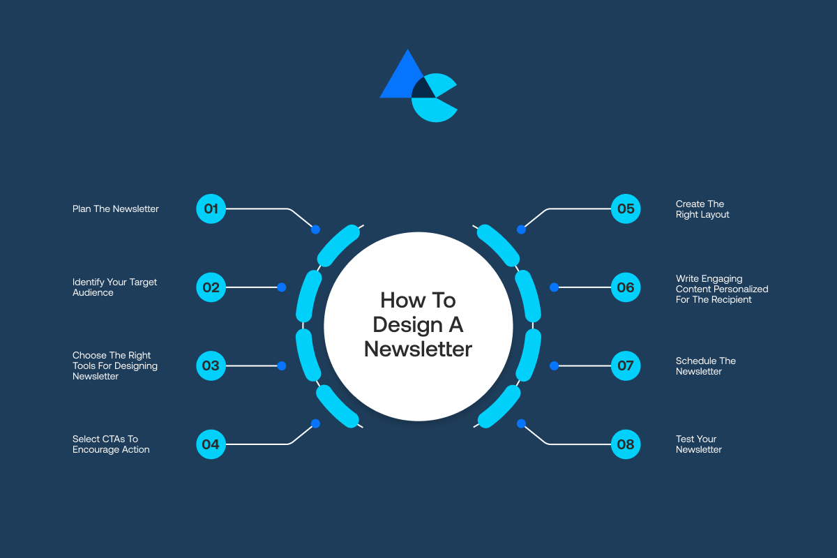
Designing a newsletter step-by-step makes the whole process easy and fun! Here’s how to make a newsletter that people will love, starting with planning, creating, and designing:
Step 1: Plan the Newsletter
Before diving headfirst into newsletter design an organization needs a clear understanding of how it will be utilized effectively.
Questions to ask yourself are: what do you want to get out of it? Will you be updating updates, promoting merchandise (products), or providing another learning opportunity?
Take some notes to clarify your ideas and decide the frequency for their newsletter – whether you’re planning to send a weekly newsletter, monthly newsletter, or just for special occurrences/news.
After that, consider which main section types you’ll want to include. Maybe you’ll have a very short introductory paragraph, followed by a main story, and finish with a few small updates/announcements.
You may want to sketch out a rough outline to stay organized with your section types. You may find planning will keep your newsletter on track and orderly/dialed in, because it is easy to stray with newsletters!
They definitely can become chaotic if you do not take the time to plan! Make the time to plan or it could be regrets!
You will find as a designer it will become much easier for you to put together a newsletter that has character when you know what you’re going to say!
19- Monitor and Leverage Analytics
Regularly analyze the performance of your newsletters using metrics like open rates, click-through rates, and conversion rates. Use this data to gain insights into what works and what needs improvement.
Understanding which content resonates most with your audience enables you to refine your approach and deliver even more compelling newsletters.
Step 2: Identify Your Target Audience
Knowing who you’re writing a newsletter to make your newsletter way better! Think about who your readers are, students, customers, parents, or maybe people who love a certain hobby.
What do they care about? What problems can you help solve for them? When you know your audience, you can pick topics they’ll find interesting and useful.
You’ll also know what tone to use, should you be formal, friendly, or funny? Plus, you’ll send them stuff they actually crave rather than utterly random pointless drivel they might summarily dismiss or flag as spam.
Look at your website visitors or social media followers and ask people what they’d like to see if the audience isn’t clearly defined yet.
Understanding readers deeply makes crafting a super personal newsletter remarkably easy and somewhat magically special!
Step 3: Choose the Right Tools for Designing Newsletter
You don’t need to be a tech wizard to design a great newsletter! There are lots of easy-to-use tools that make the job simple and fun.
Mailchimp and Canva are super popular alongside Constant Contact for various tasks apparently. Awesome templates are provided by these platforms and you just need to add your text images and links.
They often boast drag-and-drop features allowing users to rejig layout elements fairly easily until everything appears reasonably spot on. What exactly was pretty great?
These nifty tools help you test email renditions and see how they’ll render on phone screens or desktop computers pretty accurately.
Picking the right tool saves tons of time and makes your newsletter look pretty darn professional even when starting out fresh.
Find a tool that feels pretty easy and get super creative with it now.
Step 4: Select CTAs to Encourage Action
A CTA, or call-to-action, is one of the most important parts of your newsletter. It tells your reader exactly what to do next.
Want them to visit your website, buy something, or sign up for an event? Make it clear! Use action words like “Shop Now,” “Learn More,” or “Join Us.”
Keep CTAs concise and visually catchy using bold text or buttons that really stand out pretty well. Place your CTA front and center instead of burying it deep down where users are unlikely to stumble upon it.
Sprinkling CTAs liberally throughout a newsletter keeps readers from missing them pretty effectively it seems. Don’t confuse folks with disparate calls to action and keep messaging fairly focused.
A clear, simple CTA turns a good newsletter into one that really works!
Step 5: Create the Right Layout
A good layout gives your newsletter a nice, clean-looking structure and allows for easy readability. For that, you will need to follow newsletter guidelines for layout.
Begin with a straightforward layout featuring a prominent heading and a brief introduction preceding the main content segmented into discernible sections alongside eye-catching imagery and a footer containing contact details.
Leave plenty of white space so your newsletter doesn’t feel cramped and messy bursting at seams with too much stuff.
Guide reader’s eyes with judiciously placed headings and occasionally quirky subheadings. Put crucial info upfront where folks notice it immediately on top of everything else.
Opt for simplicity with a couple of fonts and just two or three brand-fitting colors that really pop for visual harmony.
Envision your layout as a navigational guide that facilitates a smooth transition from one section to another pretty seamlessly.
A great layout entices readers deeply and makes them devour content voraciously instead of clicking away quickly online.
Step 6: Write Engaging Content Personalized for the Recipient
Your writing is every bit as important as your creative newsletter design! Write like you’re talking to a friend – we want your tone to be friendly, clear, and as easy to understand as possible.
What also works is the personal touch. If you can, use the reader’s name! Try and use features that relate to their interests.
For example, if they love travel, provide travel tips or special offers. Write in short and fun sentences, keep it fun, and make it light so it’s never boring.
Keep paragraphs shortish and break up lengthy ones liberally adding quirky photos GIFs or emojis whenever it seems vaguely sensible. Does this aid your intended audience? Might they enjoy it?
People really look forward to opening your emails when content feels sorta personal and ridiculously fun. That’s a great newsletter’s real mojo.
Step 7: Schedule the Newsletter
Timing is super important! Even top-notch newsletters flop miserably if mailed at some ungodly hour.
Decide roughly how frequently you’ll blast out your newsletter every week or maybe monthly at some ridiculously irregular interval. Set goals in your mind so you stay committed. Pick a day and hour to send it forth.
Mid-week mornings often work best for most folks because inboxes haven’t gotten ridiculously full just yet. But this can depend on your audience, so experiment and see what works.
Many newsletter tools let you schedule emails in advance, which is awesome because you don’t have to hit “send” at the perfect moment.
Once you find a schedule that works, stay consistent. Readers will start to expect your newsletter, like a friendly surprise waiting for them!
Step 8: Test Your Newsletter
Always test your newsletter thoroughly before hitting send on it recklessly to everybody within your email list.
Little mistakes creep in quietly like gnarly bugs or egregious typos with weird formatting showing up sporadically down the page.
Send an email to yourself or colleagues then scrutinize it thoroughly on desktop and also mobile devices simultaneously with great care.
Verify images load properly and text remains legible while ensuring every button and call-to-action works flawlessly. Ensure that your subject line isn’t trimmed.
Make sure the email appears in your inbox and not your spam folder, it may bother people if your newsletter ends up going to their junk folder.
Some newsletter tools allow you to A/B test subject line variations or versions of a newsletter to see what your audience engages with most.
This is a very useful tool! It is well worth the extra few minutes it will take to test your email so it does not go wrong.
You have taken care of all these details and want your newsletter to feel professional and polished!
Why Choose Artisticore to Design a Newsletter?
Creating a newsletter is more than just typing words, it’s about getting every email designed and looking good, sounding engaging, and working slick.
This is where Artisticore excels! We know what makes a good newsletter. So, that’s why we design newsletters that look fabulously good and create quite an impact.
We handle everything from crafting snazzy layouts and visuals in-house and penning subject lines that grab attention quickly.
Every email embodies your brand’s essence faithfully because we stay attuned to your overall brand style pretty closely.
Furthermore, we are always testing and tweaking until it feels right! You won’t have to worry about design or strategy.
You will have a team that knows how to write a newsletter template, uses newsletter design tips, and cares about building your audience and keeping your readers excited about your next issue.
Let’s have some fun exploring your next newsletter design!
Final Thoughts
That is it for this blog on how to start a newsletter. We hope you can learn how to design a newsletter by reading this blog. Remember, you don’t have to feel stuck on designing an ideal newsletter. Just take it step by step. You can send the most read, opened, and shared emails in the world with proper planning, tools, and a little bit of imagination. Just remember it is for your readers. So, make the newsletter entertaining and valuable to them.
A good design and really friendly content with a clear layout will help you stand out well amidst super busy inboxes. Feeling stuck doesn’t necessarily mean you have to be stuck with no escape route or solution in sight. The Artisticore team is here to help you shine. Go ahead and put ideas into action and watch your next newsletter draw an audience close to you.

Sultan Hanif is a seasoned wordsmith, who brings technology trends and innovations to life through his words. A tech-savvy gamer with a passion for all things football, Sultan blends his technical knowledge with creative storytelling to empower businesses and individuals alike.
