Mobile Friendly Web Design: Make Your Site Usable & SEO-Optimized in 2026
Author :
Browsing has changed completely. Smartphones are no longer a luxury. They are the main tool which individuals use to shop, compare services, and make decisions over the internet. Do you that web design for mobile devices make 64% of the web traffic? Yes! it is true. Unless you have a website for mobile users, you are not likely to rank by Google. People get easily frustrated with sites that takes a lot to load and Google watches it. So, if you are a mobile app design company or a just a designer, make sure you know how to make a website mobile-friendly. In 2026, only the top mobile websites will hold and draw users back.
What Is Meant by Mobile Optimized Websites?

It means designing websites for mobile phones. Now, most will do just by fitting the content on smaller screens but that’s not it. You need to make according to the mobile app design trends for example, making text readable without zooming, putting easy tap buttons, using light images that load fast and structure that is smooth to follow. These are the traits that you will find in every good example of mobile websites. All these basic things that make their site optimized, reduced bounce raised, increase traffic and conversions.
Mobile Friendly Web Design Facts You Should Know

- The number of mobile devices that make up the web traffic in the world is approximately 64.35 percent (Duarte, 2025).
- It is estimated that 53% of the mobile users give up on a site that loads in more than 3 seconds (ThinkwithGoogle, 2024).
- The probability of users leaving the webpage increases by about 32% when the page load time goes above 1s to 3s (Shopify, 2024).
- Slow loading mobile website experience decrease in conversation by 20% over every additional second it takes to respond (Soto, 2025).
- The bounce rates by mobile phones (53.75%) are usually higher than desktop (51.76%), confirms the importance of mobile responsive websites (SEMrush, 2025).
- Users want websites to respond within less than 2 seconds and websites that load fast attract more interactions and confidence by users (Hostinger, 2026)
- Mobile responsive web designs enhance user engagement, loyalty and visits (Nawir & Hendrawan, 2024).
What You’ll Learn in This Blog?
In this blog, we will learn the basics of mobile friendly web design, what is it and how to make one. You will study the real life examples, tools to use and errors to avoid. Once you know it, you will easily make your site rank on Google as it prefers mobile optimized sites. When you are ready to give your site the mobile makeover it needs, get in contact with professional web design agency or learn to make one yourself. Keep in mind that mobile friendly web design is 2026 famous trend and you get a high-performing, smooth, engaging site easily by following this rule.
Principles of Mobile Friendly Web Design

Responsive Design vs Mobile-Optimized Design
If you are creating mobile websites, you will come across these two approaches. One is mobile friendly web design and the other is responsive web design.
Mobile friendly web design refers to websites that works smoothly on mobile devices. Whereas, responsive web design refers to a site that adapts itself on any kind of screen and size because of the use of flexible features.
There is no doubt that responsive design stands out because of usability and SEO. Google also favors such sites knowing they provide a consistent experience on all devices. It literally makes search engine crawling and indexing easy.
But now when there is literally more than half of the population browsing through mobile phones, the need of mobile friendly website has increased. Yes, they require frequent maintenance and cause content and performance inconsistency. Still, they are going to the most worthwhile solution to most businesses in 2026.
Loading Speed and Performance
Speed is one of the significant factors in mobile friendly web design. Mobile users would want pages to load fast, usually under three seconds. Slow loading of a site causes users to leave it and the bounce rates go up. This has a direct impact on rankings and conversions.
Google use Core Web Vitals (CWV) metrics are an indicator of performance. The performance of website is gauged by its loading speed, optimized images, stable layout and interactive icons or buttons. To check whether the mobile friendly web design engage by providing a smooth experience or not, there are indicators like Largest Contentful Paint (LCP) and Interaction to Next Paint available.
They tell you about how your site performs on mobile. Such tools are best friends of mobile web designers and developers because it helps them keep a good balance between design and speed which increases website usability.
Easy Mobile Navigation
One of the most frequent pain points of the mobile websites design is navigation. Small screens do not always perform well with desktop menus. The navigation on mobile devices should be easy and simple and easy to access with one hand.
Hamburger menus are still a common solution as it does not consume space and the navigation is still well-arranged. Nevertheless, one or two taps should still allow access to important pages. Touch friendly buttons, labels and logical page hierarchy allow users to obtain information in the shortest time possible without frustrations.
The location of CTA is also crucial. On web page, we scroll horizontally so put them above the fold to experience better interaction. Proper placement of CTAs helps guide users to take action easily. And that’s your main goal too.
Mobile-Friendly Typography and Readability
Good mobile websites have a key element of readability. The small screens need careful consideration of the typography to make sure that the user does not have to zoom in to read the screen. Body text font size should be 16px or higher and line spacing should be appropriate to take the strain off the eye.
Mobile compatibility also has something to do with contrast. Make sure that your text is clear and visible so use the background or its color accordingly. The goal of mobile friendly web design to ease the users specially if they have any vision problem. Sometimes, the content is nice and visible but the user still finds it difficult to follow because of poor hierarchy. To solve this issue, keep the headings, subheadings and body text in an organized way to help the user easily follow the page content.
19 Useful Mobile Friendly Web Design Tips

It is not simply a matter of squishing your web site onto a smaller screen to make it mobile friendly. It is about making it quick, easy to scroll around and pleasant to mobile users without sacrificing SEO and conversions. These are 19 tips that can be used in order to make your site shine on any device.
1. Use Mobile Optimized Images
Pictures are nice to have on your site, although they may slow things down. Big files may be an issue particularly with slower mobile networks. Compressed images and up-to-date formats such as WebP should be used to ensure a good level of quality without compromising the speed. Responsive images make sure that your site loads the correct size based on the device; lazy loading is used to make sure that images are loaded only as users scroll. Quick, attractive images hold the attention of visitors.
2. No Popups That Distract Mobile UX
The use of popups can be annoying to mobile users. Full screen interstitials render it difficult to read or navigate through. Google even punishes intrusive mobile popups. Rather, apply in-line banners or call to actions that will merge in with your material. It makes the process easy and directs users to action.
3. Have Touch-Friendly Buttons
Mobile users use their thumbs to tap; thus, tiny or narrow buttons cause a friction. Make big and spaced out buttons and put crucial actions where thumbs instinctively touch them, particularly in larger displays. Touch buttons are easier to use and minimize errors.
4. Use a Mobile Friendly Layout
Design small screens first. This makes you focus on the content and clear all the clutters. Single-column layouts are the most effective since they have the natural behavior of scrolling. Put key information and CTAs at the top so that the users can be felt having something of value.
5. Make Forms Easy to Use on Mobile
Long forms are a serious killer of conversion. Request only what is necessary such as name, email address, or phone. Forms divided into steps are simpler in structure and the autofill options ensure that the form is completed easily on mobile phones.
6. Use Icons Strategically
Icons occupy less space and are navigational. Always use universally recognized icons on menus, calls and social links. Make sure that they are big enough to tap and are positioned in such a way that they will not be accidentally clicked. Rightful use of icons enhances the navigation and comprehension.
7. Maximize Mobile Screens Fonts
Small screens are important when it comes to readability. Do not use fancy and difficult to read fonts. Learn to stick with clean, plain typefaces, keep a regular spacing and keep correct line heights. An effective typography hierarchy makes the user scan the material fast and grasp the data effectively.
8. Reduce Visual Clutter
The screens of mobile phones are compact but as they always say, less is more. When you put too many interactive elements, different features, it all affects the speed of your site. You can add these features but very smartly. Always prioritize on having a clean web design and out all the CTAs where they should be place to increase both the speed and usability.
9. Test on Multiple Devices
What might appear beautiful on one cell phone might fail on another. Test your mobile web design on a regular basis on various screen sizes, browsers and operating systems. Emulators and testing on an actual device assist in fine-tuning of breakpoints and provide an experience.
10. Prioritize Website Speed
Speed goes beyond images. Minimization of JavaScript, server response speed, and caching should be used to make sure that it runs fast on mobile. A mobile-friendly site loads fast, which ensures user satisfaction and enhances mobile search optimization.
11. Use the Viewport Meta Tag
Viewport meta tag informs the browsers of the way to present your page on various screen sizes. In its absence, the content can become smaller and require pinching or zooming on the part of the user. This tag is an easy but very important process in web design to be mobile friendly.
12. Design for One-Handed Use
The majority of users browse mobile websites using a single hand. Position major tasks that can be reached by the thumbs. The interface is designed to move naturally with the hand which ensures smooth interactions.
13. Avoid Flash and Heavy Scripts
Flash is old fashioned, and not supported on phones. Long scripts make pages slow and irritate the users. Use light and modern technologies to have a quicker mobile compatible website design.
14. Use Search Functionality
Navigation through lengthy menus is not popular with the mobile users who prefer search. Include large search box or big search bar in the top or on the main menu. Other things such as predictive search and auto complete help users find things quicker, less frustration and generates more conversions.
15. Simplify Access to Contact Information
One of the most common uses of mobile is visiting a site with the intention to get in touch with the business. Present phone numbers, emails and forms in an obvious way. Contacting becomes easy with clickable phone numbers or email addresses and contact is made easy with sticky buttons or footer links.
16. Make The Most of Geolocation Features
Location sharing by mobile devices can be used to personalize content of your site. Display local shops, delivery, or promotion regionally. Geolocation enhances relevancy, engagement and conversion.
17. Have Consistent Content on All Devices
It is okay to simplify mobile content, but do not eliminate important information. The mobile version will be an exact copy of the desktop content. Make content digestible by using accordions, collapsible or progressive disclosure to retain all the content.
18. Focus on Accessibility
Make your mobile site accessible to all. There are readable fonts, high contrast, and easy to understand button labels, screen reader support, and all users can easily navigate. The design should be accessible, useful, and it usually decreases the bounce rate and enhances engagement.
19. Constant Performance Check
Mobile optimization is in progress. Follow the analytics to know how the users are dropping, the most effective pages, and the way they are using the materials. Heatmaps and session videos do help to learn about scrolling and touch interactions. Constant checking allows you to optimize your mobile Web design to achieve maximum performance and conversion.
Mobile SEO Tips
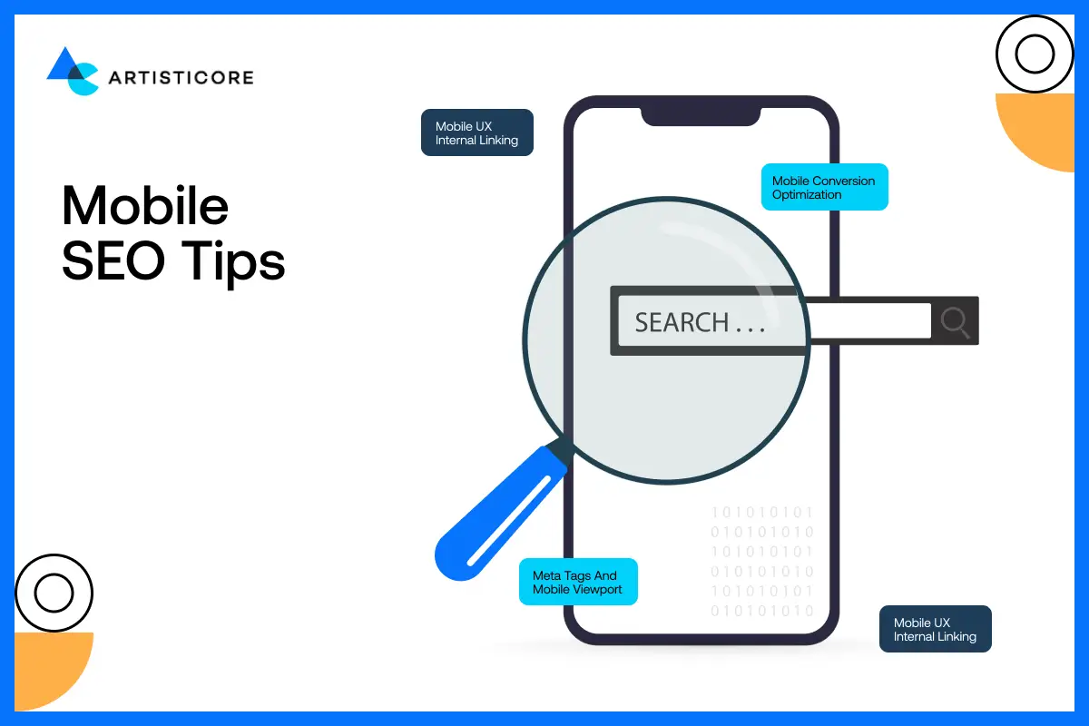
Mobile SEO is not an excellent addition; it is a necessity. Google now ranks mobile friendly web design on top while the slow, clunky, or confusing sites are getting less leads, less sales, and less opportunities.
Organized Information and Rich Snippets
Have you ever seen star rating, product information or frequently asked questions at the top of the Google results page? That’s the magic of structured data. These rich snippets are even more effective on mobile, as your page sticks out on a tiny screen, literally like a neon sign telling you to click it, it is useful!
The input of structured data does not only assist Google in knowing your content better, this also increases your click through rate and hence mobile users can easily access what they need without having to scroll the dozens of links trying to find what they need.
Meta Tags and Mobile Viewport
Mobile web design has a silent hero and this is the meta viewport tag. It helps maintain the size of the page, allowing users to stay by making the whole experience easy to read and consume.
With this, it is also important to add meta tags and description and that too in a clear, to the point and unique way. Mobile users do not digitalize, they scan. Each word is important, and such tags should be considered miniature billboards: capture interest in the shortest possible time and redirect users towards your content.
Mobile UX Internal Linking
A good internal linking structure is not only to benefit the SEO practice, but also to usability. The links should be easy to tap and they should be placed in logical positions, so that the visitor can navigate through your content without additional effort, on mobile.
Imagine internal links as breadcrumbs. They navigate users naturally towards your site, thus enabling them to locate what they require without frustration and bouncing minimal and their interaction high.
Mobile Conversion Optimization
Traffic is awesome, but unless visitors act, there is no use of it. Users on mobiles desire speed, clarity and simplicity. Cute buttons, cluttered designs or lengthy registration forms are eye rollers. This is how to maximize mobile conversions.
CTA Placement That Works
It is important to place call-to-action or CTA buttons with care. Put them above the fold so that users don’t spend too much time scrolling and finding. If you want to track if the users has scrolled down the page or not, place sticky CTAs as they make sure that the CTA is in user’s reach.
Simplified Contact Forms
The conversion killers are those long and complicated forms. On mobile, less is more. Request necessary information, such as name, email, phone and leave autofill to do the rest. There is another clever trick: step based form: divide information into bit-sized pieces so that people are not overwhelmed.
Building Trust Signals: Build Confidence
Users on mobile make impulse buying. The testimonials, security badges and client logos you add close to your CTAs is a sign to visitors that your site is secure and reliable. Consider it: would you press Buy Now on if the Web site were sketchy or unverified? The signal of trust breeds confidence and confidence leads to conversion.
Not sure if your site is mobile-friendly? Let us take a closer look.
Real Life Mobile Redesign Case Studies

A mobile first web design examples are there to tell you how to outstand your brand. Not just by making it look good but allowing it to engage well. Let’s study some of mobile website design (examples) and use them as mobile web design inspirations.
Airbnb: Making Mobile Booking Easy

Airbnb is one of the best mobile website examples that you can find. Initially, the design was messy which was making it difficult for users to stay. Now, they are ranked in the list of cool mobile websites because of redesign. The search filters are easier. They have thumb friendly buttons, and all the images load really fast even on slow networks.
After the redesign which was about turning a basic website or an app into mobile responsive one, they enjoyed massive sales. The number of mobile bookings increased, app ratings went high and user engagement touched the tops. They turned a frustrating experience of many travelers into a pleasant and enjoyable one around the globe.
Starbucks: Fast, Customized and Easy Ordering

Starbucks knew that hungry users or night pullers want quick and convenient ordering process. They have their app and website designed that focused on three things, speed, personalization and ease of order.
The payoff? Increase in number of mobile orders, customer engagement in web, app and loyalty programs. shows that a carefully designed mobile design can have a direct positive impact on satisfaction and sales.
Nike: Mobile Shopping that Feels good

When we talk about easy shopping, Nike is one of the best mobile web examples that comes into mind. Nike has redesigned the app and website by working on the loading speed of their product pages. They also added other interactive icons and made the whole checkout process easy. Not just on desktops but on phones too.
Nike witnessed increased number purchase and less cart abandonment. By studying their strategy, we will understand how a convenient mobile-friendly shopping experience is the only thing that keeps customers interested and spends money.
Apple: Clean, and Easy

The mobile site of Apple is an art of simplicity. You can see that their layout is clean with a single column design. There are large buttons that you can easily tap and every image is optimized which makes it load faster.
The design allows users to locate products, specs and purchase options easily without getting confused. Maintaining a straightforward and user-friendly nature, Apple strengthens its brand but also delivers a quick enjoyable mobile experience.
Mobile Friendly Web Design Tools & Resources

You cannot measure what you cannot improve. While designing mobile websites, you need to keep on checking the usability, speed and optimization. Otherwise, users will go away. This is where the use of right tools come in. They help you test, monitor and optimize mobile homepage design that make your visitors stick around.
Google PageSpeed Insights
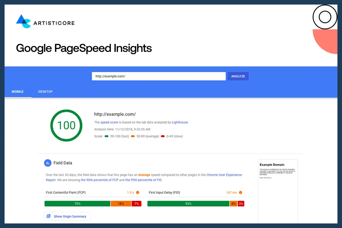
PageSpeed Insights is the starting point; in case you want to know why your mobile site is slow. All you need to do is enter your URL and it tells you your mobile and desktop loading speeds. More to the point, it provides exact advices like image compressing, removal of bulky scripts, or correcting render-blocking CSS. A quicker site keeps people happy because it is SEO optimized.
Google Mobile-Friendly Test
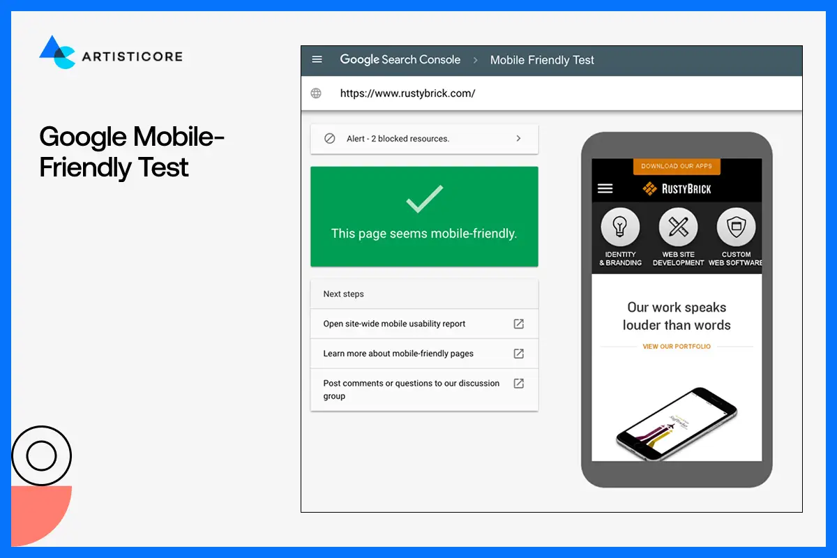
This easy-to-use tool informs you of whether your site is mobile-friendly or not. It verifies text size, spacing, positioning of the buttons and tap ability of your links. You will also get a screen shot of how your site appears on a phone. It is easy to use and tell you the exact issue that you can solve so that users do not face issues while navigating your web.
Hotjar and Maze, UX Testing Platforms

It is one thing to know how quickly your site loads. And then there is, how people really use your site. Hotjar and Maze are the two tools that provide heat maps, session recording and click tracking. What do they do? They tell you what works and doesn’t work for your site. inactivity of users. It could be a too small button, or a significant link that you need to fix to finally experience a smooth and fast web experience.
GTmetrix

GTmetrix scan the speed of your website and the tools works as a microscope. Literally, step by step, it finds everything that may be slowing down your site. You can see which images are extremely large, which scripts take extra time to load, or what code you need to trim down. Once you find the tiny errors, you fix them and see the right design for mobile website do wonders.
Lighthouse (Chrome DevTools)
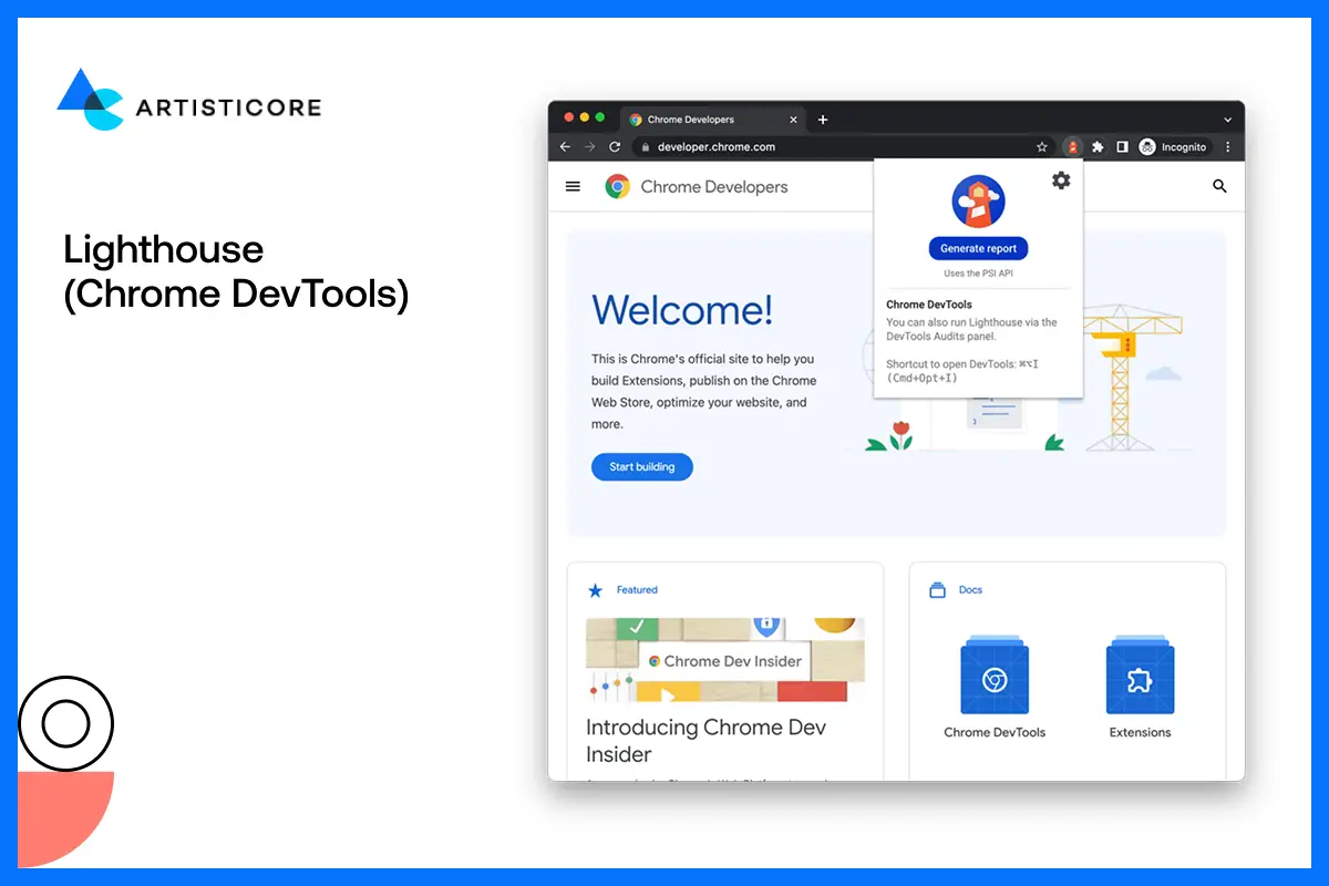
Lighthouse is built into Chrome and provides a complete scan of your mobile site. Everything literally, from performance to SEO and accessibility of your site, it scans everything. You then get a report of your site performance and find out the errors that you have not noticed. The tool is my personal favorite because it gives you proper guidelines on how to correct every issue.
BrowserStack and Lambda Test

There are all types of mobile devices and your site must be compatible with them. BrowserStack and Lambda Test allow you to test your site on thousands of real gadgets and web browsers. You can actually view how your design would appear on an iPhone, Samsung or even on older models. This makes your mobile site accessible everywhere not just on your phone.
Pingdom Tools

Pingdom checks the speed of your website on different parts of the world. You will find load time, page size as well as improvement suggestions. Slow mobile pages are expensive to users but this tool is the way to keep your site fast and reliable.
Crazy Egg
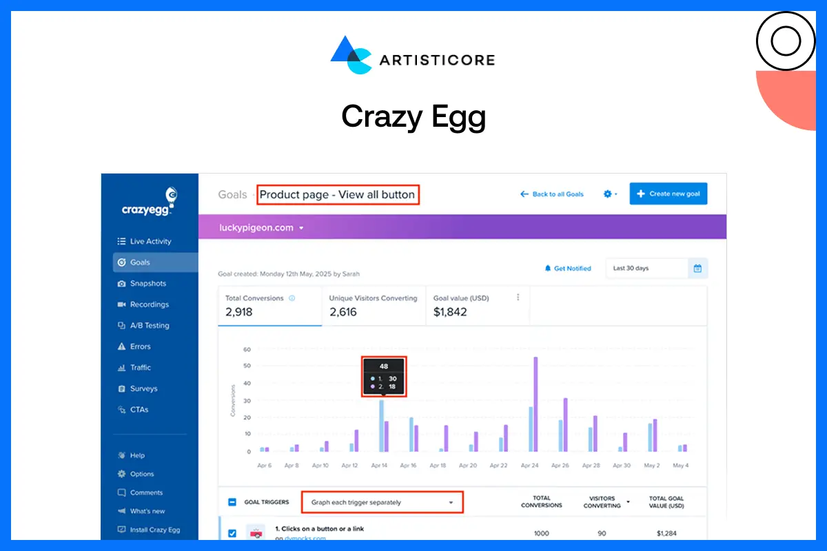
Crazy Egg is ideal to know what users are paying attention to in your mobile site. Heatmaps indicate areas that receive the highest attention whereas the scroll maps indicate how much people scroll down your pages. You are even allowed to carry out small A/B tests and determine what layout, colors, or buttons can give you the best mobile website designs.
WebPageTest

It allows you to test your site performance to see how it works on different mobile networks such as 3G or 4G. The tools work best in identifying blocks which you may overlook in faster connections.
MobileTest.me

The tool is for people who wants to get a quick preview of their sites but on different smartphone frames. It does the deep analysis that too quickly so you can easily check how responsive your website mobile phone gets. If there are any errors in the layout or structure, it will guide you through that as well.
Ahrefs and SEMrush

These are important search engine optimization tools that monitor the ranking, traffic and performance of your site. You get to know what is working, what requires correction, and where to make changes.
Conclusion
You can’t disagree to the fact that almost every user nowadays browses sites using mobile phones. Even I do, and I know you do too. When we are spending so much time scrolling, buying and just killing time using phones, don’t you think brands should deliver mobile web site design as well?
The best mobile web design does not talk about reducing content to fit on smaller screens. It is about giving a light, smooth or easy experience to every kind of visitors. The kind experience that gets loyal customers.
Being a top website design company only require the correct use of recent web design trends. If you do this, you site won’t just exist but become a game changer. It will attract, influence and convert with just one swipe, tap and scroll so don’t let it slip away.
Convert Traffic into Growth
Need a mobile website that loads faster and has better conversions? Contact Artisticore now!

Hafsa Hanif is a talented content writer at WebnHubs, specializing in topics such as graphic design, web design and development, logo design, and animation. With her deep understanding of design principles and creative processes, Hafsa crafts engaging, informative, and SEO-optimized content that resonates with readers. Her expertise in SEO ensures that her articles not only captivate audiences but also rank well on search engines, helping businesses boost their online presence through compelling design-focused narratives.
